Initial Ideas
THE BRIEF:
In this third part of the module you are asked to produce work that brings together your ideas from earlier projects, with the addition of a forward projection and declaration on which to base your future work. Your thoughts, ideas, your manifesto should be brought together in the form of a folding pamphlet, or single sided newspaper advert. The taught sessions will include exercises to help you develop the content, together with workshops in In-Design. The design of your document will need to consider: language and tone, appropriateness of design for the subject, typography, stock and print or PDF.
My aims in immediate response to the above brief are as follows:
- Question the extent to which tone and style can be satirically/ironically "bad" before becoming objectively ugly.
- Capitalise on audience perception of different typefaces as having "personality" or meaning
- Explore the gatekeeping nature of Design and Art - to what extent is design universal or is it a highly trained, educated skill?
- Make type the focus of the outcome - including limited graphics/illustrations.
- Create humorous, reactionary copy/content that reminds myself and others not to take oneself too seriously. (but also to have a bit of gumption and self-belief when it comes to sticking to your ideas and valuing your craft)
Research & Inspiration
Elliot Ulm
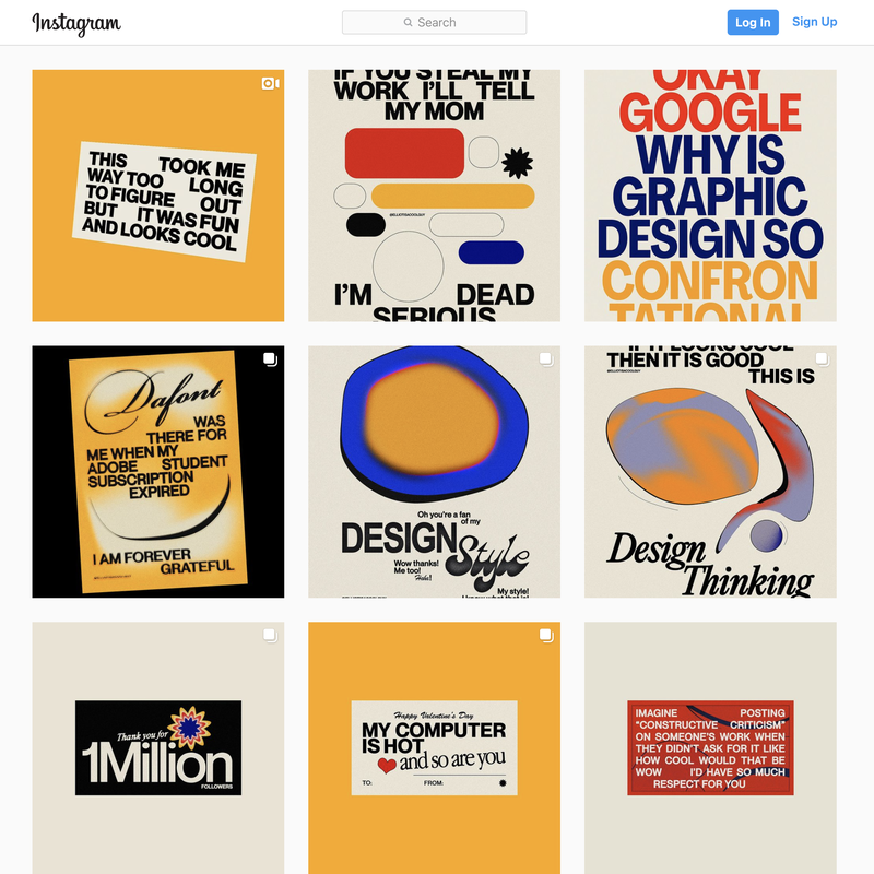
Elliot is an Australian freelance designer whose bold, type-based design and irreverent sarcasm has landed him a large internet following. I stumbled across him on instagram through the recommendation of a friend after expressing an interest in playing with design tropes and sarcastic copy for my manifesto project. The self-deprecating humour, cutting observational comedy about the design industry and minimalist approach to his work instantly appealed to me and became a heavy influence for this project. It was particularly interesting to see a young, current designer that made "simple" "basic" work that still clearly upheld key design principles. His use of typeface's as a statement within themselves, or as an example of GOOD or BAD design - framed in the millennial humour/meme format is something that i want to take further and translate into print. His pieces spark the question of what IS good design in a modern context, and who is defining the criteria as such. 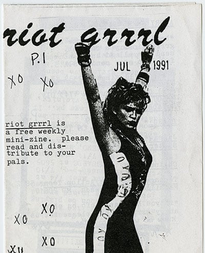
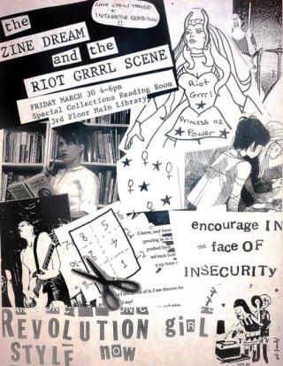
Riot Grrrl
Riot Grrrl is an underground feminist punk movement that grew out of America in the 1990s. It has been regarded as a catalyst for third and fourth-wave feminism, with music, writing, and publications that address the issues of domestic violence, rape, sexuality, racism, and other inter-sectionalist issues. With its roots in music, Riot Grrrl became a subculture involving a DIY ethic, zines, art, political action and activism. The vibrant zines and Internet-based nature of fourth-wave feminism content definitely shaped the concept of what zines are, and how they are formatted - the art style of these works paired with their strong activist message act as a strong suggestion of how manifesto can be presented. It is this subculture of zine-making that I want to focus on in my final outcome. In particular, the work of Kathleen Hanna, from the band Bikini Kill, can be seen to bridge the gap between art, music, activism and publication. The general style of Riot Grrrl zines includes illustration, rough handwritten additions, and lots of collage - combining newspaper clippings and images of raw female sexuality. the rough, authentic nature, and easily distributable material helps to spread the message further and wider in the modern era, and acts as a physical representation of the movements aims and goals. 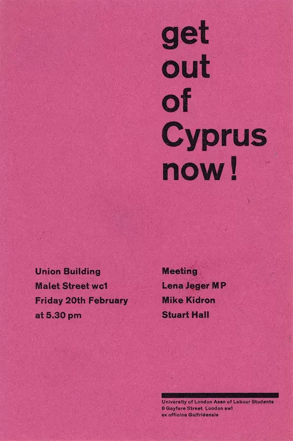
Desmond Jeffrey
Jeffrey is a contemporary letterpress printer and typography teacher who was active in London in the 1950s and 60s. His work was introduced to me in one of our workshops with Jono, and the use of bold, block background colours and sans typefaces instantly resonated with me and my aims for this project. The reactive, personal way that Jeffrey cerated typefaces from home called to the "everyman" aspect of type and zine making - I wanted to represent in my outcome the concept that ANYONE can define design practice, and aesthetics are not universal. “If Desmond’s letterpress typography is worth making a fuss about (which he himself did not), it must be for both truthfulness of purpose and his vital, true eye for type and space. He picked up a 500 year-old technology in its very last working years, just before it vanished into antiquarianism, and put new life into it. At the time of his death he was looking for what might come next. ”– SALLY JEFFERY, TYPOGRAPHY PAPERS 8 (2009) 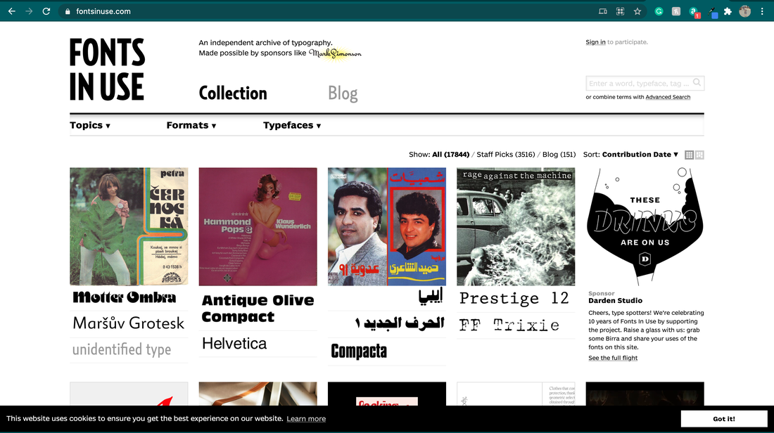
Fonts In Use
https://fontsinuse.com/ Fonts in use is a great resource to see how fonts have been previously utilised in professional and personal projects. It helps to categorise different typefaces based upon their purpose - for example, Serif fonts tend to be used for academic writing or legal firms, where as thin, sans serif fonts are often used for high-class, quality branding, and within the technology sector. Seeing fonts in their greater setting of branding, used as logos, or for publication projects helps to better ground my understanding of where and when certain fonts are deemed appropriate, and how I can play with this in my project, It is also rather interesting to see the range of different uses and edits of the same typefaces - and how its setting, manipulation of the tracking or weight, and using upper/lowercase can change its "feel". |
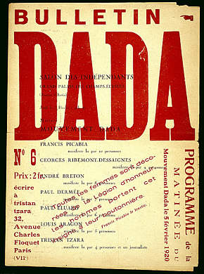
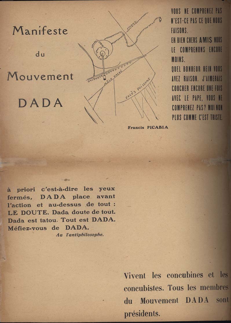
The Dada Movement
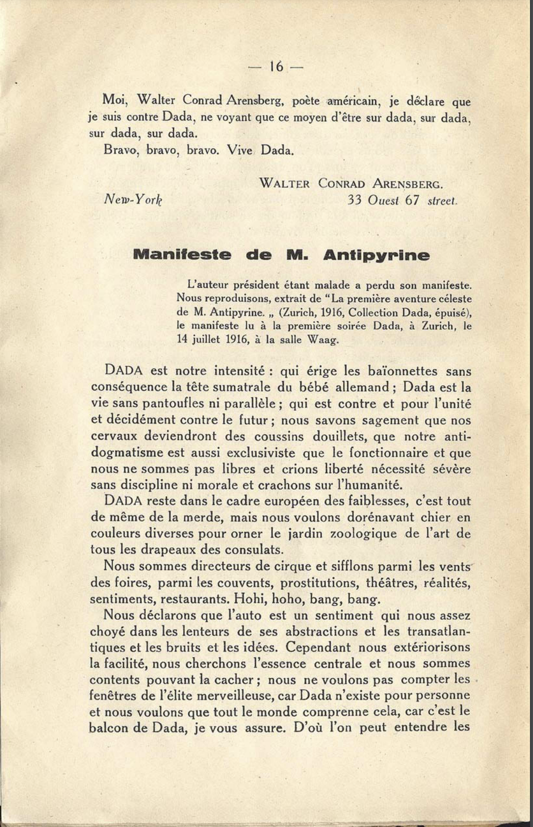
Dada was an art movement formed during the First World War in Zurich in negative reaction to the horrors and folly of the war. The art, poetry and performance produced by dadaists is often satirical and nonsensical in nature, and the reactionary nature of the work; intended to create a subversive view on WHAT is important, heavily influenced my project. The various manifestos published highlight using abstract design techniques, going AGAINST the rules of the contemporary art and political world - everything about Dada is a question, a reaction, an ineffable state of being. The manifestos show odd, abstract choices of font and text placement, overlapping characters, and playing with format and classic design concepts. The radical-left politics, paired with the anti-war and anti-bourgeois intention behind the work relates exceptionally well to zine-making, and underground press as a force for change to the norm. Dada artists felt the war called into question every aspect of a society capable of starting and then prolonging it – including its art. Their aim was to destroy traditional values and to create a new art to replace the old. "Revolted by the butchery of the 1914 World War, we in Zurich devoted ourselves to the arts. While the guns rumbled in the distance, we sang, painted, made collages and wrote poems with all our might." - Hans Arp The almost "devils advocate" approach to making their point through art is exactly what I want to encompass in my own work. I aim to use "terrible", reactionary typefaces and placement to evoke a sense that design principles are unimportant, toeing the line between "ugly" and "aesthetic". Primarily, I focussed on the later manifestos published in Paris - being able to translate the french made these more accessible to me than their german predecessors. The tone of writing is particularly interesting, with writers using pointed pseudonyms, including sound effects, inside jokes, and asides - everything adding to the sense of "reality" as one big joke, and calling for change. Below is an excerpt from Dada Manifesto 1, from Tristan Tzara, writing as 'Monsieur Antipyrine' (an interesting choice in name due to the strong painkiller antipyrine's use to treat soldiers with PTSD after WWI): The 1st DADA Manifesto: By Monsieur Antipyrine. DADA is our intensity: it erects inconsequential bayonets and the Sumatral head of German babies; Dada is life with neither cosy slippers nor parallels; it is against and for unity and definitely against the future; we are wise enough to know that our brains are going to become flabby cushions, that our anti-dogmatism is as exclusive as a civil servant, and that we cry liberty but are not free; a severe necessity with entire discipline nor morals and that we spit on humanity. DADA remains within the framework of European weaknesses, it's still shit, but from now on we want to shit in different colours so as to adorn the zoo of art with all the flags of all the consulates. We are circus ringmasters and we can be found whistling amongst the winds of fairgrounds, in convents, prostitutions, theatres, realities, feelings, restaurants, ohoho, bang bang. 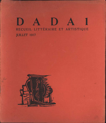
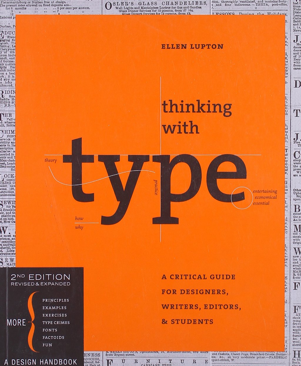
Ellen Lupton - Thinking With Type
http://thinkingwithtype.com/ The key information from Lupton's renowned book "Thinking With Type" is included open-source on the website, and goes into great lengths of detail about technical aspects of type. This resource has helped me to better understand the differences between kerning and tracking, helped me to identify the correct terms to refer to different parts of letters, and think about using the grid structure to layout type for print. Using Lupton's explanations, I now have a more critical understanding of what makes up a font, and how manipulating letters, text, and layout respectively can enhance or detract from the overall design of a type-based outcome. how to make a zine from nicki sabalu on Vimeo. Nicki Sabalu - How to make a zine
A short instructional video I found online about formatting a zine - linked for ease of reference. |

content/copy
Below is the original copy for my manifesto. It began from the titles/bullet points, which I fleshed out in a "stream-of-consciousness" style of writing. The final content included in my printed manifesto has been edited and shorted, based on altering the layout of my folded pamphlet and reducing the number of pages.
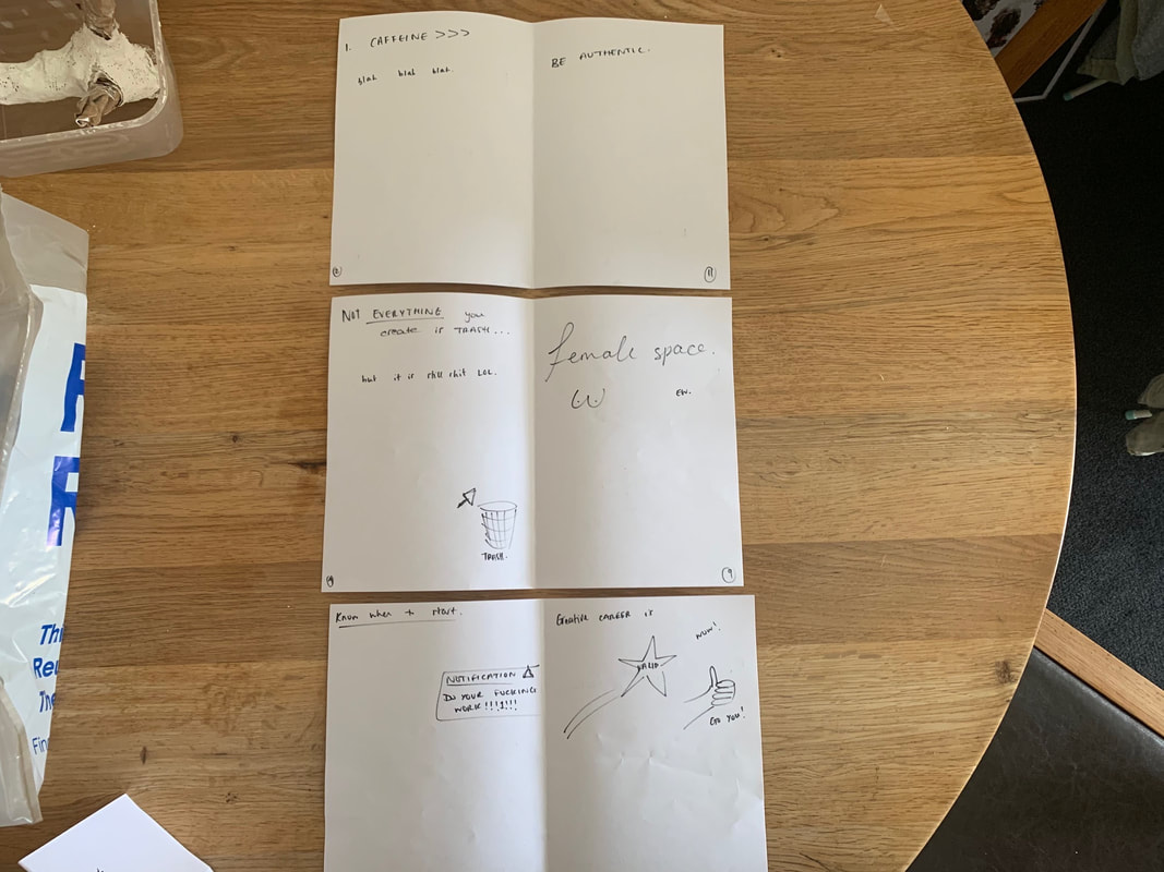
Layout planning
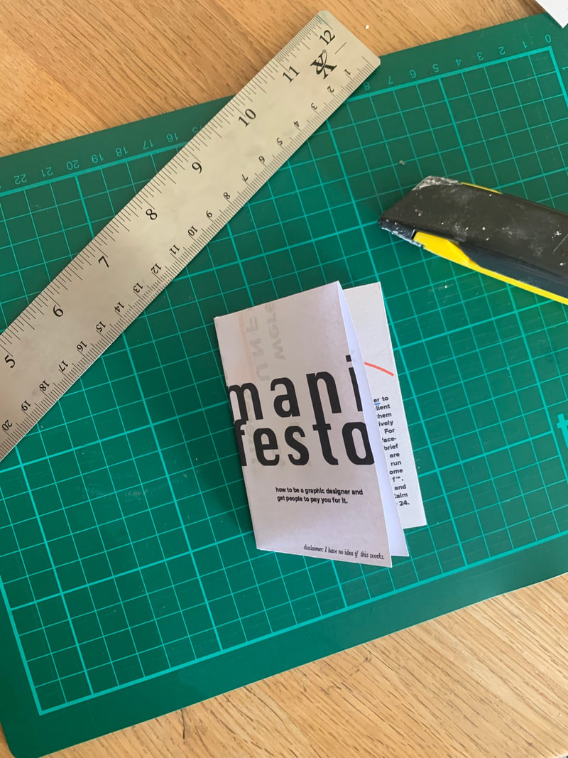
Originally, I planned to create a 12 page booklet as my manifesto - comprised of 6 spreads and stapled simply through the middle. This was the most simplistic 'book' format I could think of that allowed me to create something compact, succinct in word, and still abide by the whole "simple" "basic" "anyone can design" premise that underpinned the piece. Below is the rough plan for what content would be on each page in order for me to be able to format it correctly on InDesign. The issue with this layout design is that I had misread the brief for this project: which clearly stated "Your thoughts, ideas, your manifesto should be brought together in the form of a folding pamphlet, or single sided newspaper advert." This ruled out my idea of having a bound pamphlet with multiple spreads. It wasn't until after I had created a few pages in Indesign that I realised my error, so some of the following images will be laid out as below when still in progress.
This experience has taught me the importance of constantly checking a brief in order to make sure you are meeting the client/project requirements. Additionally, the change from bound to folded format forced me to be more creative - limiting my copy, and including a fun "secret" back page.
This experience has taught me the importance of constantly checking a brief in order to make sure you are meeting the client/project requirements. Additionally, the change from bound to folded format forced me to be more creative - limiting my copy, and including a fun "secret" back page.

|
|
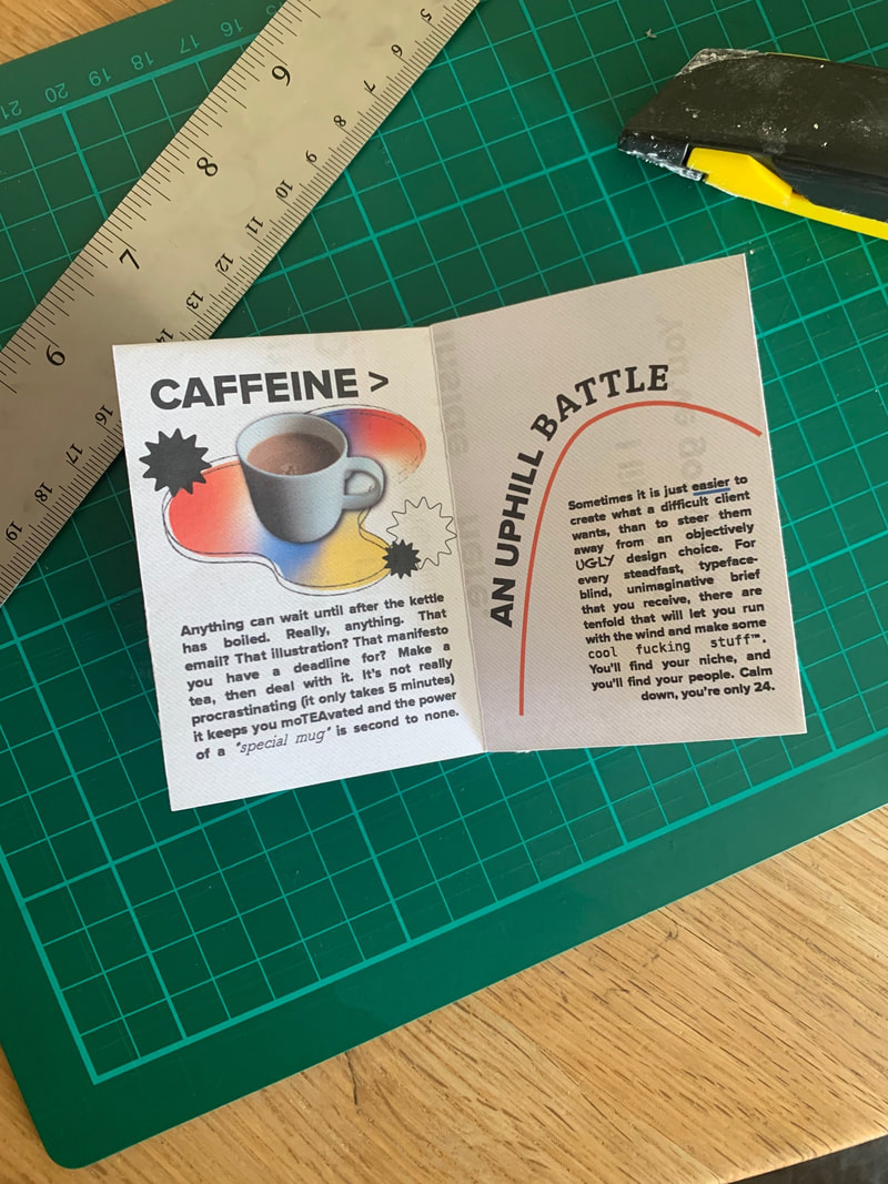
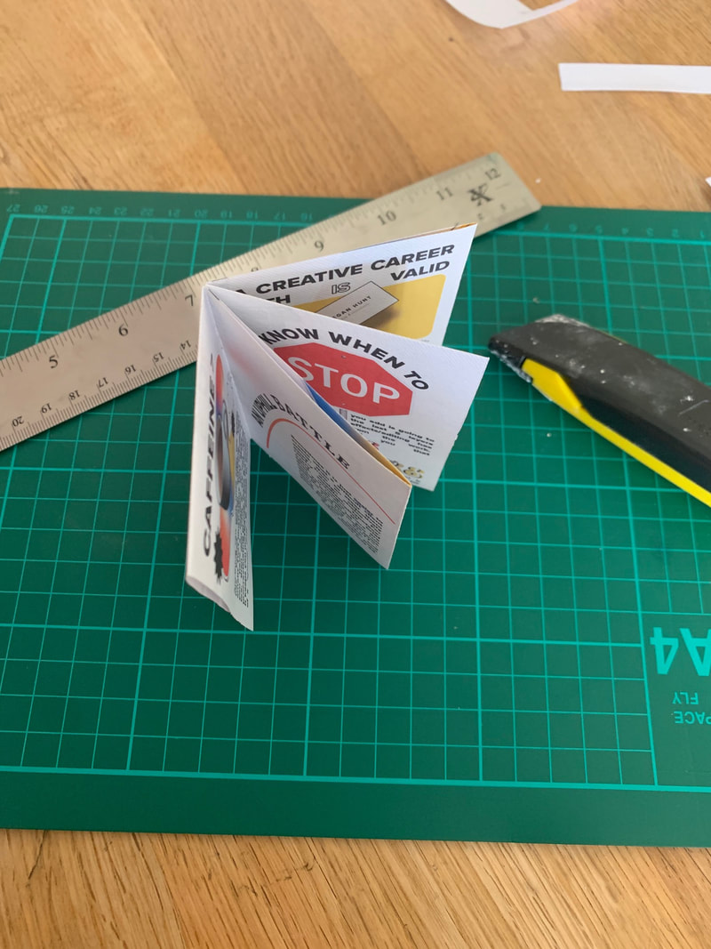
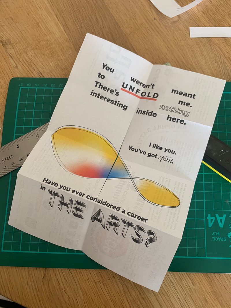
When moving to a folded format, I thought it would be interesting to use the 8 page zine format with the cutout in the centre that allows for the paper to be manipulated into a more structurally sound "book". It eliminates the need to gate fold the middle, or use a concertina fold - both of which I thought would be too "fancy" for my sarcastic content. Furthermore, I thought that the destructive nature of having a large cut/hole through the middle of a consciously designed print product physically reflected the mismatched/unexpected nature of the content and design: in other words, you wouldn't expect a rip or cut through a finished print piece - let alone right in the middle. This led me to putting a comedic message on the 'back' of the piece - meaning that if the book was unfolded to its flat format (revealing the cut through the middle) the reader would be rewarded with a commendation on their curiosity/acting outside of the box. There's an irony in this: designing something that simultaneously IS and ISN'T meant to be seen. Additionally, I popped a cheeky message on the 'back page' of the book, stating 'stop looking at my bum'. This was inspired from my work experience with innocent Drinks, whose witty, inventive copywriting always brings delight and has cemented their brand as a consumer favourite (all innocent smoothie bottles have a secret message on the bottom - ranging from "stop looking at my bottom" to "rub bottle to free genie"). It didn't seem right to include a blurb or an endnote to the manifesto based on its humorous nature, and this anecdotal joke fitted perfectly.

|

|
typefaces
A viewers response to a typeface is often a gut reaction; we have an idea of what looks good, what is appropriate, and through association, we recognise difference typefaces for different purposes. For example, Times New Roman is a classic typeface used for books, literature, and academic writing. Similarly, the likes of Comic Sans, and Papyrus (although fit for their designed purpose) will go down in history as notoriously "BAD" fonts. During our lectures with Jono, we completed an exercise where; when faced with an unnamed font, we had to answer questions about the personality, or "person" that said font was. Aside from some hilarious jokes and very strong reactions to certain suggestions, or strong feelings about WHO each font was, it served to further my exploration into the idea that type has character. I wanted to exploit this in my manifesto, using typeface as I would illustration or image: to convey a feeling, meaning, or message just by BEING.

Screenshot of the typeface "character" exercise we completed during our lecture
Design process
Colour
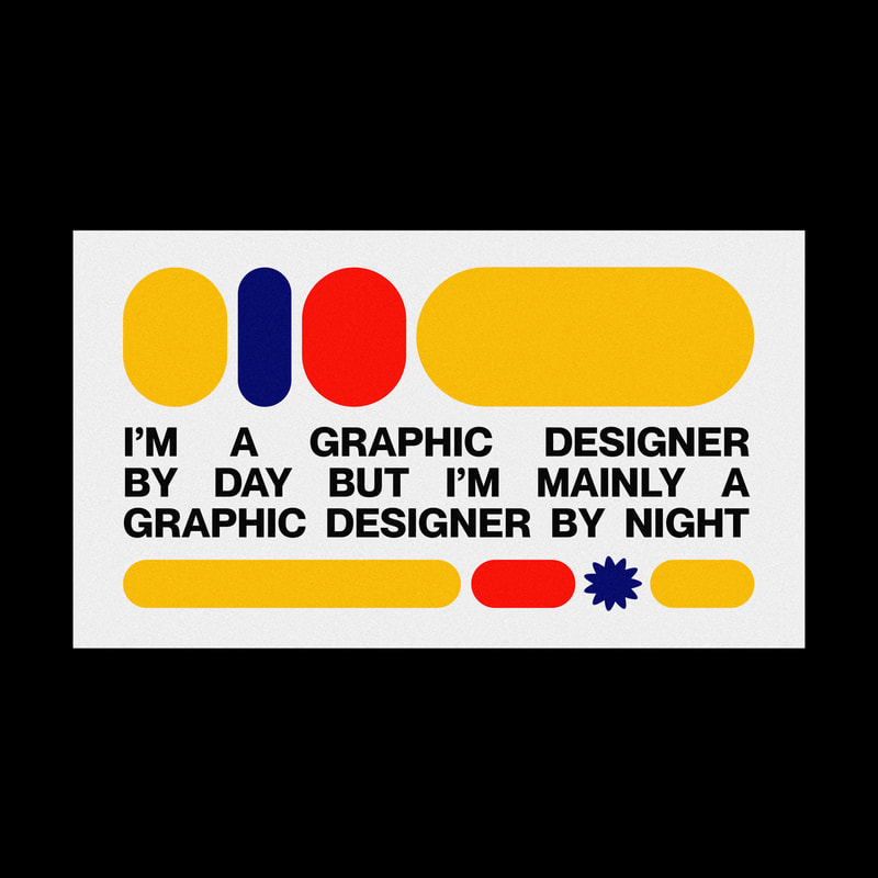
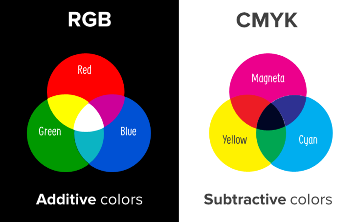
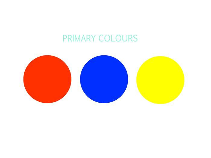
The colour scheme I used for the manifesto capitalised on Triadic colours. Inspired by Elliot Ulm's work, I intentionally limited my palette to primary colours as a movement away from additive colour (RGB) used by web/graphic designers. By using primary colours rather than the digital RGB model, I created an homage to print and physical work - using digital tools to play with traditional, basic practice and strip down everything to really focus on the use of font.
The colour scheme I used for the manifesto capitalised on Triadic colours. Inspired by Elliot Ulm's work, I intentionally limited my palette to primary colours as a movement away from additive colour (RGB) used by web/graphic designers. By using primary colours rather than the digital RGB model, I created an homage to print and physical work - using digital tools to play with traditional, basic practice and strip down everything to really focus on the use of font.
|
|
Font
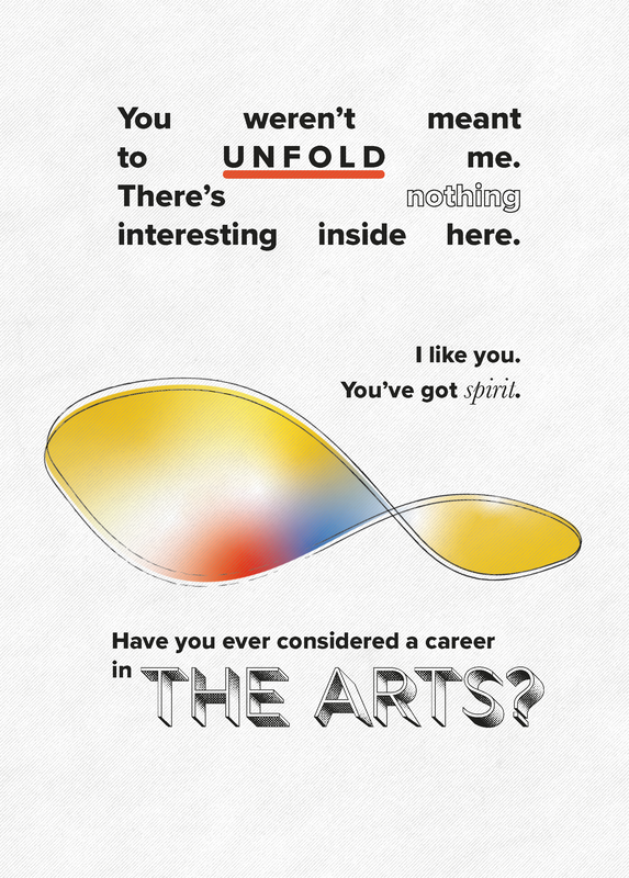
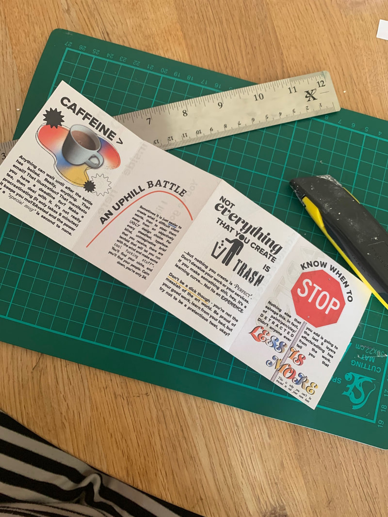
With type being the primary visual in my manifesto, I wanted to see how far I could push the idea of "characteristic" or "bad" font and use it to create something that was somehow aesthetically pleasing. My aim was to call attention to the terrible fonts, but still integrate them within the larger message, using them to exemplify meaning in the content based on their "personality". Because these brash fonts were the focus, the main body of my content needed to be inoffensive, or "plain" so as not to pull focus. Walking the line between "too much" and "too little" required a base typeface that balances out garish elements. For this reason, I chose Proxima Nova to use in all of my title statements, and as the body text. It is a clean, rounded sans-serif font with a neutral feel - and complements the simple vector graphics/shapes and stands in contrast to any more decorative or reactionary fonts. It was important that the titles were all the same size, and completely uppercase, so there was continuity between each page
With type being the primary visual in my manifesto, I wanted to see how far I could push the idea of "characteristic" or "bad" font and use it to create something that was somehow aesthetically pleasing. My aim was to call attention to the terrible fonts, but still integrate them within the larger message, using them to exemplify meaning in the content based on their "personality". Because these brash fonts were the focus, the main body of my content needed to be inoffensive, or "plain" so as not to pull focus. Walking the line between "too much" and "too little" required a base typeface that balances out garish elements. For this reason, I chose Proxima Nova to use in all of my title statements, and as the body text. It is a clean, rounded sans-serif font with a neutral feel - and complements the simple vector graphics/shapes and stands in contrast to any more decorative or reactionary fonts. It was important that the titles were all the same size, and completely uppercase, so there was continuity between each page
Layout and Graphic Elements
when working through the layout of the folded zine, I created wide margins on each "page" that all of the elements should sit within. The only exceptions are small graphics that overlap the margins to balance out large fonts or highlights. Below are images of my design stages:
I began by simply adding all content to the pages with the titles and body content formatted within the margins and using Proxima Nova. You can see above as I start to play with isolating certain words to give emphasis/ meaning through font choices, and exploring graphic elements such as the "hill" line
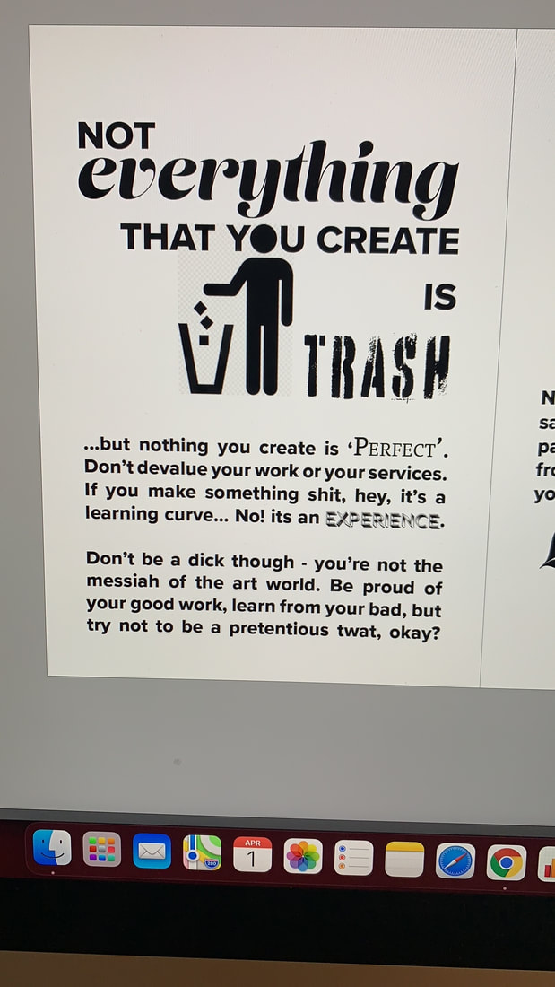
Building on the interaction of image and text, I used iconography as a callback to information design theory - but substituted the O in "You" for the icons head. This helps to illustrate my ability as a designer to make cohesive, visually balanced work and highlights that the image has been place with intention - despite the inclusion of the transparency grid. I intentionally left this "png" background in the image - an homage to terribly placed or imposed photos that indicate a lack of design experience or thinking; my aim is to point out design flaws, but make them WORK - in order to display the gatekeeping/ inaccessibility within design practice.
|
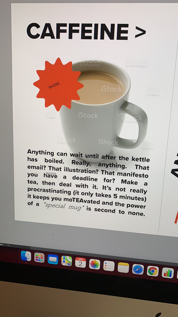
I wanted to use actual photos/images alongside vector shapes to really push the limits of design. a lot of my inspiration comes from formatting childhood documents in Word - the awful wrapping of text around images, and justification of font. The way that text interacts with the images and graphics is essential to creating a cohesive design style that comes off as ironic and intentional - rather than just poorly made.
Moving on from the last image, you can see above me exploring the boundary between INTENTIONALLY "BAD" design, and coming across as unskilled/unplanned. Based on including the transparency grid in the 'Trash" image, I exploited another design/photography faux pas - using stock images with watermarks. This approach was too on the nose, and genuinely does look as though I have put something together in under 5 minutes, so I abandoned this graphic and concluding that the use of one "poorly chosen" graphic would be enough to convey my message. I learned a valuable lesson in terms of the boundary concerning the extent of constructing purposefully "ugly" layouts before they appear as just ugly.
|
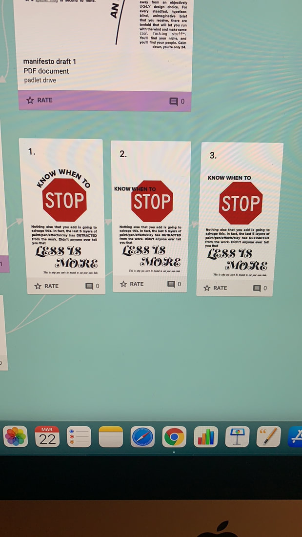
I created a collaborative environment on Padlet for out MA group to share work since we cannot physically see each other and keep up with peer work. I requested feedback from others on which layout they preferred from the above selection, in order to ascertain what was "too far" in the eyes of others. This was essential, as although my ironic intent was obvious to me, I had to ensure it was clear to an audience.


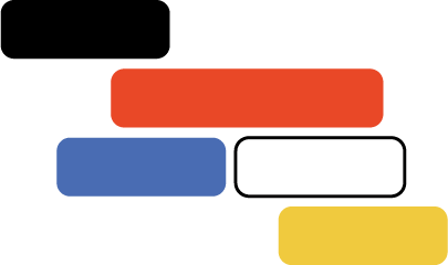
When it came to creating "flourishes" to bring in the primary colour scheme, and evidence knowledge of design principles, I worked in Illustrator with polygons and the pen tool to create abstract and structured paths. I explored different strokes, and overlaying brush lines as outlines, to combine the post-modern/abstract with something more illustrative. I layers these graphics with my photos and trialled different effects (drop shadows, outer glows, etc.) to see how I could tie the REAL and the DESIGNED elements together cohesively. Again, there was a careful line to tread between too simple and too "curated", and only through practice and visualising the elements could I determine what worked.
|
Choosing "Ugly" Fonts
|
|

|
When it came to choosing fonts for my accent words, it was based mostly on feeling; my personal response to what the fonts embodied/represented. I also took into account common perceptions of certain character attributes (such as serif being more suited for academic work or as body text in novels, comic sans being notoriously THE WORST, and typefaces used by children in Microsoft Word reminiscent of a child-like level of practice (I'm thinking here of: Papyrus, Curlz MT, Chalkduster....)
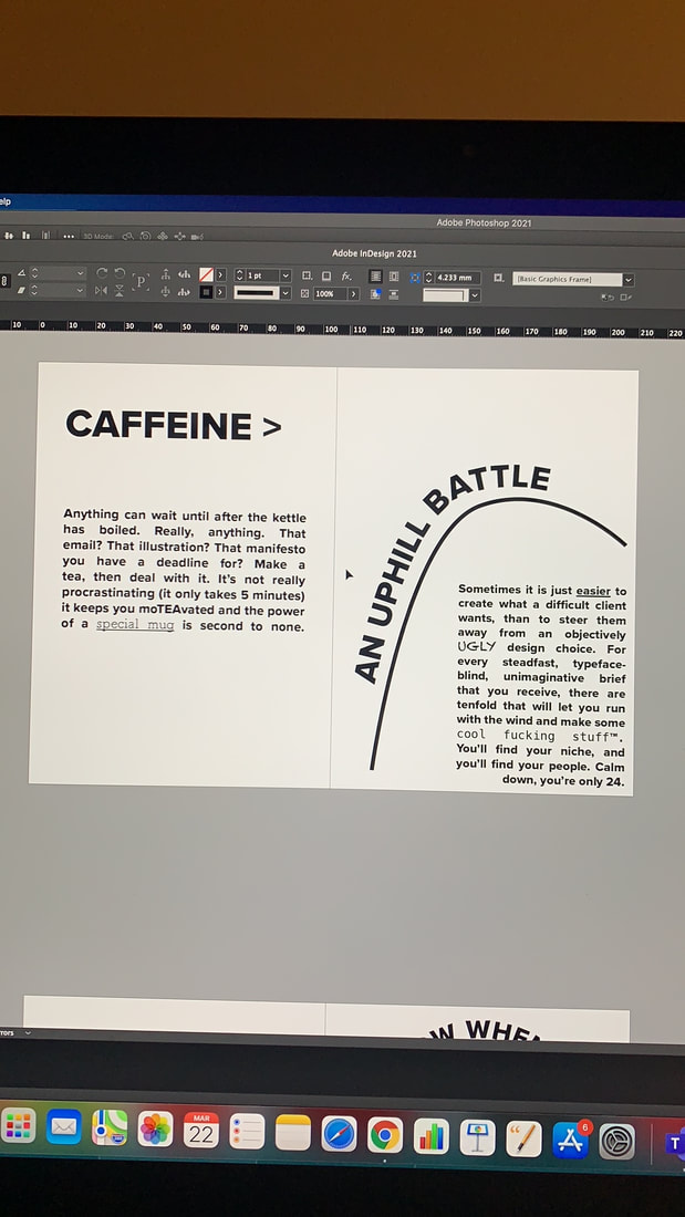
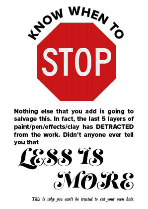
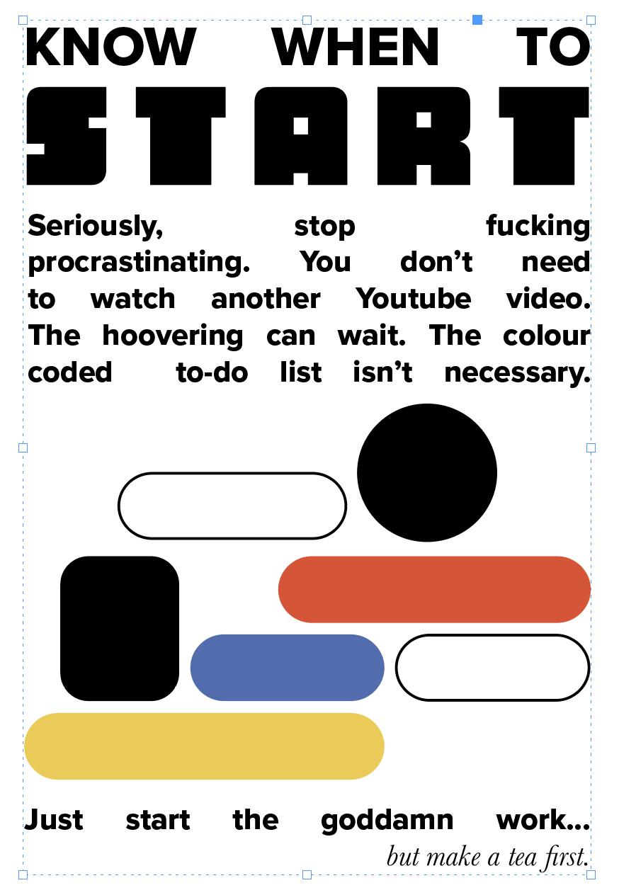
Some font's were repeated across the manifesto, for example, I used Baskerville in italics for asides to the audience - reminiscent of intonation being used in novels. As my own, sarcastic, ACADEMIC voice, Baskerville seemed the best representative for the task; it's easily recognisable, trust worthy, but with a little more "flair" than times new roman that suited my wit a little better. For "Less is more"I knew I wanted to use an overly frilly, decorative font to contradict the words and prove my point! I cycled through a few decorative font styles before settling on Lust Script in uppercase. The thickness and roundness of the characters mirrored Proxima Nova nicely, whilst the swirls on the terminals added a fanciful flourish that didn't make the text illegible. For "START", I wanted to use a thick slab sans-serif font with a square element to it - reminiscent of 8-bit video games and the start screen. I found this in Chuck, upping the tracking to ensure it was justified with the body text and graphics, and I believe it successfully reminds the audience of arcade gaming - added to by the text itself, and the button-like graphic elements. For "The Uphill Battle" page, I used a serif font for the word battle - calling to the historical context of the word - whilst choosing something with a little thickness to coincide nicely with the rest of the uppercase Proxima Nova title. For the word "ugly", I chose on of the aforementioned "terrible" childhood fonts - Chalkduster - its hand-drawn form and texture lend it really to only one use (mimicking writing on a blackboard), making it an objectively unusable, and abhorrent typeface for "design purposes". for the phrase "cool fucking stuff" I added the trademark glyph to ironically allude to how the concept of "cool" is subjective and undefinable, whilst using the crisp, clean serif font Menlo to represent a clinical, technological level of "cool".
Some font's were repeated across the manifesto, for example, I used Baskerville in italics for asides to the audience - reminiscent of intonation being used in novels. As my own, sarcastic, ACADEMIC voice, Baskerville seemed the best representative for the task; it's easily recognisable, trust worthy, but with a little more "flair" than times new roman that suited my wit a little better. For "Less is more"I knew I wanted to use an overly frilly, decorative font to contradict the words and prove my point! I cycled through a few decorative font styles before settling on Lust Script in uppercase. The thickness and roundness of the characters mirrored Proxima Nova nicely, whilst the swirls on the terminals added a fanciful flourish that didn't make the text illegible. For "START", I wanted to use a thick slab sans-serif font with a square element to it - reminiscent of 8-bit video games and the start screen. I found this in Chuck, upping the tracking to ensure it was justified with the body text and graphics, and I believe it successfully reminds the audience of arcade gaming - added to by the text itself, and the button-like graphic elements. For "The Uphill Battle" page, I used a serif font for the word battle - calling to the historical context of the word - whilst choosing something with a little thickness to coincide nicely with the rest of the uppercase Proxima Nova title. For the word "ugly", I chose on of the aforementioned "terrible" childhood fonts - Chalkduster - its hand-drawn form and texture lend it really to only one use (mimicking writing on a blackboard), making it an objectively unusable, and abhorrent typeface for "design purposes". for the phrase "cool fucking stuff" I added the trademark glyph to ironically allude to how the concept of "cool" is subjective and undefinable, whilst using the crisp, clean serif font Menlo to represent a clinical, technological level of "cool".
Adding Halftone Texture
The final aspect of creating my final outcome was adding a texture layer using photoshop to imitate halftone printing. I edited an image, converting it to greyscale, then to Bitmap, before removing transparencies and re-converting back to a greyscale image. I exported the new texture as a png, and Imposed it over the indesign file, creating lines and dots to mimic a rougher, more authentically printed style reminiscent of hand crafted zines for my final piece.
The final aspect of creating my final outcome was adding a texture layer using photoshop to imitate halftone printing. I edited an image, converting it to greyscale, then to Bitmap, before removing transparencies and re-converting back to a greyscale image. I exported the new texture as a png, and Imposed it over the indesign file, creating lines and dots to mimic a rougher, more authentically printed style reminiscent of hand crafted zines for my final piece.
Final OUtcome


Printed outcome at 50% scale.
|
|
|
|
Evaluation
I believe that the manifesto successfully and obviously explores design tropes and "bad" typefaces, presenting them back to the audience in a humorous, sarcastic way that leads to reflection on the importance of design theory and gatekeeping in the art communities. I am surprised at the coherency of the design - despite so many different fonts, the layout, margins, and colour scheme work together to make the overall composition SOMEHOW still aesthetically appealing. this serves to highlight how "ugly" really is subjective, and that it is possible to create something "good" without professional, or highly regarded tools/typefaces. Alternatively, it could be argued that the understanding of design theory; gleaned through research and education, and the application of negative space, colour scheme, grid layout, etc. is what makes the outcome coherent and successfully - perpetuating that "good" design IS something that needs training. The irony behind the piece is evident in the copy/content - with the jovial, "unprofessional" voice and (probably excessive) expletives lending the notion that nothing in the final outcome should be taken too seriously. To take the project further, I would like to have the opportunity to explore using different textures and thickness of papers and experiment with printing at various sizes to add another element of "incorrect practice" to the outcome, however, this sadly wasn't possible in the current climate. I would argue that ACTUALLY printing in halftone, rather than simply simulating the texture would be more meaningful - combining old and new practices in a disparate way that drives home the message of how unimportant tradition and "rules" really are.
