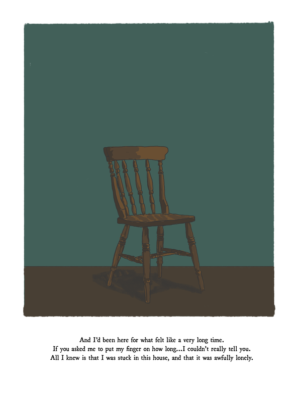
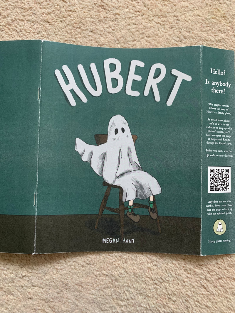
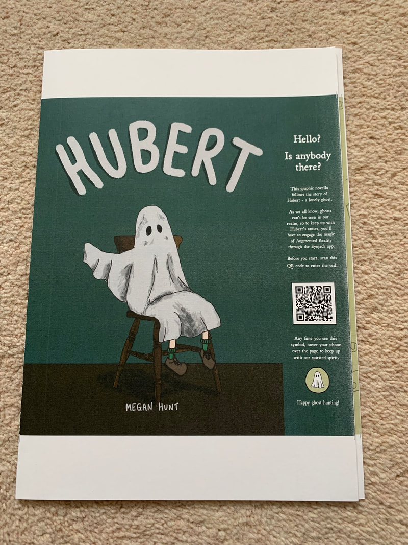
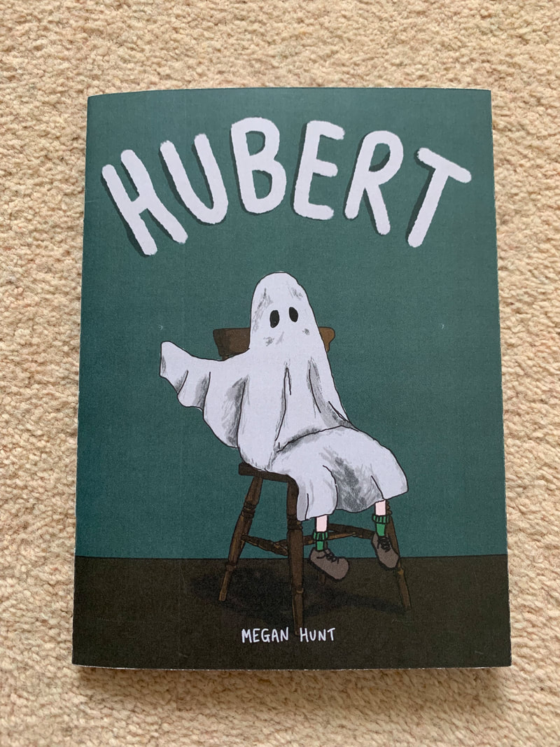
the story so far...
Over the previous module I have made several executive decisions, tested various methods of creating assets across digital and physical mediums, and honed the storyline and message of my intended final outcome, so that the final segment of my work can be focussed mainly on production. The work is documented under the Developing Practice tab of this blog, however, a recap of the key decisions, turning points and practical outcomes are outlined below:
December
- The aim of the practical work is to combine the digital and the physical in order to pay homage to both and exploit the potential of "the book" in an increasingly digital age.
- Story planning and rough story boards have been created
- Character development - using the ghost character to exploit intangible and invisible quality/ appearing and disappearing
- 3D modelling options have been explored and out-ruled - the learning curve is too steep for the timescale
- Application/Software for rending the AR experience has been tested and decided upon (Eyejack/Eyejack Creator)
- Book binding/ Printing services available at university have been explored and will be taken into consideration during production
December
- Submission of proposal
- Resolve transparency issues
- complete full rough storyboard for GN
- Create QR Code/Call to action to trigger all animations
- Finalise colour palette for GN
- Design of Covers
- Rough digital illustrations for all pages completed
- Complete all digital illustrations for GN
- Liaise with publishing/digital print at uni RE printing / explore external printing options.
- Begin illustrating and animating AR elements
- Complete all illustration, animation and export of AR elements
- Print, Trim and Bind GN
- Upload / ensure working all animations and triggers to Eyejack
- Finish Critical Evaluation
- (4th) - Hand in of all work and presentation.
- Degree Show (prep work for exhibition)
Transparency testing
|
|
The animation shown in the video to the left was not appearing correctly - and needed resolving at the end of the previous module. As stated in last module's learning journal; After resizing and re-exporting the gif from Photoshop, the result was a transparent gif that worked correctly in the app. There is an issue with the opacity of the ghost shadow (top panel right) and the sheet ghost in the bottom panel. Both were not set to 100% opacity, so the illustration below should still be viewable through them. This is something I need to experiment with over the next week to try and resolve. If opacity of moving objects is not possible, I will need to reconsider how I go about presenting my ghost character, and how some of my animated interactions will appear and work.
I need to fine tune the transparency issues with the overlays, and decide whether my workflow needs to include AfterEffects based on the complexity of my animations. With these issues in mind, I set about testing transparency when rendering frame by frame animations directly from Photoshop. At this point in time, I was considering abandoning After Effects and working solely in Ps - since my original illustrations for print will be created in Ps. Additionally, at this time there was no option to export GIFs from After Effects - meaning the animation has to be reloaded into Ps after animating - and this seemed like a step I could skip. |
This testing/ troubleshooting of transparency issues was essential to understanding the limitations of combining print and digital and for formatting how different layers and interactions would need to be formed.
I created a simple vector graphic of a smiley face and explored filling it with colour/overlaying it with colour in the following formats:
The initial gif exports are below, followed by the screen recordings of how they appeared through the Eyejack app when triggered by the printed smiley face image :
I created a simple vector graphic of a smiley face and explored filling it with colour/overlaying it with colour in the following formats:
- Full solid colour - to show the eclipse of the face.
- 50% fill of layers
- 50% opacity of layers
- Gradual increase in opacity of the overlay from 10% - 100%
The initial gif exports are below, followed by the screen recordings of how they appeared through the Eyejack app when triggered by the printed smiley face image :
|
FULL COLOUR (control)
|
FILL 50
|
OPACITY 50
|
GRADUAL OPACITY INCREASE
|

|

|

|

|
|
FULL COLOUR (control)
Notes:
- colour fully eclipses printed illustration beneath (as expected). -no change in colour on movement. - illustration triggers animation correctly. - 10 frame movement obvious (playing at 25fps) OPACITY 50%
Notes:
- circle fully eclipses illustration beneath again - colour is paler, but still opaque - has not lowered opacity. -white/discernible outline around circle? -result: not usable option. |
FILL 50%
Notes:
- colour fully eclipses illustration beneath - colour is paler, but still opaque. -appears to be lowering saturation, rather than opacity (as appears digitally) -result: not usable option. GRADUAL OPACITY INCREASE - 0%-100% in 10% Increments
Notes:
- final test to see if any of the levels of opacity appear transparent/semi transparent - proof that what appears to be lowering is the aturation - alpha channel is not working in Eyejack (as works on digital gif). - can either be visible or invisible- no leeway. |
Test Conclusion:
The images do not appear as transparent, and only alter the hue/saturation of the colour used. This is an issue I needed to explore early on, as it changes how I will format my AR interactions and how they interact with the printed image:
The images do not appear as transparent, and only alter the hue/saturation of the colour used. This is an issue I needed to explore early on, as it changes how I will format my AR interactions and how they interact with the printed image:
- I.e: the ghost cannot appear as semi transparent and move over images - my illustration of this character will need to be altered and this taken into consideration
- This changes my plan - I can no longer use this to highlight the ghost trope of being see-through/moving past and through drawn/printed objects and backgrounds.
- Shadows/ hidden movement - as in the original panel - cannot be overlaid onto the illustrations.
- Lines that I want to be visible will need to be included on the animated image (i.e: the smiley face graphic is completely eclipsed - the face would need to appear in the animation for this detail to be visible.
- I cannot FILL IN colours behind line drawings - I would need to include outlines on the animated layer for them to be visible - and ensure that they line up perfectly to give the idea of only the interior being filled in with the animation.
Back to the drawing (STORY)board.
Rethinking AR Interaction, the PURPOSE of Animations, and New Limitations.
With the limitations imposed by the software not allowing semi-transparency, I had to seriously reconsider how both the printed panels of my graphic novella would look, and how the ghost and the animated elements would appear and interact with the printed triggers. I understood that this would inevitably make my animations more complex, which could have a huge impact on my production schedule. My thoughts, questions and decisions in order to resolve these "issues" are below:
With the time constraints on the project, I was aware of the need to immediately get down on paper the new format for the story - and how interactions would work - with indicators as to what would and wouldn't be included on the printed images.
With the limitations imposed by the software not allowing semi-transparency, I had to seriously reconsider how both the printed panels of my graphic novella would look, and how the ghost and the animated elements would appear and interact with the printed triggers. I understood that this would inevitably make my animations more complex, which could have a huge impact on my production schedule. My thoughts, questions and decisions in order to resolve these "issues" are below:
- My goal is to have an animation per double page spread. - This is more achievable than every single page, and still allows the user to interact with the graphic novel upon each turn of the page.
- Trying to convey the story with still images versus with the AR overlays? Does the story make sense without the AR elements? Do I need it to make sense without the AR - again - what is the purpose/incentive for using the AR?
- Is this something that will need to change when I actually work on production?
- Anything that the ghost DOES should be animated - he exists in the non-visible realm
- Will he be visible in any of the panels other than his introductory one? - if not - then I need to make it clear in the intro that to understand the story and the character the user MUST use the AR
- How will i signify his presence/need to use AR on each page?
- Using the AR as a necessary to understand the story changes my initial/printed illustrations - they do not have to be as "complete" in their visual communication, or chronologically make complete sense. 'Absence' in the printed panels can help to signify the need to use AR
- Contrary to this - I cannot have lots of blank/ plain panels - this isn't visually appealing, does not pay homage to graphic storytelling as is my intention with the project, and also sill not be a strong enough trigger image for Eyejack to target the projected AR onto.
- Additionally - I need to think about what is included in the printed panels - and how it will be obscured. For example - if something changes to a printed image in the animation - I will either need to eclipse it fully with the entire panel (a new background) being animated, or with a large enough illustration. The purpose of the AR element is to intertwine, and react with the printed image - I do not simply want an animation to be triggered that eclipses the whole printed image - or I may as well just be creating something purely digital/a video.
With the time constraints on the project, I was aware of the need to immediately get down on paper the new format for the story - and how interactions would work - with indicators as to what would and wouldn't be included on the printed images.
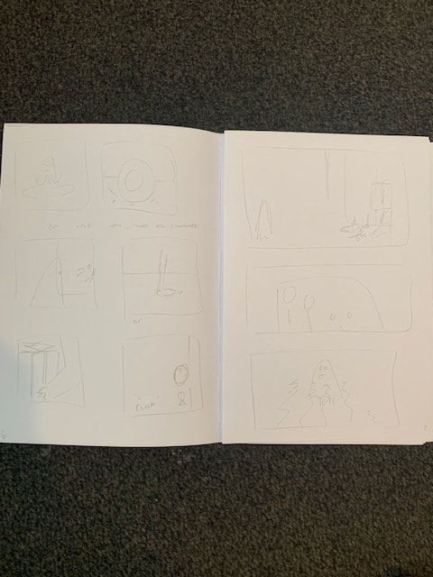
Original Storyboard
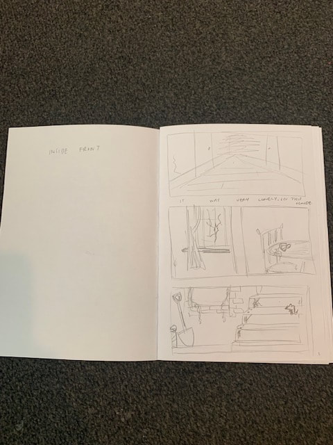
V1 note: Page 1 had more panels, and each panel includes very detailed drawings (time consuming)
|
V1 note: more panels including the ghost, and no thought for the layering/placement of objects (eg, sitting ON the chair but BEHIND the table)
|
V1 note: storyline more spread out - longer between ithe reactions versus actions of the ghost. many small panels including more movements
|
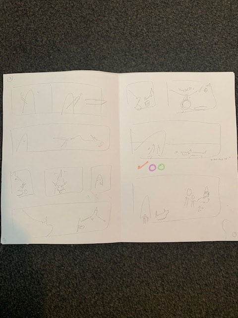
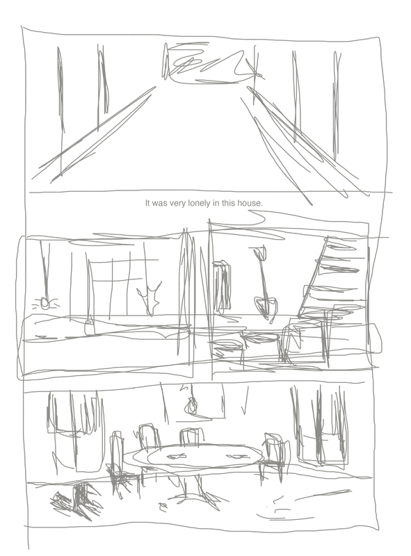
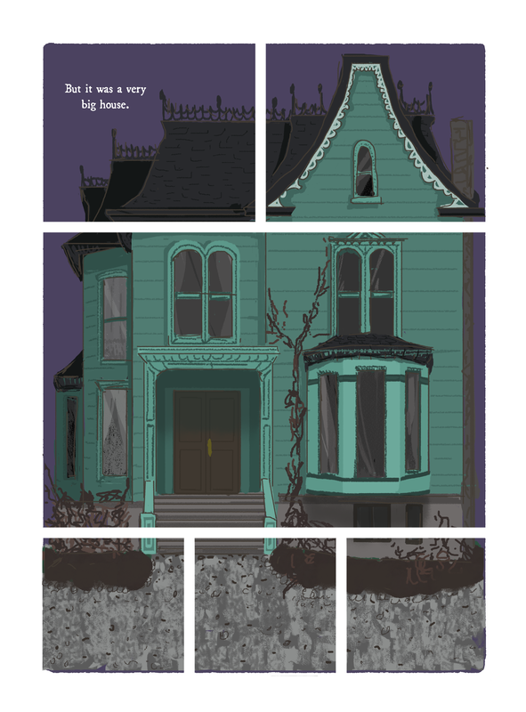
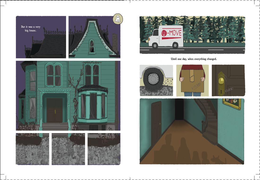
My original storyboard above (from the previous module) was for a longer novella - consisting of 24 pages. Most of the illustrations were more fully formed or more detailed, and had not taken into account what would be included in the printed versus the digital images. different actions/reveals spanned over several pages, relying on the turn of a leaf to "reveal" truths - rather than being contained to one page and the reveal being found via the animation. The ghost was present in the majority of the panels, and powered the storyline. If we were to simply remove him and rely on animation only, the printed images would be very boring, and the narrative would struggle to flow. In addition, the length of the story, versus the work required for the amount and complexity of animating everything made it unrealistic. The perks were that I had a strong sense of what I wanted to include and the style and look of the settings and characters - I could effectively now just decide what to remove, versus what HAD TO remain to make the narrative make sense.
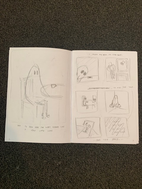
Second Iteration
V2 Note: Page 1 - now had more panels, but with smaller moments/less detail on them. This was in an attempt to bring the ghost's first reveal forward and fit more of his antics in later - trying to conform to 16 pages.
|
V2 Note: The families arrival and the ghosts reaction has been condensed down to a double page spread. Panels are more structured, and smaller - showing "snippets" of movement rather than the ENTIRE story
|
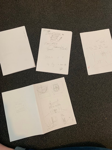
V2 Note: See discarded extra pages - I went between swapping out certain pages, and playing with order and placement of certain panels and its effect on the narrative. Working with unbound rough paper made this quick and easy to do.
|
My second version of the storyboard was actually made up of around 4-5 versions/ attempts. I refrained from adding too much detail to any of the drawings, as I was consistently switching up what would be included in order to fit things into the reduced page count and realised early on that detailed sketches were only adding to the time. As long as my idea what clear to me, and I could understand what needed to be illustrated, that would suffice (plus, I always had the original storyboard as a reference to fall back on). In the attempt to condense the story down, I was left with some pages having TOO MUCH information, or too many panels on them (see page 1 above). I need to take a step back, and think about the function and form of the book, and why things should be on different pages. Although I had been successful in cutting down the story to 16 pages, I hadn't quite managed to display what would and wouldn't be printed, or thought about how images would appear when separated like this.
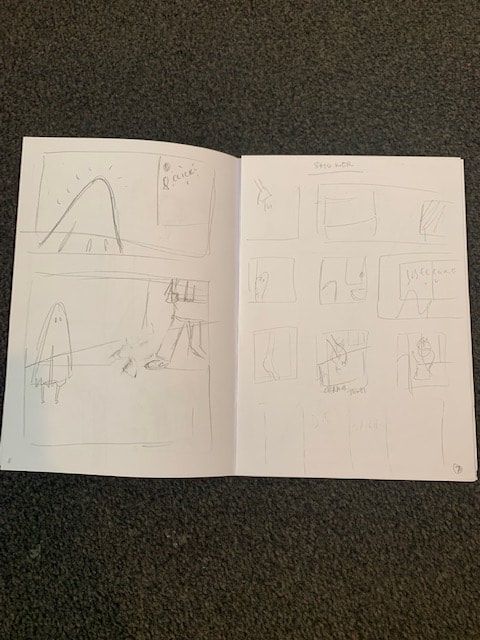
"Final" Storyboard
Simple suggestions of panels - I can focus on detail when actually illustrating and have strong ideas/references from old versions (no need to repeat previous work)
As each sheet included 4 pages, when I was chopping and changing ideas, and didn't want to redraw certain elements - but only needed one page, I used paperclips to conceal pages I no longer needed (rather than drawing everything again on a new 4 page spread)
|
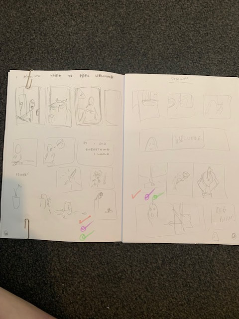
Animated sequences/ "mishaps" caused by the ghost isolated to single pages. (see above - miscellaneous troubles page, and shower page)
Centre double page spread reserved for most complex animation/interaction with Hubert. Also the turning point for the family to seek help (big event).
|
Conscious use of different grid/panel layouts to keep the printed book interesting. No need to completely fill all space/add extra illustration if not needed.
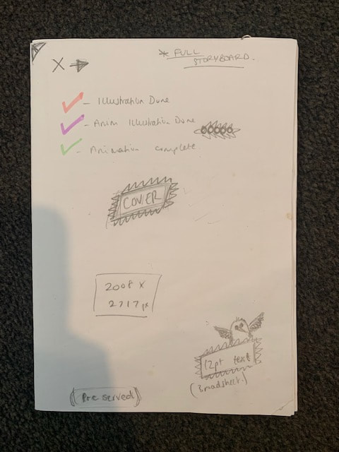
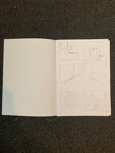
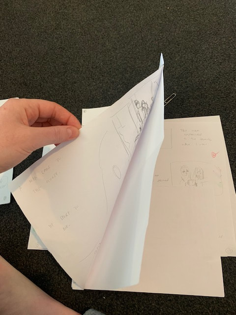
Later, when I began working synchronously on animating and illustrating (see sections below) I used a colour coded system on my storyboard to keep track of what had been completed. See also notes on dimensions, font and pt. size.
|
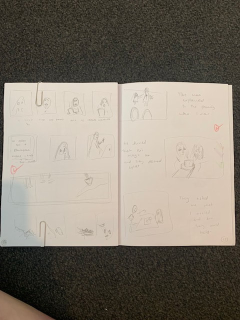
For the final storyboard, I focussed on refining what was included on which page, and its placement, using the form of the book to aid reveals and poignancy that I wanted to stress to a reader. For example, the ghosts first appearance was now on page 2 - and was a singular panel - to draw focus to the realisation that THIS is the main character, and that the AR interaction is integral to revealing him. Similarly, key animated moments, or key interactions of the ghost with the family were isolated to singular pages. This was both in an effort to draw focus to the misconceptions of each event and how it can be seen from 2 perspectives, and also to stick to my plan of animating one page per DPS (8/16 pages).The central spread now housed Hubert's interaction (and unintentional murder) of the family dog - acting as a pivotal moment in the narrative (from this point, the family take action, call an exorcist, and the true nature of Hubert is revealed). This way, the physical form of the book mimics the stages of the narrative - beginning, middle, and end. In an effort to not duplicate work, I used paperclips to secure pages together from 4 page spreads, concealing pages I no longer needed, whilst eliminating the need to redraw anything. The impermanence of this also allows for later changes or reviews of prior ideas. As this was the storyboard/prototype that all of my work relied on, later I colour coded each page and ticked when illustration was complete (for print) , illustration of extra layers for animation was complete, and when animation had been completed to keep track of my progress.
drawing, drawing, and more drawing....
In the effort to not repeat steps/reproduce the same drawings and work consistently - my paper storyboards had become increasingly rough. The next BIG step for the project was to create digital roughs/outlines for each of the pages. My original plan was to create all digital roughs in one pass, and then go back and fill in the colouring/details of the final illustrations afterwards - however - this doesn't suit my brain or my working style very well - so I decided to just work on the pages as and when - meaning I did not create them chronologically, and not all "roughs" were finished before full pages had been completely illustrated.
In the long run - this benefitted me - it kept me interested in the project - as I was constantly working on different elements, and allowed me to make changes to the comic panels as I progressed and found the style of the illustration. I had clear, decided visions for certain frames and pages - whilst other were not as final - so it was quicker to get the certain panels and pages finished - and these would influence what was included in the later "undecided" images. It also lent itself to the changes made to my animations/battle with lining up overlays.
The stages of illustration followed the following format:
- Creating a rough sketch/outline in the digital space (below left)
- Using digital brushes to fill out individual elements in layers - as if painting (below right)
|
|
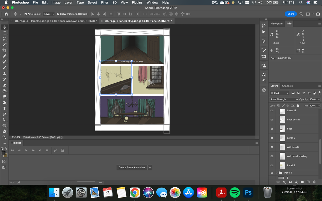
I worked on a "panel" at a time, and separated the layers of brush work and details of each panel - which were then grouped. This allowed me to quickly change every element of each drawing, and hide/show whole panels easily. Additionally, I was taking into consideration the need to export certain layers/groups into the compositions for After Effects - by ensuring everything was clearly labelled, separated, and grouped - navigating moving specific elements would be easier at a later time.
|
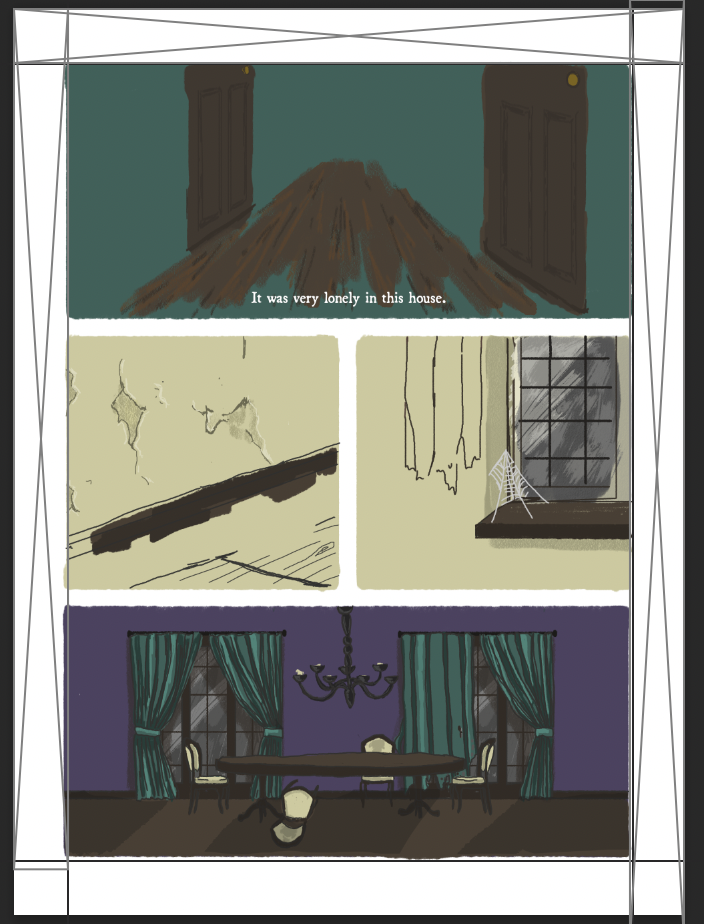
All edges to panels have a "bleed" effect - a conscious choice made when selecting watercolours/pastels for rendering the illustrations. I wanted the drawings to have a handcrafted feel despite being created digitally, and I wanted this texture visible regardless of the finish of paper I later chose to print on.
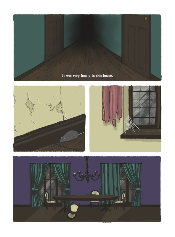
When the images were finalised, I exported them as .pngs and .jpegs with no scaling. The pages and panels were set up exactly to the specification 17x23cm of my printed pages, so I wanted no discrepancy or loss of quality when I then exported them into Indesign in order to be laid-out for print. Layers/illustrations that would be animated later were hidden for the print export - or in the case of this first page - did not exist. |
rough sketch on painted panel background
|
final panel illustration - filled and outlined
|
reference image
|

initial line sketch
|
final drawing before panel segmentation
|
final page for print

Stage 1: Layout of panels using grid principles, frames, and page dimensions

Stage 3: Handdrawing the background of the panels to ensure the "bleed" along the edge caused by the texture of the digital brush.
|

Stage 2: Digital rough sketch of panel illustrations
Stage 4: Paint illustrations, and add outlines, working through panel by panel. Export as page
|
setting up for print (first pass)
In order to illustrate inner and outer covers, I needed to set up an InDesign document for print and to work out the dimensions. This changed several times through the process of trial and error with printing at the end of producing the book - however - this is the first version set-up.
4 facing pages were set up - with the dimensions 225mm x 230mm plus a 5mm bleed on all edges. This was the original inner page width of 170mm, with an added 55mm for the dust-jacket style folds. The intention is to have negligible creep where I intend to saddle stitch, so the covers can be the exact same width (when folded) as the inners. The cover style was modelled off of existing graphic novellas I owned from Nobrow's 17x23 showcase editions (discussed in my previous module/learning journal). Basing the dimensions on something that I could physically, see, touch, and unfold made the print layout easier to comprehend. I used guides/rulers to mark the edges of the cover folds and roughed out where te text and images would be placed central to these margins.
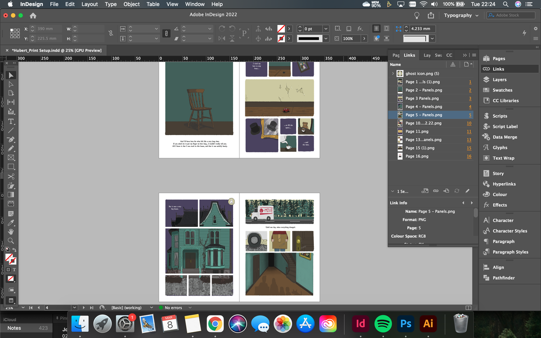
Additionally, I set up the pages as a separate InDesign file ready for print. I created 16 facing pages, 170mmx230mm with 5mm bleed. I included 12.7mm standard margins - that would match the border frames of my illustrations in Photoshop. As soon as any pages were illustrated, I exported and dropped them into the indesign document as linked image files. (as seen below)
a moment of reflection
Taking a step back from making, I reflected on the conscious decisions that would impact the story, the emotions I wanted to portray in the narrative, and ensure I was grounding my practical work in the principles I was trying to explore through the project. The purpose of the graphic novella was to explore the intermingling of digital and print, and how they can be used together to better one another - and I was in danger of losing this focus by plughing ahead without consideration.
AR Thinking and Story Development
Timescale thinking:
AR Thinking and Story Development
- Decision to move the ghost only into the AR space has affected some of my storyboarding and the visuals of the book. I need more enhanced/visually arresting images of the effects of the ghost - and focus more on the perspectives of the family and their turmoil at being haunted.
- My original storyboard had many smaller interactions/mishaps caused by the ghost, and now that ALL ghostly apparitions had to exist only in animated space, I am looking at a much larger body of work.
- This affects at least ½ of all pages - which "set up" the problems caused by the ghost. It will appear that the ghost is terrorising the family, and the idea (revealed by the AR animations) that he is attempting to help will seem ironic/humourous. The reader will side with the family initially as they can only see the outcome, and not his intent.
- His intent should be revealed on the immediately following pages/panels - to ensure the playful dynamic between what is perceived to be happening, versus the actuality of his attempts/what has actually happened.
- At this stage, I was separating different scenarios onto new pages, and deciding what would be included, removed, and animated/non-animated. The interaction with the dog (double page spread) was the most likely choice to be animated, and I was intending to remove the scenes with the writing on the mirror, the movement of packing boxes, and several other small scenarios due to predicting complications with animating them. This is a limitation imposed by the timescale of the project and the amount of effort and time it takes to create 2 sets of drawings per page and rig and animate custom illustration.
Timescale thinking:
- The book illustrations and layout can be completed and printed early march - however, this would mean that colour scheme cannot be altered at a later date/altered to match rgb in animation.
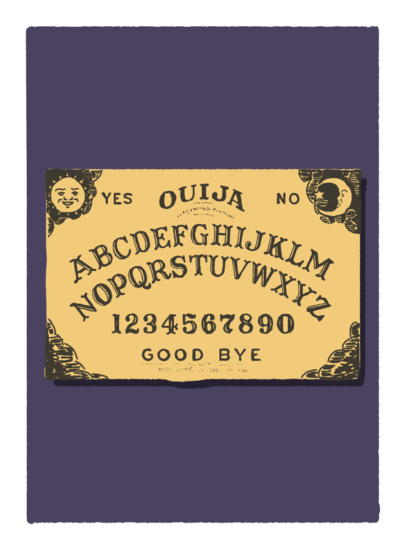
- I need to test the vibrancy of the colours moving between RGB and CMYK/screen and physical print - for a few pages - testing type of paper/quality of print - as accurately as possible. I could do this with limited edition runs of prints.
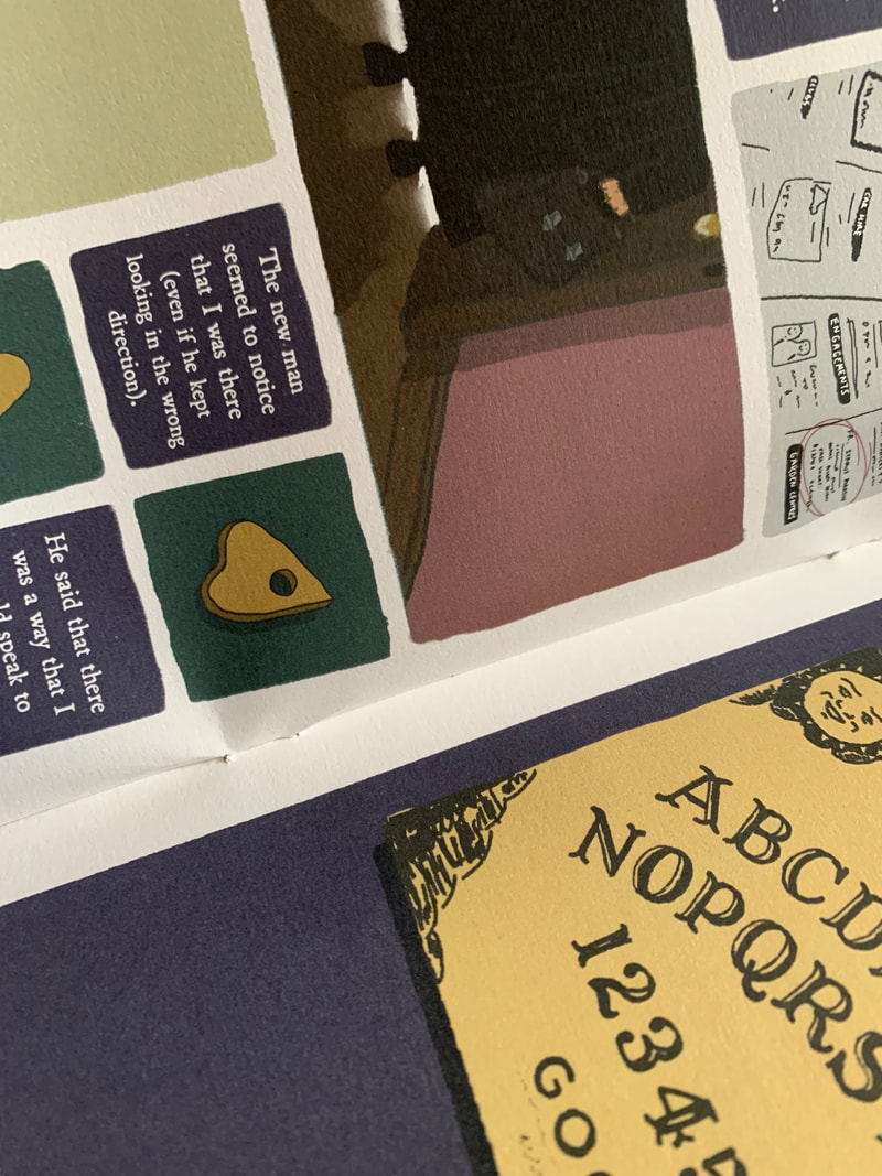
- A good test for this would be the ouija board print - which acts as a standalone introduction to the character, and features heavy use of the dark purple background.
the first animation!
|
The first page that I illustrated and animated was Page 11 - with the ouija board. I chose to complete this first, as it was the only page that consisted of one singular panel, and one singular, "flat" animation. hello
Several decisions were behind this - I wanted some sort of poignancy represented at the moment which Hubert first actively interacts with/successfully contacts the humans in the story. It was originally planned as my centre page double spread when I was intending to create a 24 page book, but now existed as a single page in the new storyboard. As soon as the illustration for the printed image was complete (rendered as above) I added an extra layer, which I drew the planchette onto - ensuring that the hole was the correct size for the letters to be visible through (top right). I then exported the page as usual (bottom right) - with this layer hidden - before revealing it again, and saving a copy of the entire Photoshop document into a series of folders intended for After Effects. I always set up my folders as Import (where the photoshop file went), Export (where the final animation would be exported to ), and Project (where the Ae file itself would be saved). This allows me to quickly find, link, and edit anything as I see fit if I need to revisit it later. |

|
|
|
To the left, you can see the first pass of the animation I created. I simply keyframed the position of the planchette over the letters I wanted it to highlight, and then adjusted the paths between the movements to make them smoother.
Later - I tidied up the timing between the movements to each keyframe, and added holds and eases to make the movement more natural/jerky to mimic a natural hand movement of the planchette. The animation was set to the exact dimensions as the printed page(since I had imported the original photoshop file as a composition. To ensure everything was in the right place, I animated the movement with all of the layers visible, and then before exporting, hid all of the "printed" layers (the board, the panel, and the background" so that ONLY the planchette was visible. |
|
Technical Difficulties
GIF exporting
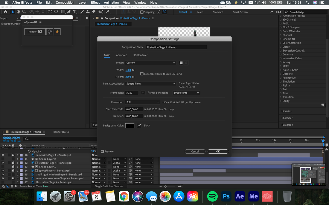
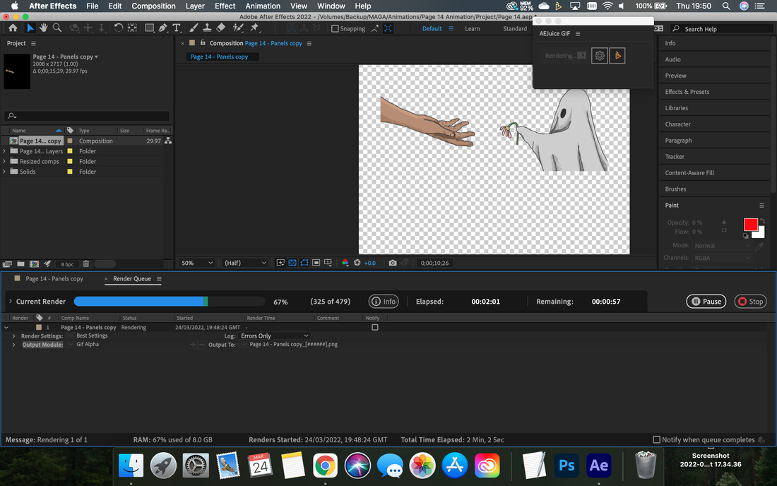
- As stated above, I now had DIFFERENT transparency issues - when exporting as a gif from After effects, when I was placing the apparently transparent animation into Eyejack Creator, a black background was appearing. (SEE RIGHT) I double checked that I was exporting with alpha channel enabled, but nothing would eradicate the background. After furiously googling solutions, I discovered a plugin to export gifs from AfterEffects named AEJuice Gif. It has been created for older versions of after effects, that offered no option to export as a gif, but most importantly - it could export Gifs with alpha channel and transparency! After testing the plugin and realising its success - my sole concern was about amount of storage it required and time it took to render. It exports not only a gif, but a png sequence. With 30 second animation, working in 30fps - this was creating 900 images. I quickly realised i could cut down the number of .pngs if I decreased the frame rate, and trimmed the composition to exactly the end of the animation - as well as shortening the animations themselves - my shorthand notes on the different test versions that I went through are below:
|
Testing - alpha channel not working on gif export direct from AE
Testing - First successful animation export. Later edited to shorter wording.
|
With the first successful animation working, I was confident in the process moving forward, and had a better understanding of the time it would take to a) animate each sequence b) export each sequence and c) troubleshoot any difficulties. With this new view on the timescale of this aspect of the project, my workflow changed from my initial schedule (illustrating all printed pages and coming back to work on animation after ALL were finished), and I started to work on animating and illustrating in tandem - focussing more on completing entire pages (in both digital and print).
I also printed the image using my at home printer - to test the trigger image working when on paper format (which was successful), and to see the discrepancies behind the CMYK printed colours, versus the RGB animations on screen (as noted in the section above - this illustration included the darkest/least visible colour - the purple in high quantity, so was a good marker) The RGB colours on screen appeared slightly brighter, and more saturated - which I was expecting, but the differences were minimal and not of concern. If anything - it simply made the animation more discernible, and helps the reader to pick out what is happening in the moving image/what they can expect to move/interact next.)
I also printed the image using my at home printer - to test the trigger image working when on paper format (which was successful), and to see the discrepancies behind the CMYK printed colours, versus the RGB animations on screen (as noted in the section above - this illustration included the darkest/least visible colour - the purple in high quantity, so was a good marker) The RGB colours on screen appeared slightly brighter, and more saturated - which I was expecting, but the differences were minimal and not of concern. If anything - it simply made the animation more discernible, and helps the reader to pick out what is happening in the moving image/what they can expect to move/interact next.)
getting trigger happy
Early on in the production process, I was thinking about the logisitcs of triggering multiple images/animations from a single interaction point (QR code)
- I was unsure if each individual image needs its own QR code trigger to be viewed by a user. This would affect the layout of panels.
- This also has an impact on the user interaction, and user experience of the book. I do not want a user to have to wait constantly for animations to load, nor do i want them to have to take actions on every page - this is limting and not entertaining. I want them to read the book as you would usually, and hover a phone device over pages to almost "find extra clues"
- I was unable to test whether this was an option until after I has created multiple animated panels
- This moved my schedule of creating the call to action included on the inner leaf of the front cover to later down the line.
- It is possible that I can produce a theoretically working/tested version of the book and film all of the interactions from my own Eyejack account (which would have all of the triggers/animations saved and automatically play as scanned), but ideally, I would like a working prototype that ANYBODY could pick up and use as intended.

As soon as I had one animation completed, I added it to my first test animation (created last module) into a "Collection" on Eyejack. This allocated the same trigger to both artworks. - meaning only one QR code was needed to download both animations, and they would appear when their respective trigger images were scanned. I tested this on mine and 2 other mobile devices to ensure it was working, and then set about working on a collection for the actual book.
|

Once I had set up a 'collection' for the book (Hubert) - I could use the QR code to trigger all of the animations. I did test removing and adding different animations to the collection to see if this altered the look of the AR code. when i was certain that it remained the same for the entire collection regardless of edits made within - I screen-shotted it and exported it as an image.
With this created - I could now finalise the covers of the book (where the QR code would need to sit) - and didn't need to worry about fitting multiple QR code spaces on every animated page. |
|
|
With the this issue solved, I simply needed a small indicator that the reader could use to identify which pages they could expect an animation on. This needed to be small enough to not interfere with the panels themselves, yet standout from the rest of the illustrations. To make it clearly an add on - I created an "icon" style - using a small circle, and the avatar of a tiny ghost - to visually display that if AR was employed - ghost antics were sure to follow. I exported the icon separately from the page themselves, and added it "in post" - dropping it on top of the pages in indesign and positioning it as suited best for visibility and least interference with the grids.
What the icon means would be clearly explained to the reader on the front cover fold - alongside the QR code. |
See icon placed on LH page - indicating that an animation can be triggered. It does not interfere with the general layout of the panels, nor obscure the illustration
the perfect fit
|
Export 1 - Complete misalignment - but adhering to trigger image and surface
Export 2 - still compressing the file - same alignment issues persist.
Export 3 - Exported at identical pixel/aspect ratio. still alignment issues, and problems caused by the panel boundaries - see window overlapping.
Export 4 - Window removed. Everything needs to shift approx. 5mm down.
Export 5 - So close! infuriatingly - everything is around 1.5mm too low!
Export 6 - Finally! Note slight discrepancy in colours/ almost a white outline - but this assists in drawing the viewers eye to what WILL be interactive.
|
The next animation revolved around several panels, and need to directly layer on top of the printed image in order to be cohesive and successful. I had used masks and trackmattes to ensure certain elements remained in their respective panels, and had taken care not to accidentally move anything after importing the composition directly from the photoshop layers, so that the windows would remain in their original positions. However, on the first export and upload to Eyejack creator, the animation was wildly misaligned with the printed image. ( Export 1 - left)
I was unsure what had caused this, so I went back into aftereffects, reimported the photoshop layers again as a comp, and exported the animation via the plugin again, thinking that this would solve the "glitch". I noted that when exporting, a popup saying that the filesize was quite large appeared, with the options to export or compress the file. I thought this would have to do with the amount of pngs in the sequence, (I was having to export as a png sequence with alpha. 600 images. (20seconds - 29.97fps) In order to have a transparent background Upon inspecting the exported gif file, I realised it had been resized to "640". 640 what? - I wasn't sure, as I hadn't set these parameters. Upon having the same issue of alignment (see Export 2 - left), I retested - choosing to not compress the file on export. I also inspected the pixel/aspect ratio of the photoshop file setup, and the after effects canvas size - realising that they were not set to the exact same numbers. I rectified this and re-exported - This resulted in the third test video (Export 3 - left) 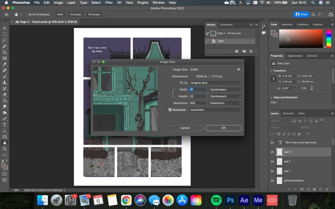
Checking dimensions of image in Ps (above) versus AE (below) and realising this discrepancy was causing the misalignment
This new export at ACTUAL size had a much better fit - but issues were caused by breaks in the panels - I went back to photoshop to tweak the original illustration layers - there was no need to bring in the middle floor righthand window. After removing the middle floor window and several other extraneous layers to try and reduce the file size, the export appeared as above left (Export. 4)
The only issue now was a TINY misalignment - everything needed to move down about 5 mm. Since the illustrations and animations were perfectly aligned in my after effects file, I decided to just attempt this by eye as it defied logic. Eventually, I got to an alignment I was happy with! Other things to note! Remembering the correct files to use - working with cloud files on photoshop to reduce usage and space save on my laptop. Already running the external hard drive as the cache/scratch disk.
|
FINAL AR INTERACTION
striking the difference between "blank" and "boring"
During the illustration process, I had to take careful consideration as to what i included and left out of the printed panels that would later have animated elements. As the ghost did not appear ANYWHERE in the printed images, and sometimes he made up the entirety of the visual information in the panel or was the explanation behind the narrative, it was difficult to navigate what to draw. I didn't want to simply have blank background squares, nor did I want to create detailed printed illustrations that would be completely covered up by the animation.
As i was working from incredibly rough, all encompassing storyboards (that showed the essence of the story - including animated objects) - it wasn't until i started fully illustrating these pages that this problem arose.
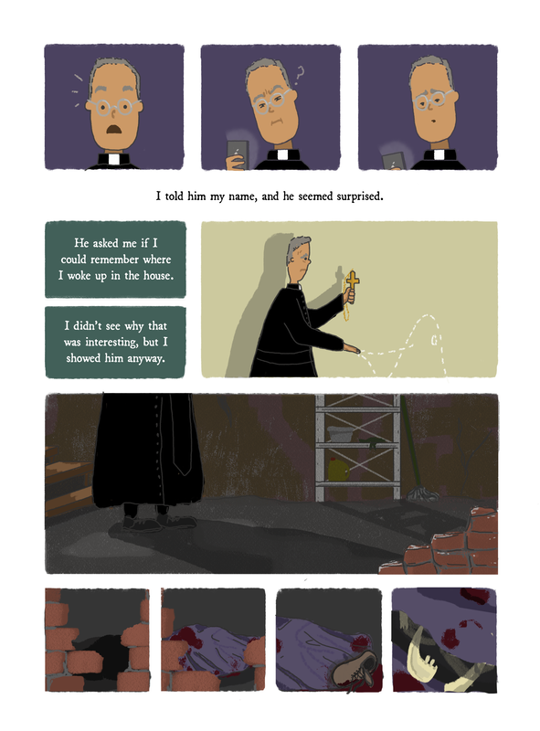
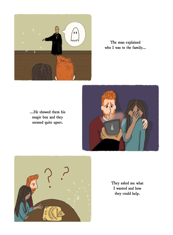
There were 2 instances where the pages would not have an AR animation, but humans are interacting with Hubert, and I needed the story progression to be clear. The first instance of this was on Page 12, where Hubert leads the priest to his final resting place ("where he woke up in the house"). I needed it to be obvious that the ghost was leading the priest, but I couldn't include him in the printed image - or I'd break the established set of rules the narrative/interaction had set up at this point.
Rather than draw him into the panel - I decided to simply suggest his presence - through a faint dotted outline.
As i was working from incredibly rough, all encompassing storyboards (that showed the essence of the story - including animated objects) - it wasn't until i started fully illustrating these pages that this problem arose.
There were 2 instances where the pages would not have an AR animation, but humans are interacting with Hubert, and I needed the story progression to be clear. The first instance of this was on Page 12, where Hubert leads the priest to his final resting place ("where he woke up in the house"). I needed it to be obvious that the ghost was leading the priest, but I couldn't include him in the printed image - or I'd break the established set of rules the narrative/interaction had set up at this point.
Rather than draw him into the panel - I decided to simply suggest his presence - through a faint dotted outline.
Similarly - I needed to make his presence clear when he was eventually speaking to the family. Again - this page was not animated - and since it was only one small panel out of several - I made the decision to simply "suggest" again with the dotted outline.
My other option would have been to animate both panels on both pages - but this would have included a walk cycle for the priest - something more complicated and time consuming than I could really afford with my schedule - and would have been a very boring "fade in" on only one panel for the family shot. If i was to animate the latter - i would need to rethink ALL illustrations on the page - to make the whole page and interaction more engaging.
My other option would have been to animate both panels on both pages - but this would have included a walk cycle for the priest - something more complicated and time consuming than I could really afford with my schedule - and would have been a very boring "fade in" on only one panel for the family shot. If i was to animate the latter - i would need to rethink ALL illustrations on the page - to make the whole page and interaction more engaging.
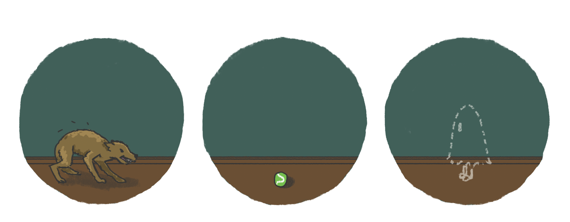
I did debate placing the outline suggestion of Hubert on the central spread - to give reason behind the dog growling/cowering away from apparently nothing in the printed image. Ultimately, I decided against this, and instead animated Hubert fading into the top circle panel as the first interaction on the page - this explains the dogs reaction, and gives the viewer time to adjust before the main, central animation (including the run-cycle) begins. Additionally, animal reactions to "nothing"/the supernatural are a well known trope, so the printed apparent invisibility plays into this,
Testing including the "suggestion" of Hubert
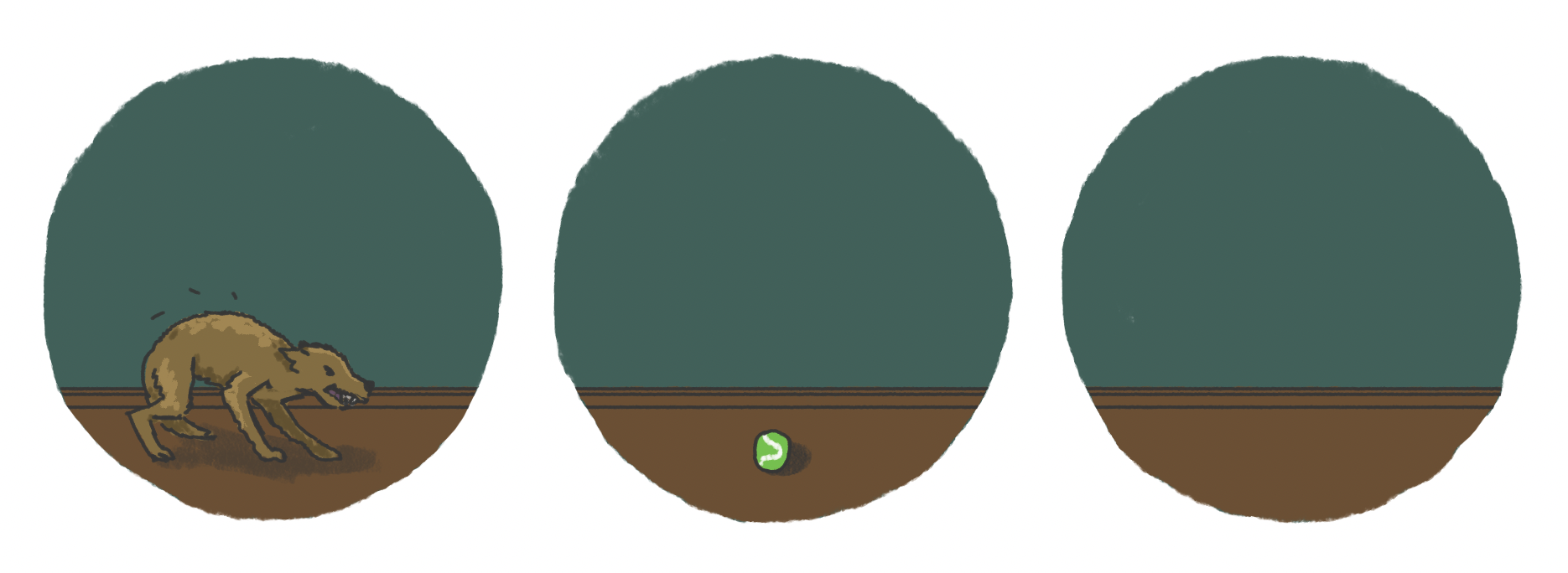
Final Panels - full animated ghost appears in AR instead
On the flipside of this - Page 14 posed the issue of panels that were to be animated, that solely included Hubert and his antics. The first panel of the page simply had his sad/hopeful expression appearing - it is the only upclose/emotive shot of his face in the entire novella, and I knew i wanted the focus to be on this, and for it to seem important. Meanwhile, the second panel had the outreached hand in print, and the "floating" flower. - (that Hubert is handing to the mother). Knowing i was going to animate over this, I had issues with working out how to cover up the original printed arm, flower as they moved, so there wasn;t duplication.
My final decision was to leave the top panel completely blank - it is a clear indication to the reader that something is missing - and they muut use AR - even without the icon denoting an animation. It draws more attention to the fact that the ghost is DEFINITELY going to do something - and something important - as it is the only blank panel in the entire novella. This is an instance of the "blankness" actually imparting meaning - but it only does this as it is the exception.
As for the issue with the hand outstretched - I couldn't have 2 printed blank panels - so this was the first animation that included a "background" to eclipse the panel as a whole. My options were either to have a blank panelled book printed, or include the background in the animated layer so as to block out the non-moving, printed elements.
Later, I would have to employ this again for the centre fold animation of the dog running (Page 8-9), and for the animation of the vase smashing/being dropped (Page 6) - however, as these are both in the "past" from the printed image (the animation explains how we got to the point of the printed still image) I made the transition of the eclipse either fade in or wipe in - to visually represent the cleaning of the slate/travelling to a different reality.
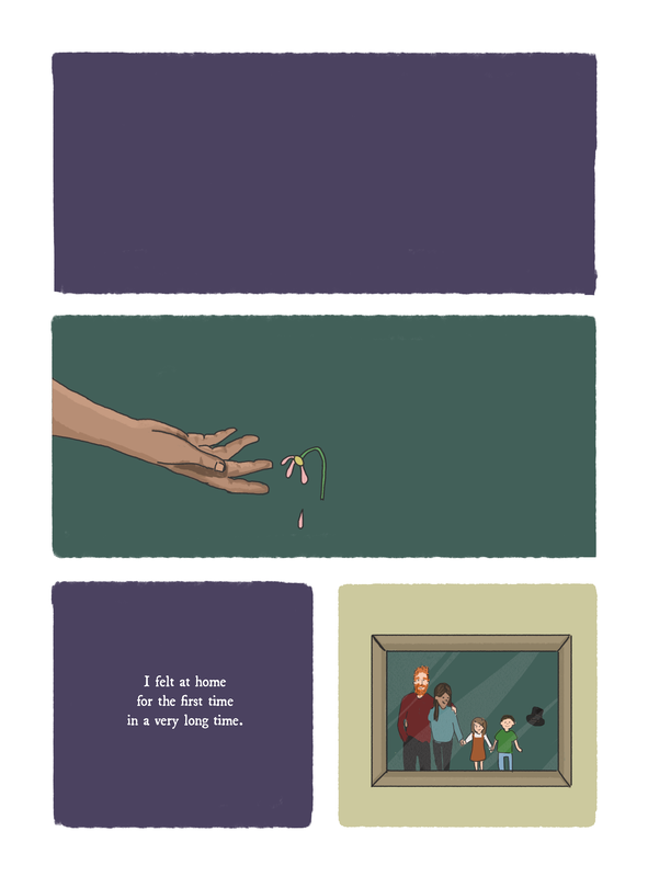
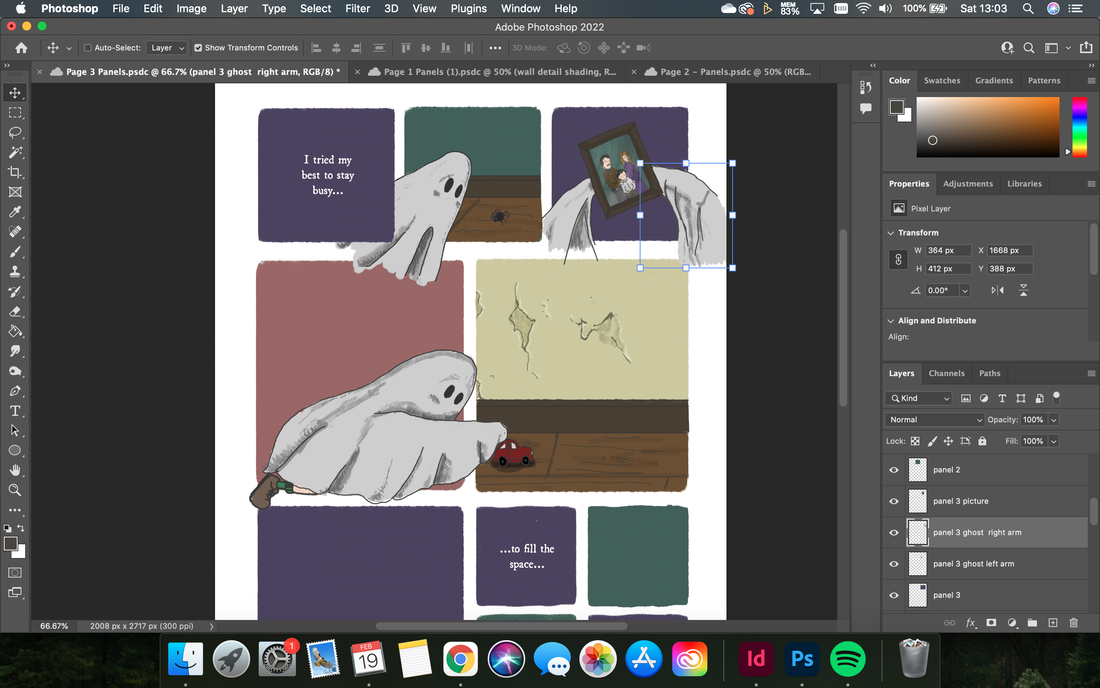
Page 14 - Printed Panels
|
Animating the AR overlay for Page 14
Exporting the initial animation for the 2nd panel on Page 14 - note the transparent background. This led to duplication of the hand/flower as the printed image remained unmoving beneath - confusing the image. The background was then added and re-xported for the final animation.
|
animating the invisible...
While most of my animations proved relatively simple, wrapping my head around what would be visible, when, and where, was a constant battle. The majority of the illustrations and interactions were simply created, and the ghosts presence was obvious and easy to visualise and create. As seen below, it was simply a case of drawing the unmoving character once on a new layer. The largest differentiation I had to make was with any moving parts (e.g: his arms moving separately from his body), as i need to draw this in order for them to exist. This may sound obvious, but there are certain things that can be manipulated in aftereffects to create movement - like the rippling of the sheet as he walks. This was done using Warp Mesh as an effect- which allows one to manipulate the shape of the lines that exist - meaning the flat sheet can be keyframed and stretched to different 'wiggles' to simulate movement that would otherwise be created by frame by frame drawing the different positions as multiple layers. Similarly, making the character appear in line with drawn panels (after troubleshooting the export line up issues I had previously) was achieved using shape layers the same dimensions as the squares/rectangles/objects, and applying a trackmatte to the ghost layer. Anything outside of these areas would now not appear.
See "invisible" layers for animation in original Ps file. They do not conform to the panel spaces, and will be put into frame using trackmattes and shape layers.
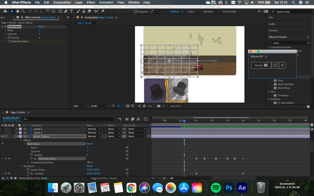
Warp Mesh Effect: Using a malleable grid to manipulate and keyframe changes to a singular layer/shape
|
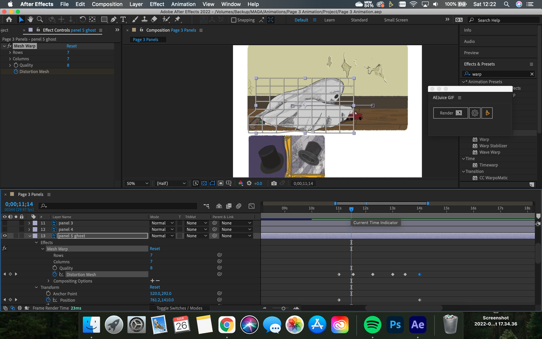
See next keyframe - the "mesh" positions have been altered to "warp" the sheet - imitating body movement and cloth fluttering
|
this is where it gets (more) complicated...
|
|
For animations that involved a little more than simple appearances and fades, some problem solving was required. For the interactions on Page 6, I had the issue of what would be on the central printed panel versus how I would eclipse this in the animation to explain the story behind the smashed vase. In order to represent the idea of a change in "time", i chose to slowly bring in the panel with a wipe transition - as though erasing/rewinding the printed panel. The easy option would just be to have the "background" panel appear on the beginning of the animation, and remain there (i.e: the printed image would be completely invisible from the point of pointing the phone at the page), but I thought this looked tacky and didn't explain the relationship between the animated state and the printed state well enough. If I had to have the original printed image covered - I wanted to at least do it in a way that was meaningful.
Once I was happy with this process, there was the issue of the movement of the ghosts limbs - effective creating a small walk cycle for 2 steps, and the arms dropping the vase. Additionally, the wilting of the flowers, and the changes in the expression of the woman in the final panels sequence. In an attempt to save time, I had not drawn any of these illustrations in frame sequences (drawn each position of the movements), I worked around this in the following ways: |
- 3 versions of the "arm" drawn and keyframed in. Wrap mesh and easy ease added to smooth trasnitions between frames and lining up with "body" sheet.
- Above video is of the first main keyframes before easing and warp has been added. Note joltiness/obvious steps of the movement.
- Legs as separate layers behind main sheet. Using position and rotation keyframes to mimic a walk cycle.
- Wilting of flowers done with severe warp mesh and rotation keyframes.
- Additional custom shape path masks added around edges of arms and legs - so that when "fading" out to 0% transparency, the overlaps/layers beneath not visible.
- New layers created for - sad ghost eye - half closed ghost eye - shocked woman's eyes - shocked woman's mouth - speech bubble - speaking mouth (open/closed) - which are keyframed in
- these are reliant on specific alignment with the printed image below - so dimensions on export had to be spot on.
- Custom masks and track-mattes to shape layers to allow the ghost to appear around corned/ in doorways included in the image
|
Final Result and Conclusions
The final test of the animation is to the right (as you can see - it was not completed until AFTER I had actually printed the book - as the various keyframes of so many points took me much longer than anticipated) . I am happy with the wipe transition especially, as I think this successfully represents the passing of time visually to the reader. It also helps establish the harmonious relationship between the digital and the printed, and I think I have avoided either being too blank or boring. Getting the eyes and mouth (indeed, all of the panels) to line up to the printed trigger took several exports and lots of gentle nudging the animated panels pixels at a time up, down, left and right. Although the offset of the ghost in the top righthand corner panel isn't perfect, the other, more essential panels line up accurately, so I was happy to draw a line under the animation. This experience taught me that It didn't save me any time trying to avoid drawing frame by frame movements, as the resulting manipulation in after effects to simulate walking movement and flowers wilting was complicated enough that it took a similar length of time. If anything, I would have achieved a more polished final look if I had actually frame by frame illustrated these movements. Sometimes, there are no shortcuts! |
|
finalising illustrations for print and making tough decisions
At this point in the project, most of my illustrations for print were complete - the only remaining pages/panels were the ones that involved more complicated animated interactions. After what I had learned from previous illustrations and working through the simple animation, I was left with decisions to make surrounding the centre page spread, and what would be included. Considerations I needed to take were:
- This was a turning point in the narrative, so needed to stand out from other pages in its style and animation
- The larger nature of the images, and its positioning required a more complex interaction that simple fades
- The time limit of 30 seconds meant that I couldn't include multiple long winded complicated interactions.
- Thinking about what would be visible in print versus what would only appear in AR had a larger impact since there would be MORE blank space if things were not printed.
- There was no page turn to act as a "reveal" - working with animation to conceal information, and juxtaposing it with printed images to change the story/reader perspective.

Based on original storyboard - issue with too many panels for animation and too many that would end up blank in print
|

Idea to have one large full spread image that faded in animation to reveal the smaller actions/panels of action. Issue in that half of this would actually be non-present as the ghost is not in print
|

Similar to previous draft - large image/interaction of "the touch" as central, but including smaller illustrations in a surrounding formation to fill in blank space. Far too complicated!
|
Playing with overlapping panels and using blank/filled space to suggest different moments in time/sequence of events. Second panel is the final storyboard choice
|
Realising I would need to animate a run cycle and first attempt at visualising movements - see detailed explanation further down.
|
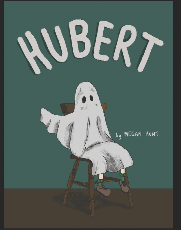
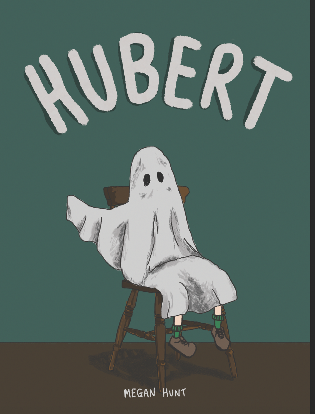
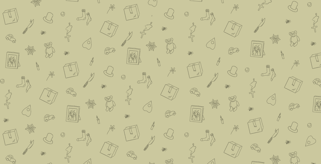
With the final page(s) storyboarded, I set about illustrating the panels for print. I finally worked on cover illustrations, deciding to use key preexisting images and motifs (the hat) from the story). I wanted Hubert himself to appear on the front cover - to establish that the story would be following a ghost, and to add an element of intrigue as to the fact he wasn't actually visible on the inner pages. The inner covers were illustrated with my rough illustrations/line drawings of different motifs from the story - giving them an ethereal - "half-there" feeling that mimicked the whole nature of the project nicely and creating a pleasant surface pattern that wouldn't detract from the rest of the work. I also though this would add a nice inside nod to the amount of development and work that had gone into all of the illustration and animation - showing it's starting point, I played with the byline, and positioning of the text until I was happy with the result - opting for a simpler, more handmade vibe. As soon as this was complete, I set up everything in indesign ready to be printed, and exported the files as pdfs to take to the Digital Print Facilities at university.
Pages 1-3:
|
|
|
|
Playing with byline:
|
|


|
Inner Cover - Surface Pattern:
PRINTING
Printing the graphic novella was a major stage of the project; and took up far more time than originally anticipated due to several issues with print quality, finish, and choosing different materials.
INITIAL SETUP
I was confident in my ability to set up a document for print, since my 9/5 involves pagination of magazines and directories. I am familiar with indesign, and understand the layout needed for a 16page booklet - working in spreads across 4 pieces of paper. Because I didn't want to leave the print job to the last minute, I actually started printing (and thought I would have a complete, easily finished Graphic Novella) before I had finalised all of the animations for the AR. The animations were taking longer than I had originally planned, and i knew I could continue working on them after the book was finalised since they existed in the digital space - the only limitation would be that the printed image/illustration could not longer be changed - so i would have to be certain about what was included/omitted, and what would be visible/invisible in the later animation.
Explain how printing was carried out before all animations were completed.
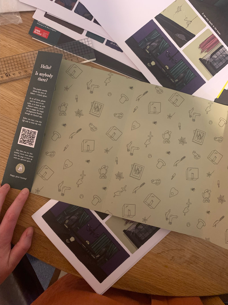
The setup for the book is below: I worked on 2 documents - a covers document set up with 2 pages of 22.5x23cm, plus 5mm bleed. This was the 17x23cm standard page size, PLUS 5.5mm additional for the folded dust-flap-style of the cover. This made the spread a total of 45x23cm. Instructions for using the book, and the QR code for all of the AR interactions is included on the front inner fold.
INITIAL SETUP
I was confident in my ability to set up a document for print, since my 9/5 involves pagination of magazines and directories. I am familiar with indesign, and understand the layout needed for a 16page booklet - working in spreads across 4 pieces of paper. Because I didn't want to leave the print job to the last minute, I actually started printing (and thought I would have a complete, easily finished Graphic Novella) before I had finalised all of the animations for the AR. The animations were taking longer than I had originally planned, and i knew I could continue working on them after the book was finalised since they existed in the digital space - the only limitation would be that the printed image/illustration could not longer be changed - so i would have to be certain about what was included/omitted, and what would be visible/invisible in the later animation.
Explain how printing was carried out before all animations were completed.
The setup for the book is below: I worked on 2 documents - a covers document set up with 2 pages of 22.5x23cm, plus 5mm bleed. This was the 17x23cm standard page size, PLUS 5.5mm additional for the folded dust-flap-style of the cover. This made the spread a total of 45x23cm. Instructions for using the book, and the QR code for all of the AR interactions is included on the front inner fold.
The pages were all 17x23cm plus a 5mm bleed (unnecessary due to the margins included around all the panels.) I set this up in facing pages over the 16 pages.
FIRST PRINTS
The first round of prints were done at Bower Ashton Digital Print Bureau. After consulting with Ben in print, I discovered that the covers would need to be printed on SRa3 (45cm x 32cm) and the pages on A3. The pages needed to be exported as pages, not spreads - for the uni software - and the colour profile needed to be sRGB (Adobe 1998 setup). I would need to cut 5mm off of the width of the cover spreads.
I selected 140gsm cartridge paper for my inner leaves, and 270gsm “Bread and Butter” for the covers - a matte, slightly textured SRA3 paper. I quickly edited the cover spread, cutting each "dust fold" to 4.5mm width. (SEE LATER - this was incorrect maths...). My covers and pagers were then printed on the laser printer.
I selected 140gsm cartridge paper for my inner leaves, and 270gsm “Bread and Butter” for the covers - a matte, slightly textured SRA3 paper. I quickly edited the cover spread, cutting each "dust fold" to 4.5mm width. (SEE LATER - this was incorrect maths...). My covers and pagers were then printed on the laser printer.
|


There were several serious issues with the initial print:
|
Below, the misalignment of the covers is more obvious. the centre fold mark (indicated in the slug) did not match up on either side of the paper. If folded where indicated, there was an overlap (below right). The positioning of the print had eliminated the belled, but on one side had spaced the print further in from the edge of the paper. In short, I couldn't fold the book centrally on either sides guideline without some sort of error on the reverse.
|
|
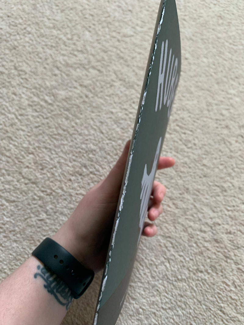
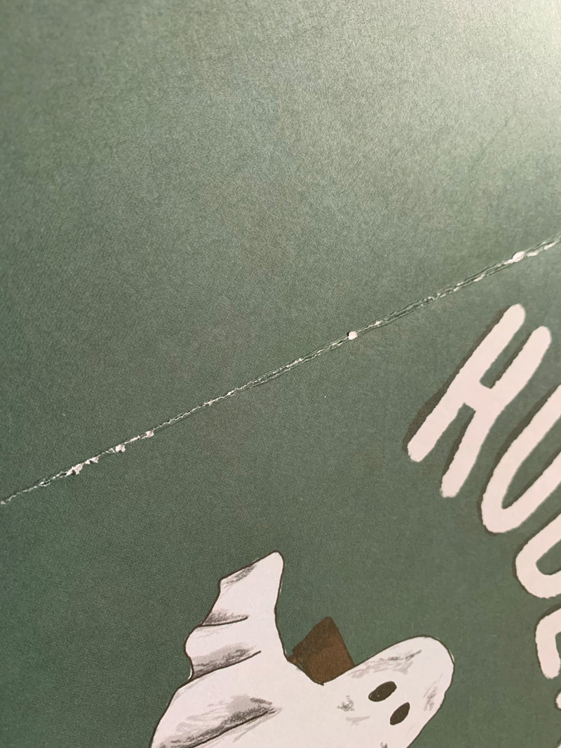
In addition, the print was fading on the final edge (see right edge of dust-fold below). these cracking isues, paired with the misalignment, made me trial different papers and dimensions for covers.
Considering dimensions, upon reformatting the covers, I realised in my haste I had done the wrong maths. I had incorporated the bleed of the original cover pages (minus flaps) when setting up the spread (meaning the pages sans flaps were 18cm across (17mm+5mm bleed either side). As i had been unhappy with the enforced, thinner flaps, I took this opportunity to rectify my maths, extending the flaps to 5mm, and removing the unnecessary bleed from the "cover page". The below image shows this working out - I measured the print and realised I had overshot it. I also noticed a leading issue on the inner back flap (below left) - the last line had a higher leading, dropping it lower than its fellows spacing. I rectified this for my next export.
Considering dimensions, upon reformatting the covers, I realised in my haste I had done the wrong maths. I had incorporated the bleed of the original cover pages (minus flaps) when setting up the spread (meaning the pages sans flaps were 18cm across (17mm+5mm bleed either side). As i had been unhappy with the enforced, thinner flaps, I took this opportunity to rectify my maths, extending the flaps to 5mm, and removing the unnecessary bleed from the "cover page". The below image shows this working out - I measured the print and realised I had overshot it. I also noticed a leading issue on the inner back flap (below left) - the last line had a higher leading, dropping it lower than its fellows spacing. I rectified this for my next export.


SECOND PRINT
With the cracking issue, we trialled using the 350gm matte standard paper for the covers that Digital Print had on hand. This still cracked, but had a very slightly better finish. However, I was not overly enthused by the SLIGHT shine to the material. The comparison of the two materials is below:
With the cracking issue, we trialled using the 350gm matte standard paper for the covers that Digital Print had on hand. This still cracked, but had a very slightly better finish. However, I was not overly enthused by the SLIGHT shine to the material. The comparison of the two materials is below:

270gsm Bread and Butter (left) and 350gsm Matte from DP (right)
The only surefire way to prevent cracking is lamination; an expensive option that I didn't want to pursue, since I didnt want a shiny, tacky finish - I wanted the connection to the maker, and the matte, watercolour sheen that I had lended to my illustrations.
Through owning 17x23 Nobrow novellas, I knew that it was possible to create a folded book to my dimensions without cracking.
THIRD PRINT
I tested using thinner paper, descending to 170gsm cartridge paper, but the cracking problem persisted and the quality of finish was terrible - it was too thin to stand up to being a decent cover - and didn't give the feel of a professional book that I was trying so hard to achieve.
FOURTH PRINT
Reasoning that the problem may be print technique, I sought out and funded professional printing through my workplace’s preferred supplier.
|
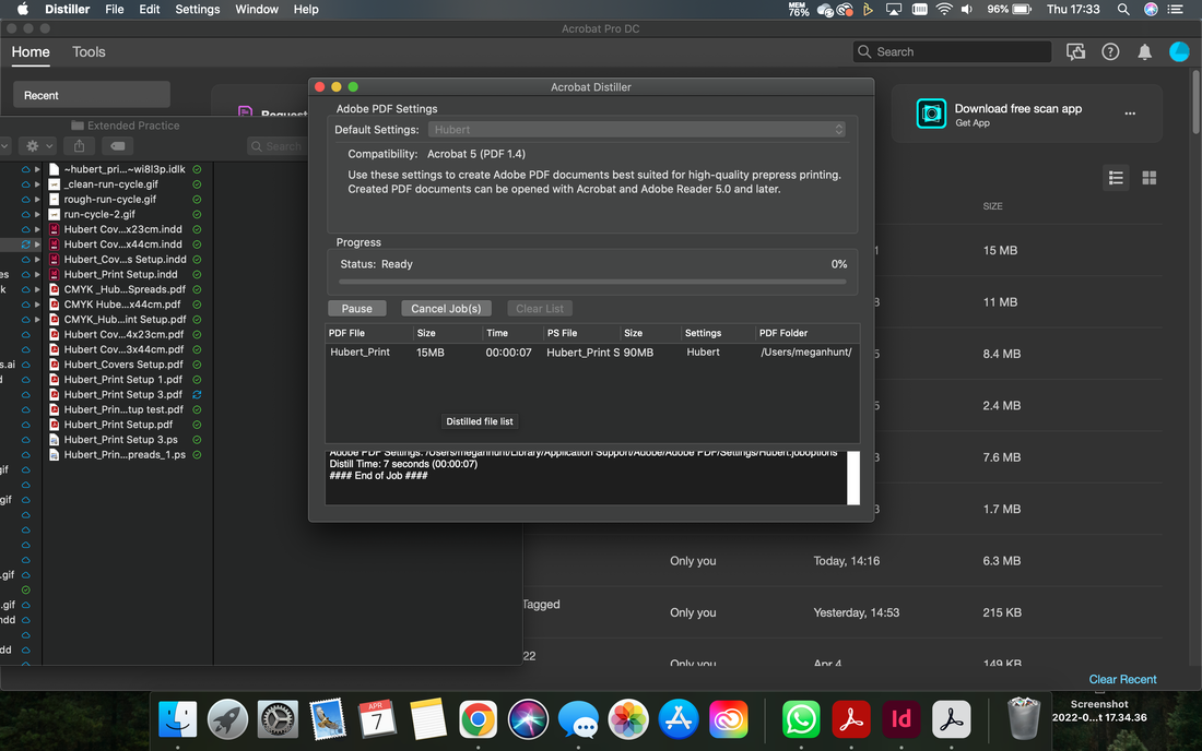
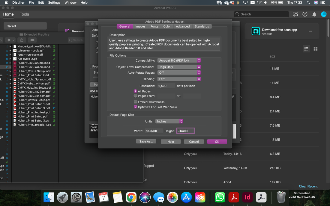
I had to reformat the print setup again - reverting back to CMYK colour, and supplying the pages in print-ready setup (booklet style). This meant exporting the pages from indesign "Saving as booklet" so that the page would appear in the correct layout order for printing and folding into the 16 page booklet.
After this, Adobe Acrobat Distiller is used to export a pdf from the file. the dimensions need to be set at the exact dimensions of the printed page, in order for this to appear correctly. (see screenshots of setting up this export to the left) The prints arrived back in a much higher quality; the colour profile far exceeded the facilities at university and the paper was thick, buttery, and smooth - connoting quality and professionalism. The colour profile was much brighter and clearer. Unfortunately, the orientation of the inner covers was incorrect and upon consulting the files provided, I confirmed this was an error on their part. I refrained from repeating the order, as when folding the covers the cracking persevered to a worse extent; the printed layer was actively tearing. |

University print (left) versus Professional CMYK print (right)
see colour difference of CMYK professional print (left) and university sRGB print (right)
|
better saturation and brightness in professional print (top) versus university panels (bottom)
|
move severe cracking - causing tearing on cover fold.
|
result of folding - tearing remains after flatlay
|
Professional print: inside cover is printed upside down
|
IN THE FOLD?
With all of the covers in every format and print finished, I trialled a variety of folding options:
|
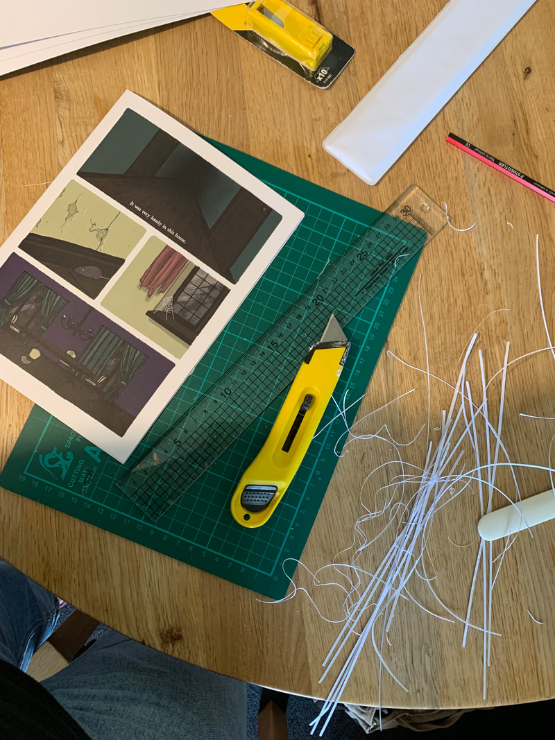
hand trimming pages creep with steel rule and stanley blade.
|
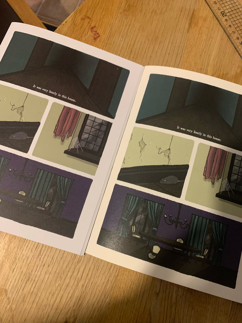
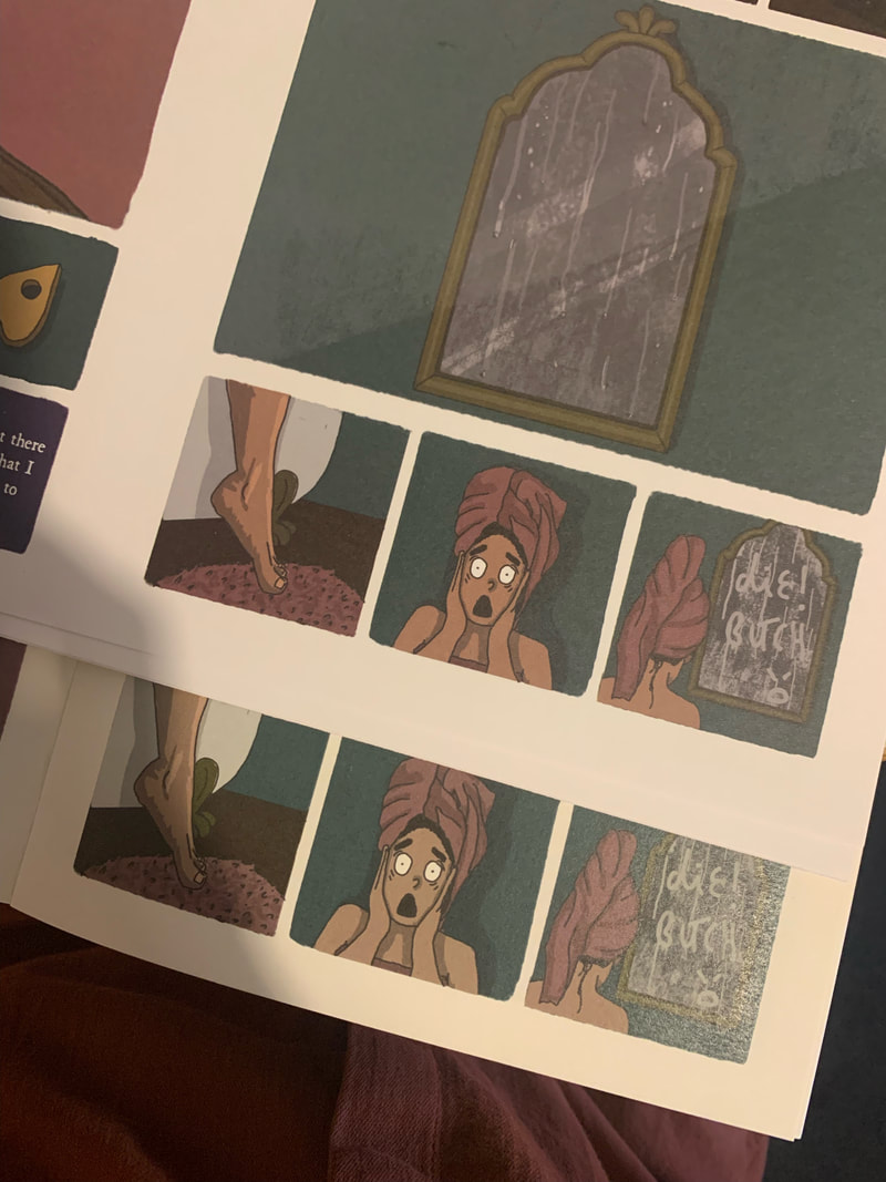
images of final printed novella
|
Things to note:
|
|

|

|


learning through practice

|

|
|
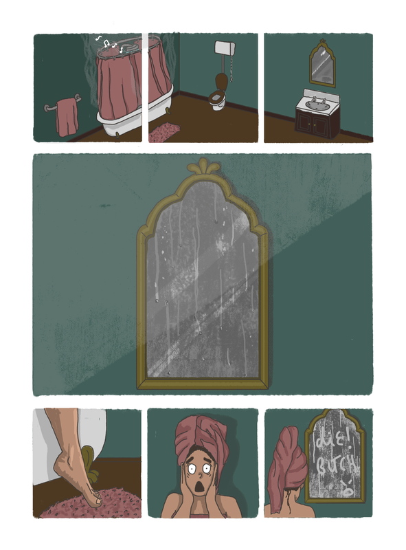
Animating Hubert writing on the condensation in the mirror posed an interesting challenge, and involved animation effects that I hadn't used before. firstly, the mirror illustration itself was made up of several layer - building up the "mist" and the drips. In order to rub this out (as if writing in the watermarks) - i would need to manipulate the layers INBETWEEN to top and bottom that made up the mirror. As this image was already printed, I had to create the whole mirror again in the animation - rather than simply animating the text on a new top layer - so that the effect of the foggy mirror remained consistent with the original, printed illustration, and the words appeared written in the fog, rather than appearing as if created by a ghostly pen!
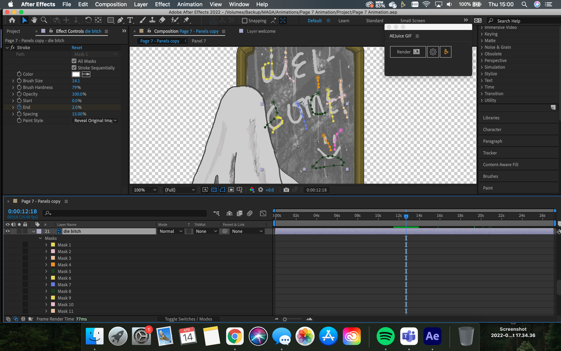
See isolated layer with individual stroke masks. Each colour is a new mask - with breaks between any continuous line movement.
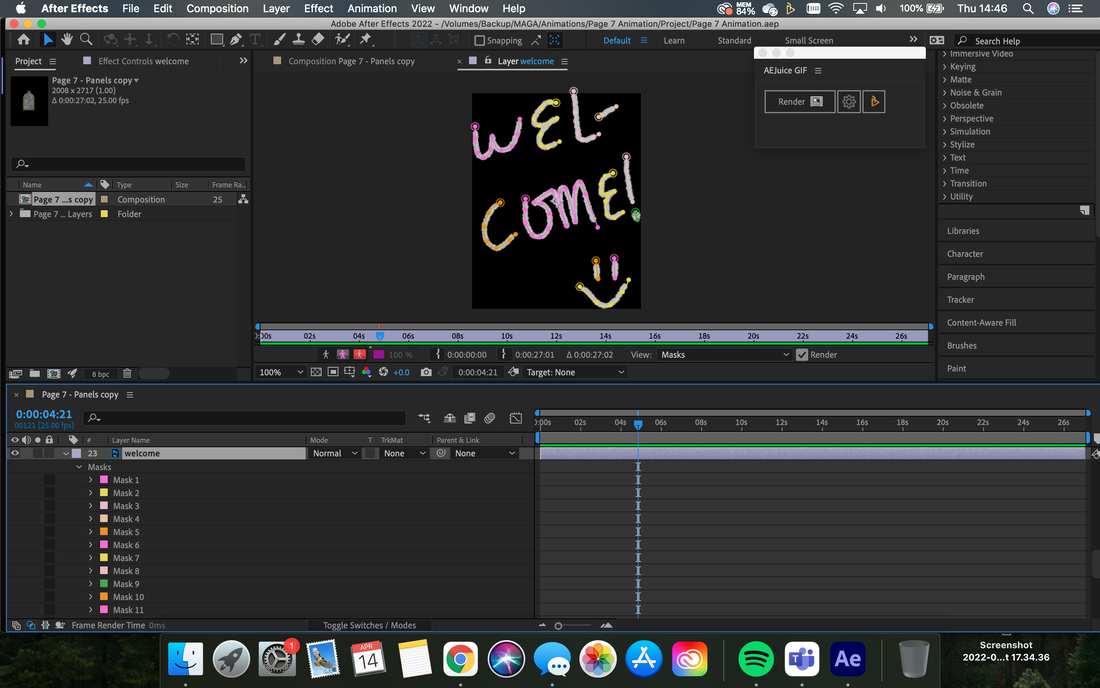
See above: first pass at welcome reveal after ghost has been keyframed to follow the reveal with his movement.
|
When creating the original illustration, I had already mocked up a small sketch of how the word "welcome" would drip down to become "die bitch" - the "font"/way that the letters were arranged was set up for this to be feasible.
Getting the welcome to appear gradually, as though created through touch was another story. After some research, I learned that I could create masks within the layer that had the writing on using the pen tool. I had to create a new mask for each continuous pen stroke (so any gaps in letters/ crossing of t's = new mask). Once these masks were set up, I applied the Effect>Stroke >Reveal - and set the keyframes of opacity to 100% - 0%. This meant that the letters would reveal themselves along the masks I had created gradually. I tweaked some of the keyframe so that certain parts of the writing were inconsistently drawn (nobody move their hand at exactly the same speed the whole time). I then used the position keyframes on the ghost and his arm to follow the reveal on the stroke, and applied warp mesh to smooth certain transitions, and add movement to the sheet as the arm moved. To transition to the next set of words, I created similar masks on that isolated layer, with stroke reveal (see image below) - however, I omitted any strokes that were already there (from "welcome". I then faded out the original "welcome" layer - using custom track matte alpha shape layers with only the needed remaining parts of the letters isolated to remain in place to make up the fully formed "die bitch" sentence. |
The final stage was to position keyframe the "drips" to fall and form the new words, much in the same way as the ghosts finger created the original "welcome". The entire process was completely new to me, and took around 6-8 hours, however, I have learnt some invaluable lessons about the use of masks, custom shapes, and isolated layers that I believe will be a huge help in the future. This is my personal favourite animation in the entire book, due to its absurdity, the personal challenge posed by the complication of the process, and the cheeky element of the reveal - both the viewer wondering what the ghost is up to / what he is writing, and the discovery in the most blatant way of how his intention has backfired.
|
|
(Left)
See how reveal is created along the masks which form the stroke. Drips have been added at this point to follow the reveals, |
Final Animation:
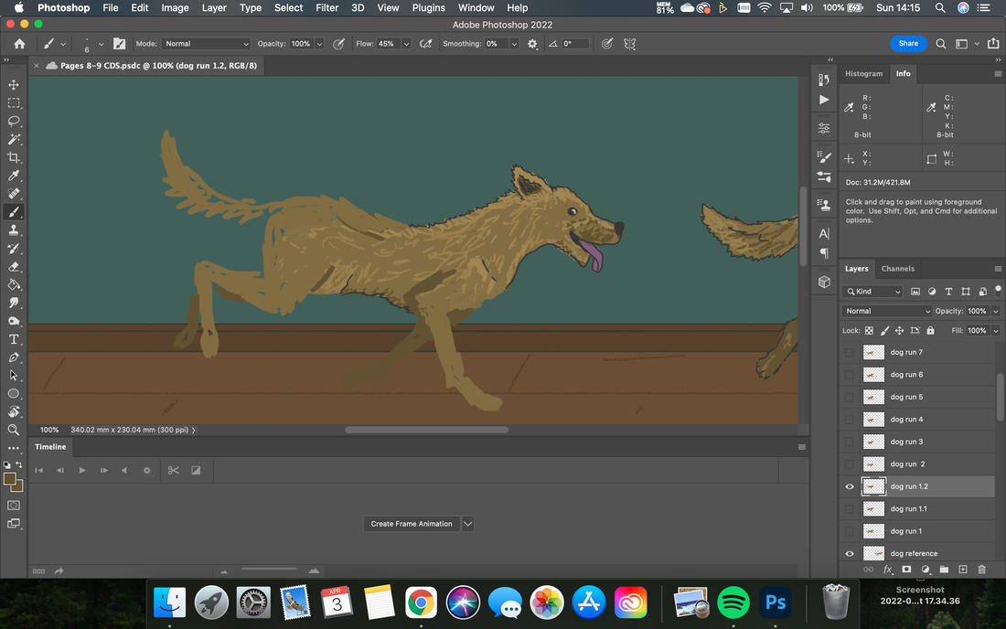
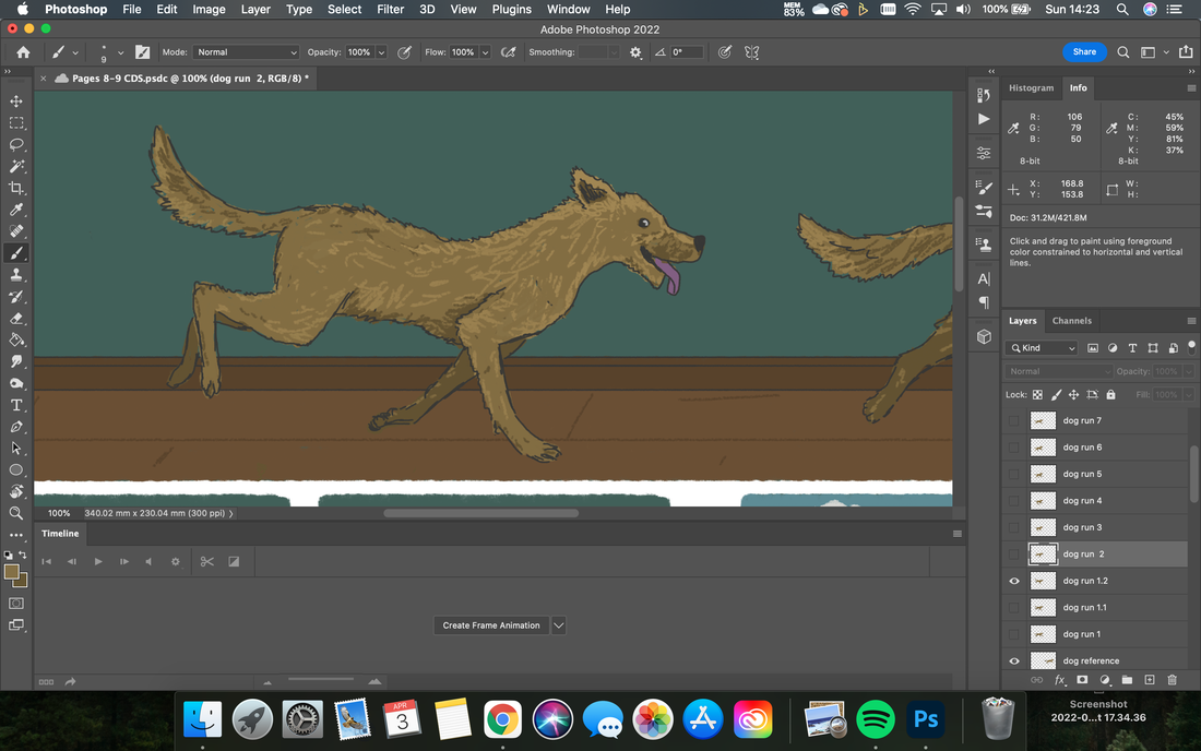
teaching an old dog new tricks (Animating a dog run-cycle)
The final animation for the book was the most complicated, in the sense that it would require the most drawing. In order to make the dog run realistically, I had to create a walk-cycle (in this case - a run-cycle). This meant drawing each frame of the movement on a different layer and then animating these in sequence. As a reference, I used THIS VIDEO.
Using the original dog drawing as a reference and starting point, i duplicated the layer, and erased and redrew the legs for each frame. If body modifications were also required, I would tweak the original shape and structure of the original image (i.e: changing the ears, lengthening the back, moving the tail etc.).
Using the original dog drawing as a reference and starting point, i duplicated the layer, and erased and redrew the legs for each frame. If body modifications were also required, I would tweak the original shape and structure of the original image (i.e: changing the ears, lengthening the back, moving the tail etc.).
|
|
In order to test the frames before exporting into after effects - I isolated only the dog drawings - and animated them as a gif in a new separate photoshop file using the layers to create a frame sequence. Once I was happy with a run sequence, I went back to the illustrations and refined them (as seen above), before exporting to After Effects to form the rest of the animations. The gifs exported from the isolated Ps file are below:

Run Cycle 1 - rough (8 frames)
|
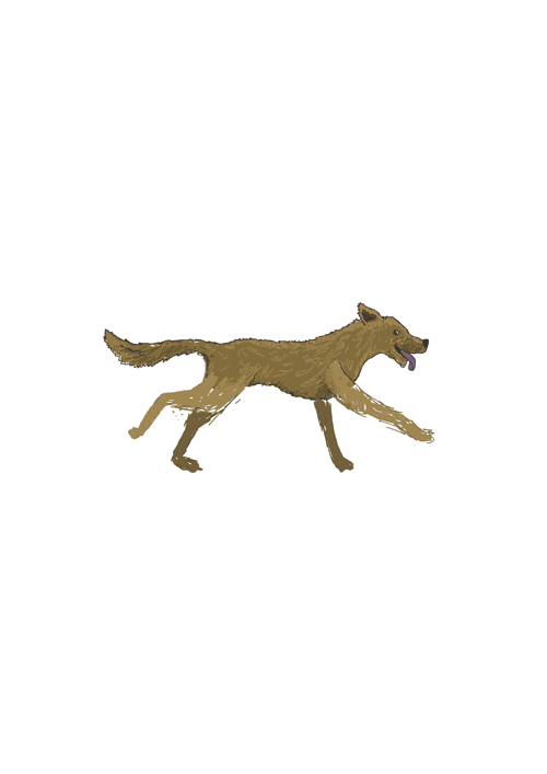
Run Cycle 2 - rough (10 frames)
|
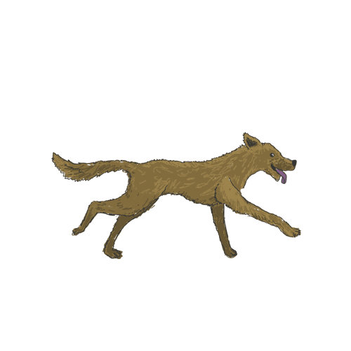
Run Cycle 3 - Cleaned - (10 frames)
Usually, a run cycle is used when the background or ground moves around the character - to give the impression of moving forwards. As my background was static, I moved each frame's position gradually along the path the dog would run - this was successful since the loop only lasted for one cycle - and I was only crafting a very short, quick animation. Again, I had to include a panel background for this animation, to cover the printed image of the dog.
This animation involved the most work, yet appears for the shortest amount of time in the book. If I was to have more time, I would have altered the printed image and removed the dog (rethinking all of the panels to balance the blank space), and utilised the work I had put into the run cycle by moving the background in some way and having the cycle loop several times.
This animation involved the most work, yet appears for the shortest amount of time in the book. If I was to have more time, I would have altered the printed image and removed the dog (rethinking all of the panels to balance the blank space), and utilised the work I had put into the run cycle by moving the background in some way and having the cycle loop several times.
The final product
For full videos of all animated interaction broken down by page, please visit my vimeo profile using the link below and look at the section labelled Hubert: Page Animations.
GO TO VIMEO
GO TO VIMEO
evaluation of work
Overall, I am satisfied with the final body of work, both as a personal achievement and as a successful representation of my original aims; to combine the physical and digital, to explore the potential of Augmented Reality for furthering visual storytelling, and to enhance the Graphic Novella’s appeal in this digital-centric era. I have showcased the potential for AR to augment visual narrative, interrupting the prevailing use of AR for education, information, and marketing, and bringing it into the realm of entertainment. I believe that my learning journal and evaluation evidence the critical thinking, time and effort dedicated to the project, and how I analysed and eliminated all reasonable alternative solutions to challenges faced. Through practice, I am increasingly informed on animation, having acclimated to new softwares and gained key experience with new techniques I was previously oblivious to. Use of masking, trackmattes, onion skinning and stroke reveals has altered how I will approach future animation projects, allowing greater efficiency and instilling confidence to approach more complicated sequences. I believe that the final work evidences my capabilities across illustration, animation, and print, and will be an invaluable asset in my portfolio when approaching post-graduate employers. In regards to celebrating the physicality of the book and paying homage to the value of printed media, the shortfalls discussed in this evaluation were unavoidable. If given more time and resources, I would pursue more expensive printing processes to attain a more polished finish to the covers of the book; cementing the idea of physical form denoting quality and value. Specifically, I would investigate sublimation dye printing, which deposits ink more directly into the paper, and penetrates deeper within the fibres; meaning cracking is rare. This is an expensive process, and one unavailable to me through the university at the time of completing the work. For such a short run project, this was not a sustainable nor realistic option, so I would only consider this if hypothetically my novella was to be published and sold. It is worth noting that this may not completely eradicate wear and tear along the fold, but it is the most failsafe option other than lamination; which as previously stated, would add gloss and detract from the tactile quality of the paper that I desired. Additionally, I would restructure the narrative so that each page included animation. Although this isn’t a huge issue, from testing the final book amongst friends and colleagues, most users, when interacting with the book, expect to see an animation on every page. A further modification would be implementing sound to accompany the animation, increasing the immersion of the augmented reality. Considering the time limits and sustained focus of the body of work, I am content with my achievement and believe the project to be a crucial stage in my development as a practitioner; upskilling my practice, lending the importance of design theory and contextual considerations, and developing maintained focus and drive.
what's next? and contemporary use of Ar/Vr in exhibition
|
Moving forwards, I intend to continue working as a graphic designer, and the skills and focus I have developed in this project will act as an asset to my professional working capabilities, and showcase creative thinking and diverse skills in my portfolio. In the more immediate future, I need to work on creating some accent pieces to accompany my work at exhibition, and to consider how I can utilise AR/QR codes to showcase my work and the theory behind my project of augmenting narrative.
As inspiration for how AR can be used to further the experience of art, I visited the Van Gogh:An Immersive Experience exhibition currently being held at Propyard (link here). This is the second immersive Van Gogh experience that I have visited, the first being in Southbank last year (2021); which focussed heavily on physical set pieces and 3-d models/sculptures based on Van Gogh's work. This exhibition focussed on sound, visuals, projection, and AR/VR to EMBODY Van Gogh's work, and place the viewer INTO the art and the mind of the artist. Although this exhibition is to a far larger and more impressive scale than my work could ever dream, it has imparted some useful ideas for disseminating knowledge, The popularity of the exhibition is due to the relatable nature of Van Gogh's mental struggles, and the ability to relate to his human experience (much as I have been trying to stress as the root of intriguing narrative) as much as the novelty and awe of new technologies. Additionally, much of the QR usage at the exhibition was for accessing the printed panels of information on ones personal device. This allowed the user to move on/read at their own pace/not be in direct sightline of the large scale pieces of text information - allowing a more personal, accessible experience of learning. 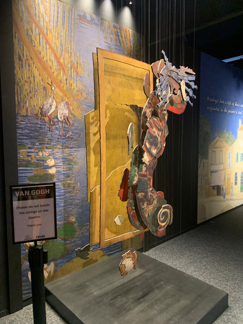
|
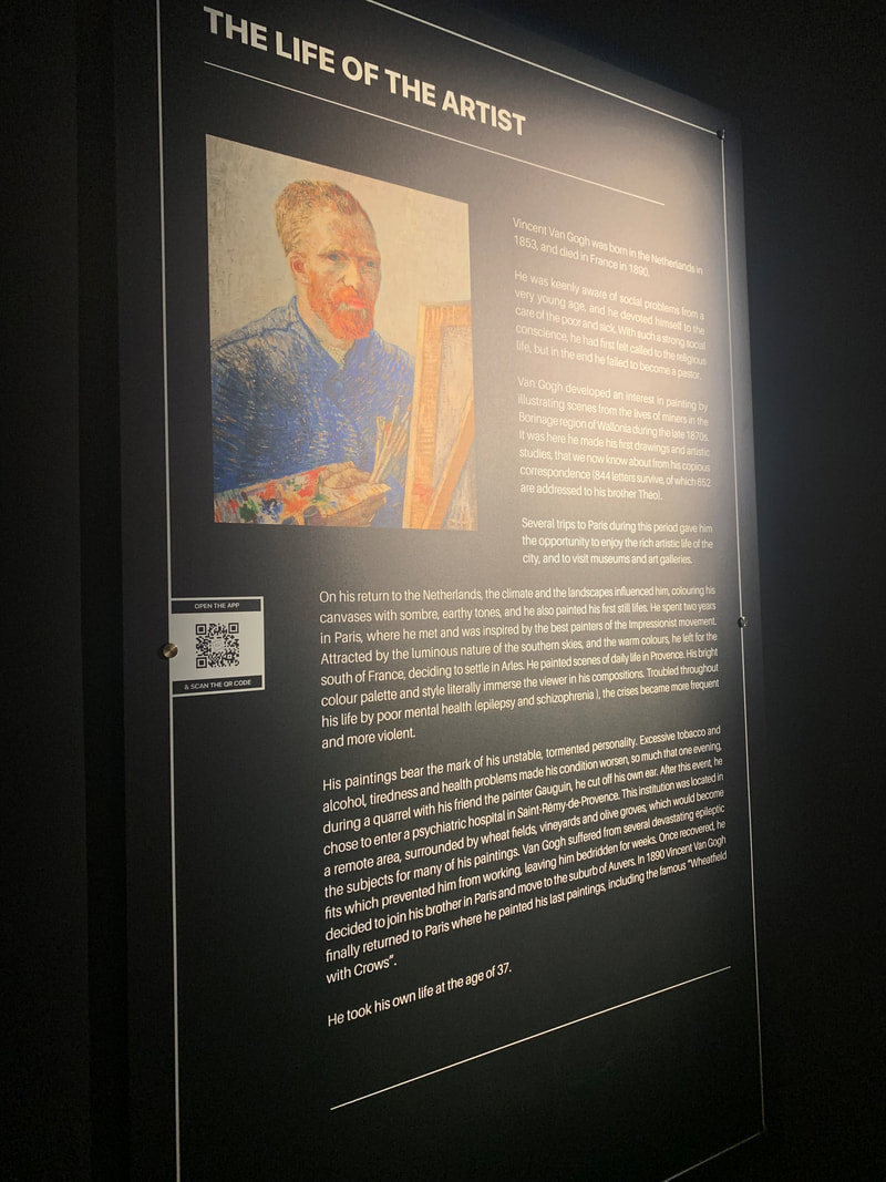
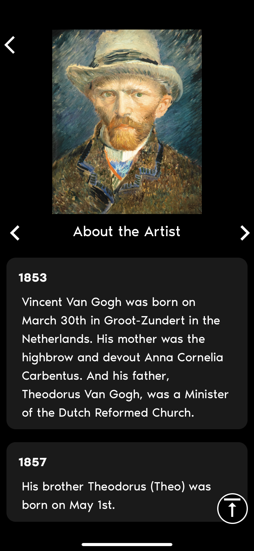
Above: Panel of text on display, and then in-app text explanation when scanning the QR code.
|
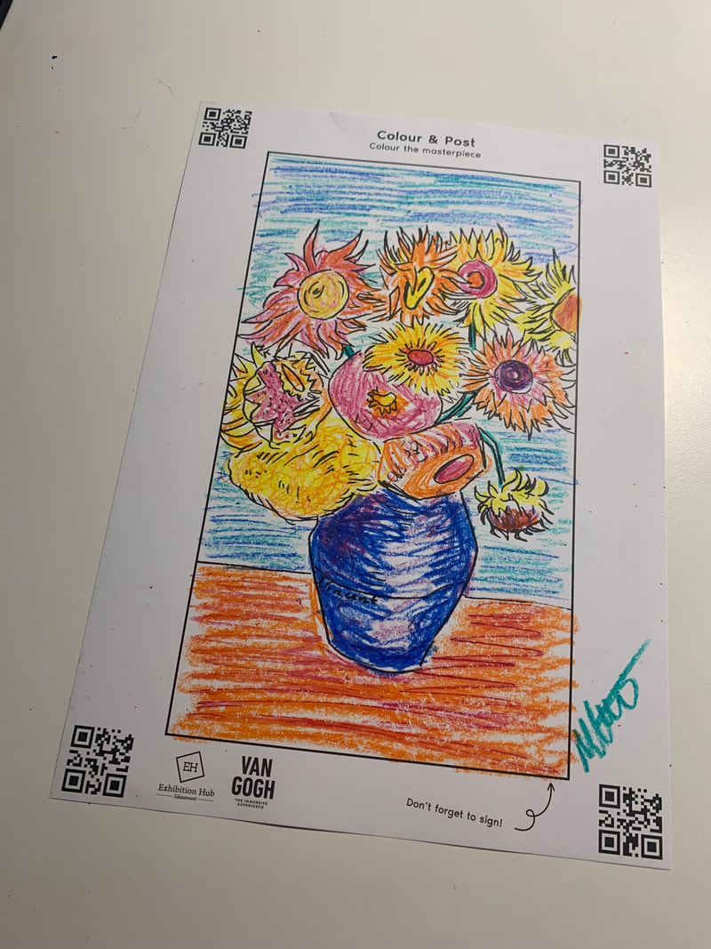
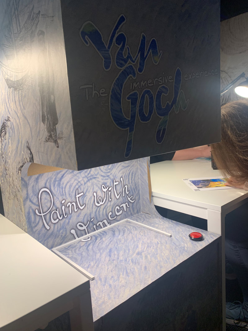
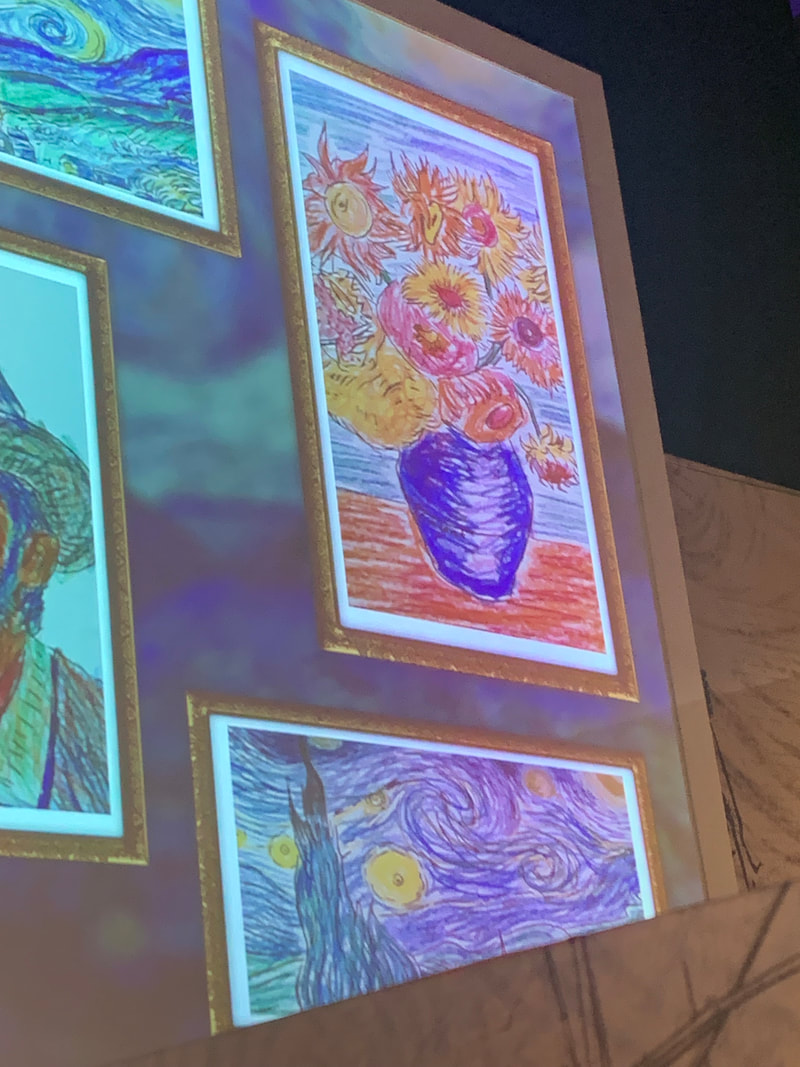
Another interesting aspect of the exhibition that I could potentially use in my exhibition of work, was the viewers ability to interact and participate in exhibition themselves. A machine was set up that scanned and projected users colouring of Van Gogh's most famous works. Once coloured using the crayons available, you simply put the paper under the machine, which used QR codes to recognise that paper dimensions, pressed the button and it launched it on the opposing wall - displayed in a digital frame. This was a nice way to involve people in the immersive experience, and invite interaction with the technology and the artist's work.
|
|
|
For exhibition, I want to display large scale posters of some of the interactive pages. This will involve isolating and scaling up illustrations, and formatting them for large scale print; producing A2 posters that act as “teasers” for the novella, intriguing audiences and encapsulating the user experience of the book at a scale that is accessible to multiple people at once.
Additionally, I will think about using the space as an immersive reality to give context to the novel - decorating with spooky setting pieces reminiscent of the haunted house, and perhaps offering an interactive experience for viewers of my work. this may take the form of colouring pages, or of a wall dedicated to visitors drawings of their ideas of a ghost. I would like to use the QR codes, and business cards/interactive paper elements to direct people to my portfolio and website, and distribute my personal practice further. In this way, immersivity, and novelty of AR as an emergent tech can be usued to give my name and work memorability.
Additionally, I will think about using the space as an immersive reality to give context to the novel - decorating with spooky setting pieces reminiscent of the haunted house, and perhaps offering an interactive experience for viewers of my work. this may take the form of colouring pages, or of a wall dedicated to visitors drawings of their ideas of a ghost. I would like to use the QR codes, and business cards/interactive paper elements to direct people to my portfolio and website, and distribute my personal practice further. In this way, immersivity, and novelty of AR as an emergent tech can be usued to give my name and work memorability.
