introduction: when worlds collide...
As a preface to this Learning Journal/Blog, it is worth noting that my project revolves around how we can combine traditional print and emergent tech to better entertain, enthral, and intrigue an audience/reader. The question I pose is about how narrative can be adapted from its traditional format without losing its effectiveness, and how form and perceived "physicality" impact audience/user experience. Since this was written in true blog style - A.K.A. as and when research was undertaken - it jumps back and forth between the two "separate" spheres frequently. (n.b.: since the culmination of these two spheres is my goal/challenge, I use "separate" emphatically). It is not until towards the end of this module that my work culminates in practical tests that combine the printed and the digital. Where it is a very new concept to use AR in storytelling, I thought it best to examine the features of work from both "sectors" on their own to understand what made them successful, the theory behind them, and the nuances of historic and contemporary practice. When I had worked out what the essence of the graphic novel was, and the utility of AR experiences, then I could combine them and exploit their potential.
Additionally, the digital aspects of the project were new to me: I had no idea how AR worked, what softwares I could use, how to 3-d model anything, and a rather shaky understanding of animation. Since I knew that these areas would take me longer to grasp, my initial focus was on creating, creating, creating! before I came back around to working on my actual storyline/illustration for the printed graphic novella.
This approach means that it may be a little confusing for an outsider to follow a linear trail of my process. I have attempted to rearrange entries in this journal so that similar research areas/sections of work are grouped, and stages of the project are mostly chronological, however for ease of understanding I have denoted whether the section is "Print" or "AR" related where appropriate.
Project Planning
Initial Ideas
At the outset of the project I had a few ideas as to which direction my work could take. I wanted to develop work that would utilise my skills - both those from outside of university, and those that I had learnt over the first 3 modules and workshops. As a designer who works both with digital and print forms, I wanted to explore creating a body of work that utilised the two mediums in an effective way. I didn't want to pigeonhole myself with something specifically skilled, and hoped that my final outcome would demonstrate a variety of ability to potential employers, and allow me to flex my creative muscles. That said, my initial thoughts revolved around the following ideas:
At the outset of the project I had a few ideas as to which direction my work could take. I wanted to develop work that would utilise my skills - both those from outside of university, and those that I had learnt over the first 3 modules and workshops. As a designer who works both with digital and print forms, I wanted to explore creating a body of work that utilised the two mediums in an effective way. I didn't want to pigeonhole myself with something specifically skilled, and hoped that my final outcome would demonstrate a variety of ability to potential employers, and allow me to flex my creative muscles. That said, my initial thoughts revolved around the following ideas:
- 2-D animation and promotional video
- Social media and online content that drew attention to the issue of disassociation from real-world life
- FMCG branding and packaging - making a product buyable, or "trend" worthy
- Graphic Novellas/Comic books as an art form - focussed on adult graphic novellas opposed to children's illustration
- Celebrating "the book" - printed medium in a digital world.
- a return to reading - consumption of traditional media in the face of the internet/modern tech/gaming
- Exploring interactive storytelling.design - VR/AR elements and their significance after distanced learning/living
- Drawing attention to climate change/veganism/waste/consumer culture - issues that concern me and my generation
- Combining digital and traditional print mediums to emphasize the importance of the two (one is not better than/replacing the other)
Project proposal - 1st draft (22.09.21)
Draft Project Proposal
Below is the rough project proposal submitted in the second week of the term (at the outset of the project), outlining my area of study and goals for the next 2 modules.
Proposal Title / Area of Investigation
Graphic Novels:
Below is the rough project proposal submitted in the second week of the term (at the outset of the project), outlining my area of study and goals for the next 2 modules.
Proposal Title / Area of Investigation
- - Integration of traditional printed media and augmented reality for more immersive storytelling.
- - Creation of a graphic novel/illustrated story that exists as a standalone narrative, but can be layered with an interactive, augmented reality element (3-d modelling/animation?)
- - Questioning the boundaries that exist between traditional and contemporary media/forms of entertainment. Bringing smartphones into play with books.
- - Illustration and the Graphic Novel as a visual storytelling medium - and its placement in the modern world of digital media consumption
- - Moreover, using emerging technologies to further printed media as opposed to competing with it
- - Exploring use of QR code to allow AR to be layered over physical printed image
- - Exploiting the boundaries set up between digital and print design
- - Focus on narrative and storytelling - but worth noting the marketing capabilities/commercial opportunity of overlaying print media with AR
Graphic Novels:
- - Tom Haugomat - Through a Life
- - Robert Hunter - The New Ghost
- - Susi Vetter (Interactive Illustration)
- - Andrew Wilson (3D Lettering)
- - Matthew Rey Treece (AR sculpture artist)
- - To have a defined narrative, with some rough accompanying illustration
- - To have tested 3d modelling and animating interactive AR elements
- - To understand the use of QR codes, and technical requirements in creating AR scenarios
- - To have identified the most appropriate software for creating all aspects of the project
- - Potentially draw attention to a social/enviro issue with the subject of the story, that is instilled by the idea of continually evolving tech
- - E.g: Throwaway culture?
story ideas and outcome development
|
I moved away from using AR as a supplement for marketing or educational purposes, as I felt this was too close to my current job and day-to-day production, and I wanted to explore my skills and create something I was unfamiliar with. I wanted to create a graphic novel with a jovial story - something that was purely entertainment based, yet physically exhibited the use of combined technologies and printed media.
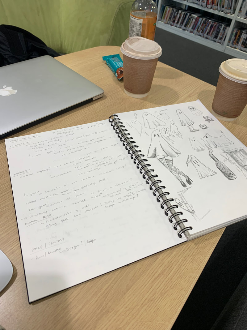
The value of the project is in the artefact itself, rather than it's agenda; I want the interaction of the user/audience with the story and the animation to be amusing, appealing, and give them a sense of awe or intrigue. My focus is on how narrative comes in many forms, and how contrasting technologies can contribute to storytelling. The printed story should be complete and cohesive without the AR interaction, however, it needs to add an element of surprise or appeal that engages an audience. In order to combine the virtual with the real world, I spitballed some storyline ideas and sketching in my sketchbook (right). This is written up below so it's legible: |
|
rough ideas - story planning
|
RAINFOREST
|
LONELY GHOST/ BAD GHOST
|
3-d scanning/printing workshop |
(AR) |
I attended a workshop revolving around 3-D type - my expectations were to be using software to create 3-Dimensional illustrative words in the digital space, however, the workshop had been restructured to focus around Structured Light Scanning (SLS) and recreating physical 3-D shapes/models in the digital space in order to be able to 3-D print and replicate/reproduce them.
Although I was hoping to work with 3-D modelling software to create 3-D digital illustration the workshop introduced me to the possibility of sculpting something physically using real-world materials, and then transferring it to the digital space with SLS scanners. This opened up the possibility of being able to create 3-D assets for my AR experience, without needing the knowledge/skills of using 3-D modelling software. This made the world of 3-D more accessible to me at this early stage.
Softwares Used:
Rhino
Mesh Mixer
Scanners Used:
Artec Space Spider
Artec Eva
i-Pad with Structure Scanner Attachment
The workshop involved us creating small sculptures from clay - utilising more than one colour as a prerequisite in order to demonstrate the scanners ability to map different colours and textures. The following are properties that make an object suitable or difficult to scan:
Good properties
- Varying topography
- Solid, Opaque textures (Colours)
- Varying textures
- Symmetrical, featureless topography
- Clear, matt black, furry, reflective
- Translucent, thin cross section
- Certain blue colours (Spider scanner only)
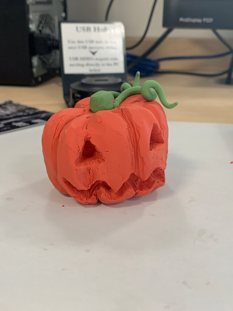
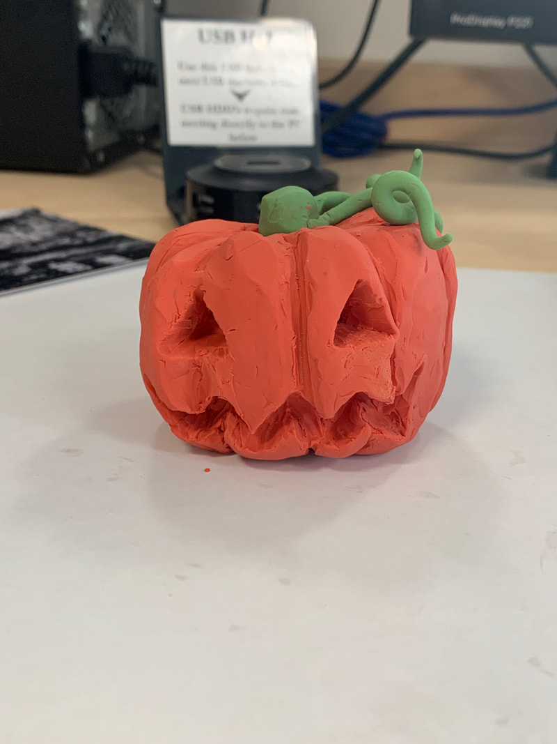
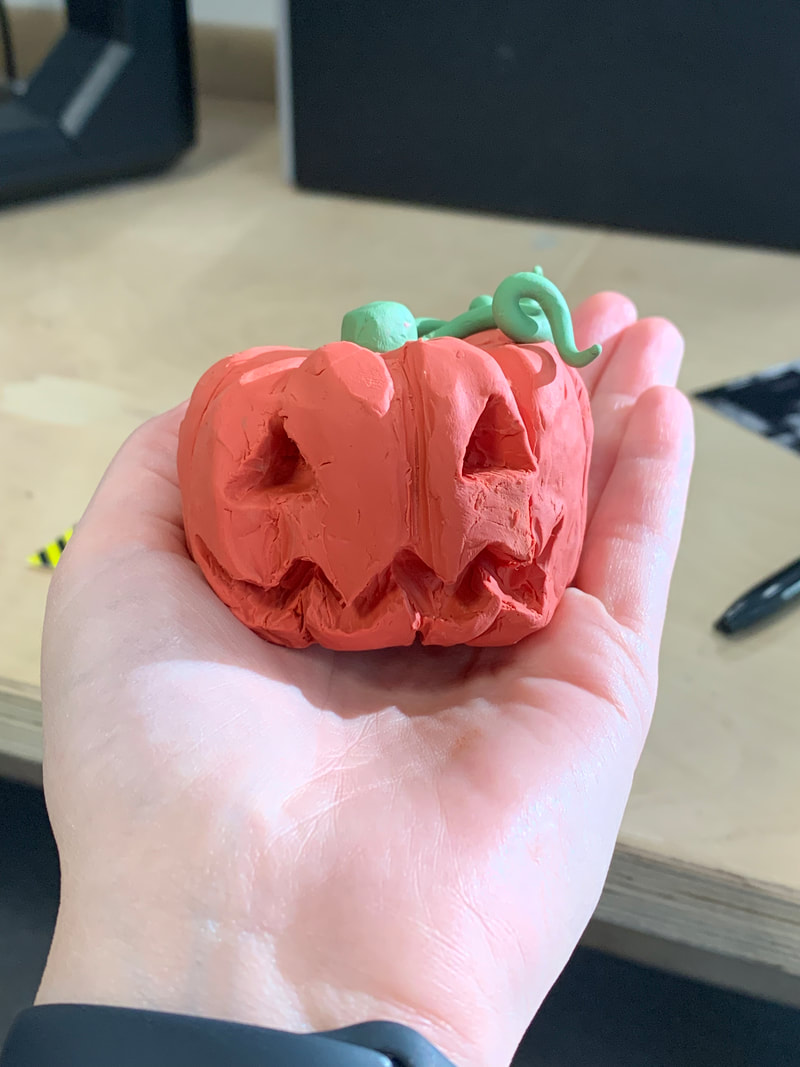
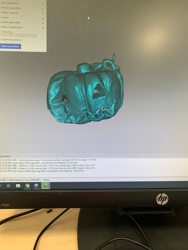
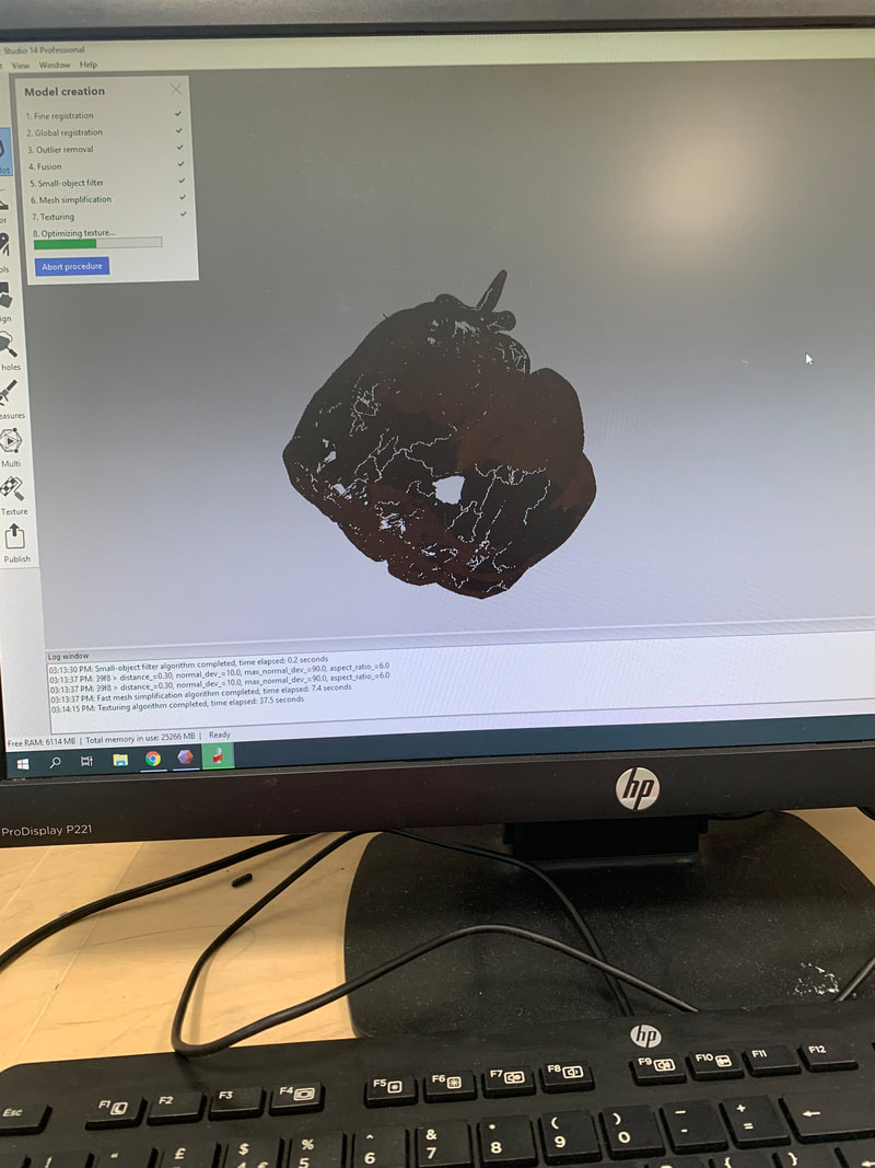
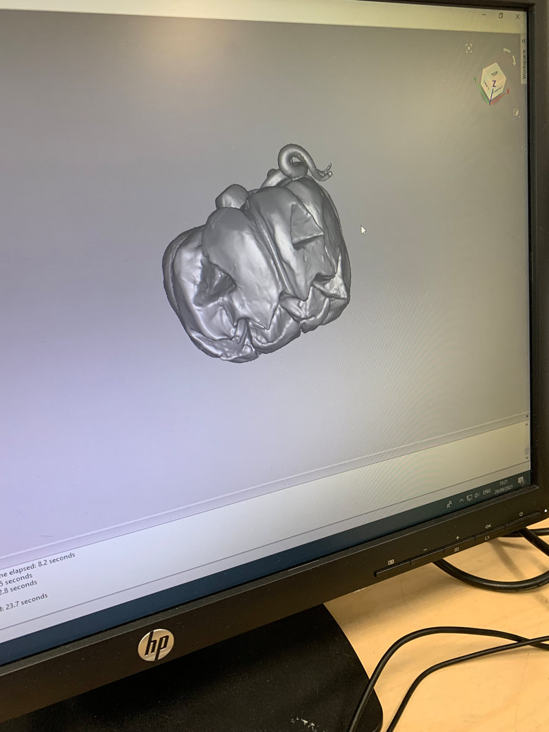
The first stage was creating a clay model. I was unsure of the level of detail that could be recreated in our short session or interpreted by the scanners/software, so decided to crate a small jack-o-lantern with vines. At this point, I was confident that the face and topography of the pumpkin body would be easily transferred, however, I was dubious as towhether the thin, spiralling vine would be easy to translate by the scanner.
|
|
|
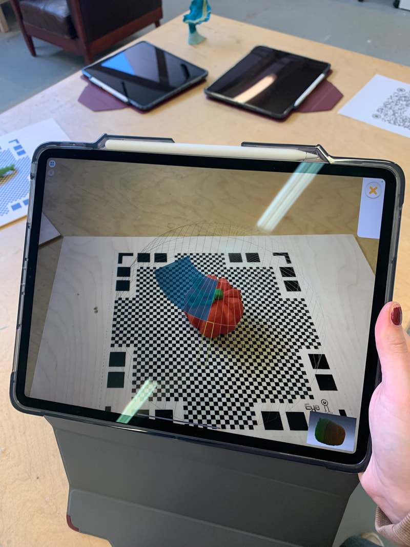
As our group was quite large, we trialled different scanning softwares and techniques in rotation, so that we were occupied whilst the Artec Spider was being used by others. Below are images of using the i-Pads camera and the software Qlone to scan the object and then place it into AR space. The object is placed on a QR mat that the software and camera recognise, and then use to map out the topography and scale of the object. Colours are also captured - allowing a 3-D, digital version of my pumpkin to be saved and placed in any environment. This allows for infinite scalability, and the Qlone app also includes basic animations (such as bounce and spin) when viewing the option in AR.
The scan did run into some difficulties - the vine was not formed properly (as I had predicted) , and some of the edges became warped - giving the impression of a dented., or flattened areas of the pumpkin - however, the overall digital version was a good representation of my original model, and a good option for entering 3-D digital space considering it is free and easily accessible at home..
The scan did run into some difficulties - the vine was not formed properly (as I had predicted) , and some of the edges became warped - giving the impression of a dented., or flattened areas of the pumpkin - however, the overall digital version was a good representation of my original model, and a good option for entering 3-D digital space considering it is free and easily accessible at home..
|
|
|
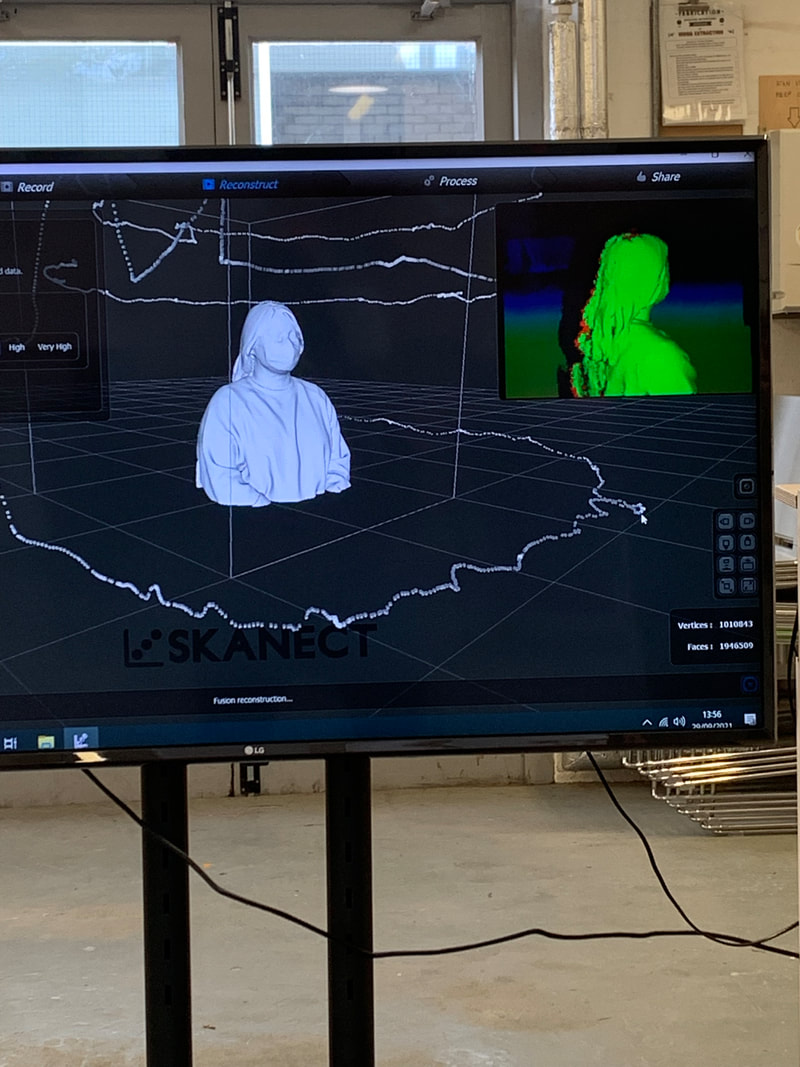
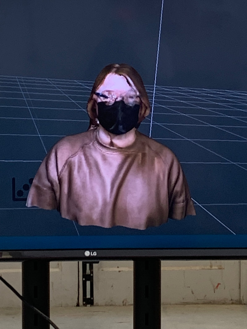
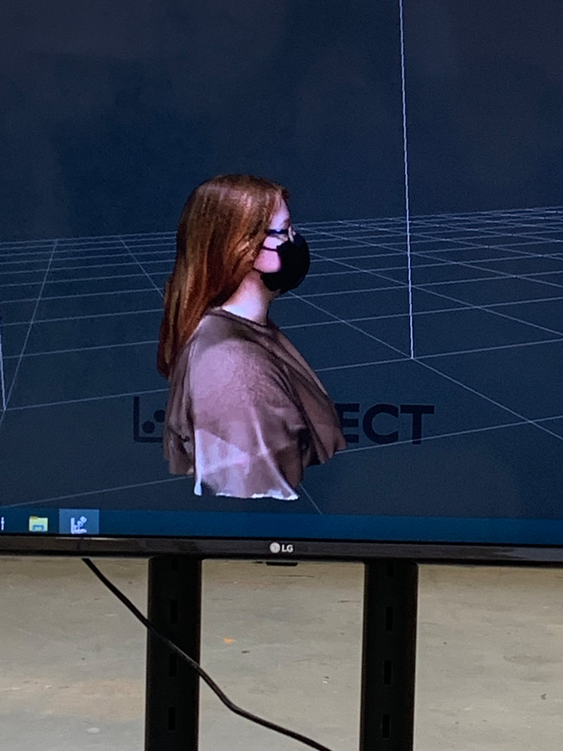
We also used an i-Pad with a structure scanner extension on the camera to scan and recreate digital avatars of ourselves. Again, these captured colour and topography. The first image shows the path of the scanner/camera as a white line, as it travelled around me to capture my 3-D image. The side profile is a true representation of me in digital 3-D - in particular the folds of my jumper and hair colour translated very well through the scan, however, issues arose with my Glasses due to their transparency. There was no defined lines on the portrait view, and my eyes have become obscured. This demonstrates important limitations of the hardware and considerations that need to be taken if creating physical assets to be used in 3-D digital spaces - transparency, very dark areas, and thin lines all cause issues.
|
|
|
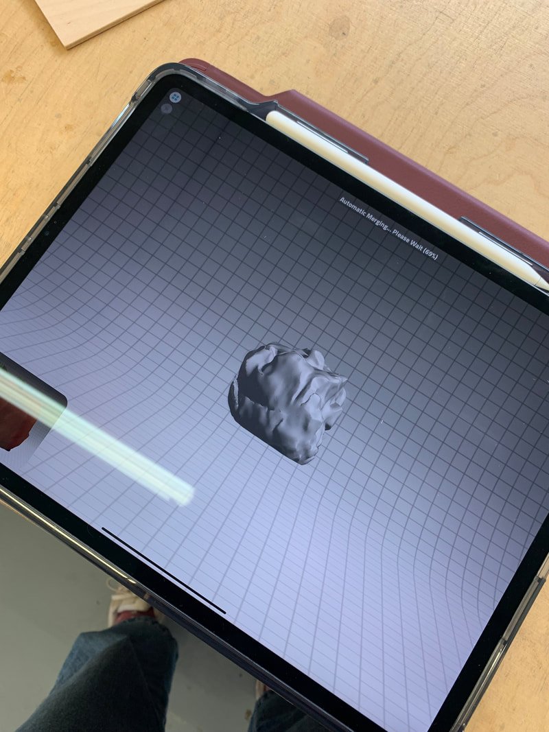
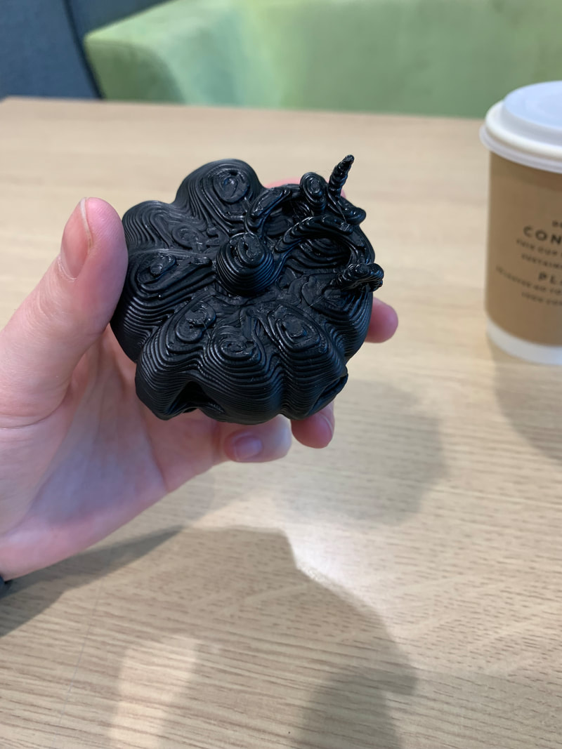
Once the objects were scanned with the Artex SLS scanner, they were imported into Rhino, where we corrected any topography issues with further scans from different angles, and layered them into the main composition. Smoothing was applied, and the final 3-D models were created in the software. The software MeshMixer was demonstrated to us as an option for building and sculpting directly in 3-D, or for altering scanned models.
|
|
|
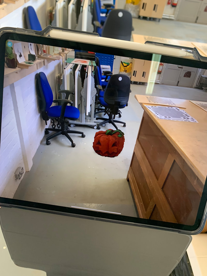
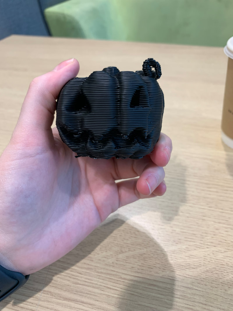
The below is the final result of the reproduced jack-o-latern being printed in polymer by the 3-D printer. The printer creates layers of thin lines of plastic, working upwards in a circular pattern. Surprisingly, the vines did translate rather well, illustrating that smaller details can to an extend be recreated. Limitations still exist as to what can be 3-D printed - the lines of. The layers are still visible, and fine detail becomes obsolete, However, this method of printing is very cost effective and fast, versus using a resin printer which is more environmentally harsh and far more costly.
|
|

|
Overall the workshop was a fun and interactive experience, however, the introduction to AR, and the possibility of creating 3-D assets without the need for knowledge of 3-D modelling software opened up the possibility of using 3-D in my own AR projections - something that I previously considered off limits. With this access available to me a university, it would be possible to create physical models and then replicate them in the digital space for my graphic novel, adding another layer of complexity and immersion to the augmented experience.
Current Practice - the graphic novel(LA) |
(PRINT) |
Since I wanted to create a printed graphic novella, I looked to contemporary practitioners creating work that inspired or resonated with me. The following is a selection of artists whose illustrative style, narrative technique, or unique way of manipulating graphic story-telling posed questions for my own practice, and work as a frame of reference as I continue the project.

ROBERT HUNTER
Rob Hunter is a London based illustrator whose work and style inspired me and introduced me to the format of graphic novellas. The New Ghost - with its illustrative style, and whimsy, yet melancholic humanistic storyline - resonated with me and was the first of my collection of graphic novellas long before my personal practice developed. The ability to communicate effectively via illustration, and his use of varied panels, tonal colour, and traditional mediums/collage piqued my interest in alternative storytelling formats. Hunter's illustrations have a hand-made, dreamlike quality, utilising soft pencil lines, subdued blue hues, and rough, bleeding edges to panels. There is a sense of nostalgia, and connection to the maker, that makes his illustrations imbue a sense of emotion, or hidden feeling behind them. The New Ghost was my first introduction to Nobrow Press; an independent publishers that works with small artists and writers and focusses on producing high quality, artistic narratives. Their 17x28 Series (which The New Ghost is a part of) champions young graphic designers and emerging artists who wish to publish their stories - the only stipulation being that the story must conform to 24 pages, of 17x28cm. 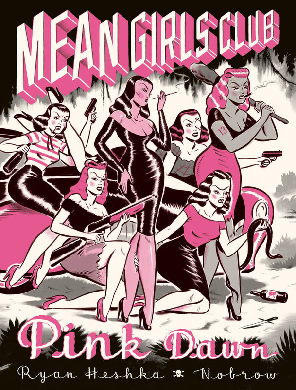


RYAN HESHKA
Heshka's Mean Girls Club struck me through its use of colour - utilising only greyscale and pink to reflect its subversive narrative of a gang of femme fatales committing crime, murder, drinking and riots. The illustration style subverts 1950's cliches using pin up figure references in vulgar and violent scenarios. His narrative and illustration style create a commentary on contemporary glamour; his audience can appreciate the feminist message beneath the superhero/nostalgic bravado of the action. Using familiar tropes/ artistic styles, portrayed in new and unsettling ways (through use of colour and characterisation) is an interesting way to push a narrative message. Playing with the audiences preconceived notions of similar artistic styles, forms of media, and storylines makes them question their own assumptions and attitudes. Heshka's work displays how visual language can be a powerful communicator - how the uncanny image can make an audience question their own perception. 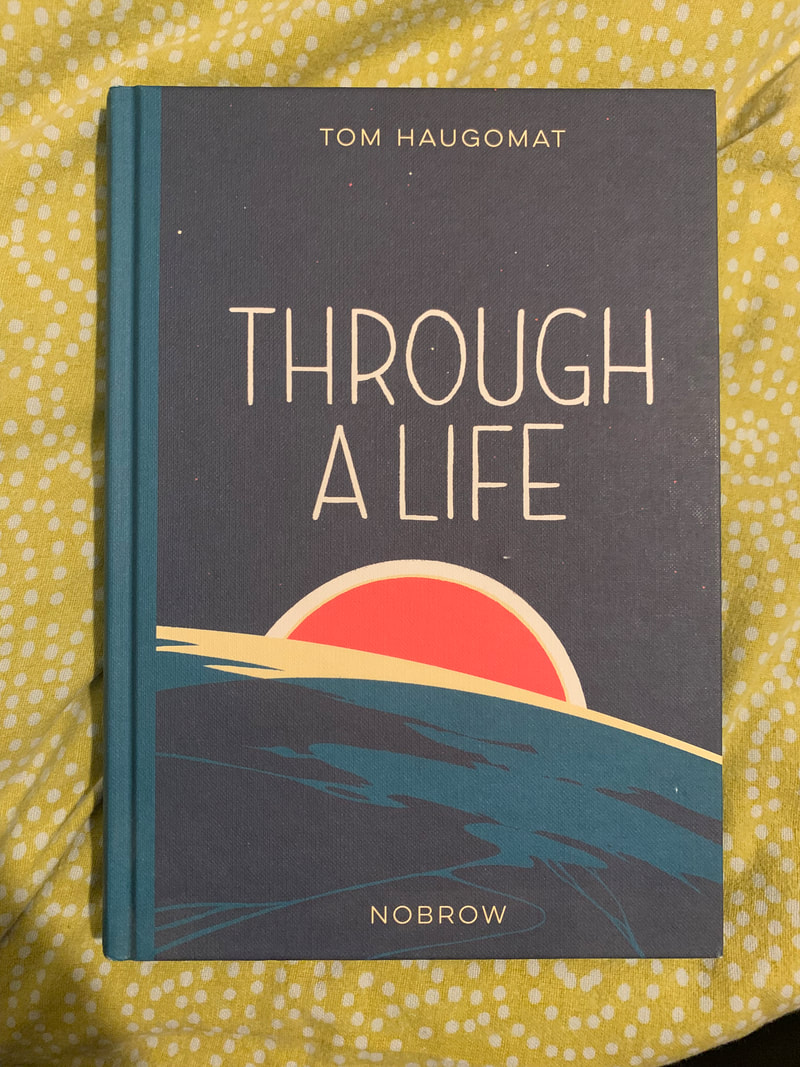
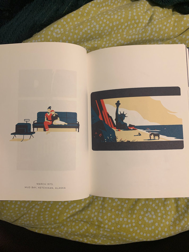
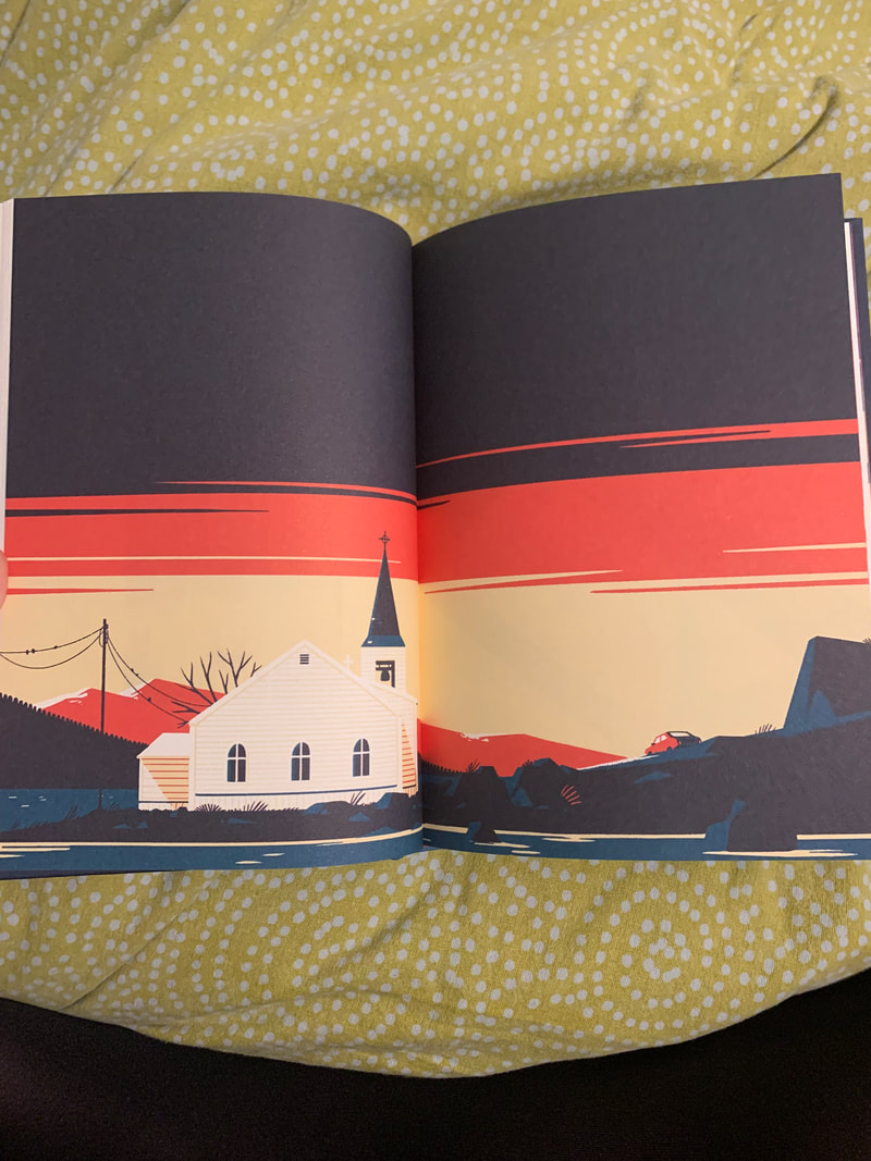
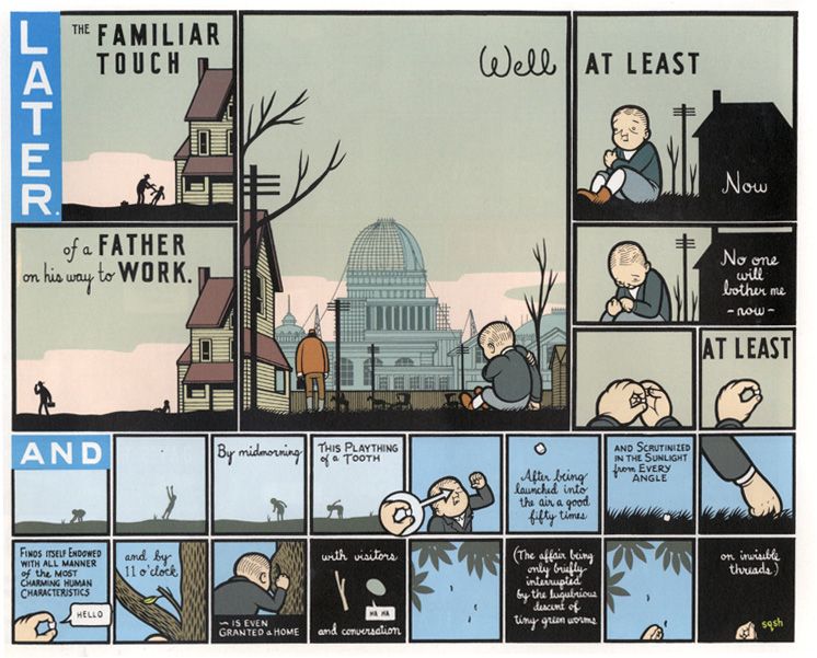
TOM HAUGOMAT
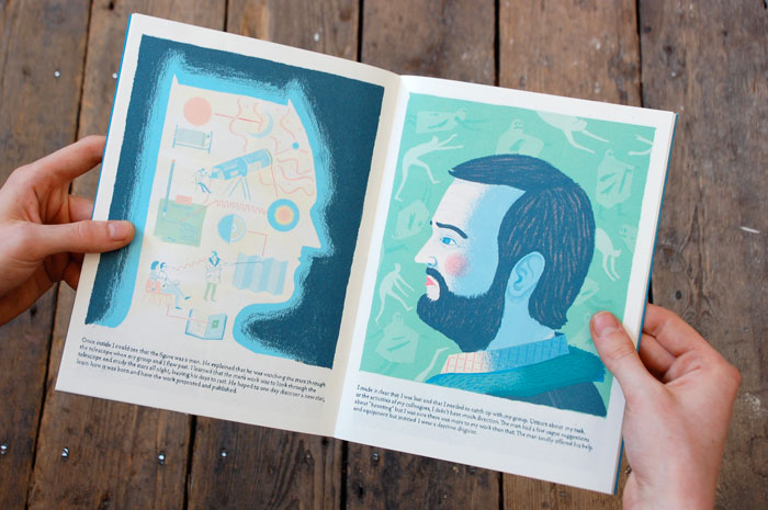
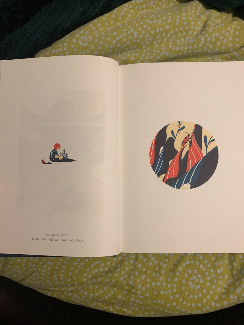
Through A Life by Tom Haugomat is a great example of how narrative and storytelling doesn't have to rely on words to be profound and emotive. This graphic novel is silent - but the structure, the limited colour palette, and the use of form; using reveals between overleaf pages, changing viewpoints between facing pages to add detail and pinpointing important events by expanding onto double page spreads - create a strong chronology, sense of time passing, and attachment to the story. The pages follow the general flow of the window, or object which the view is created through being on the left-hand page, followed by the first-person view created on the right-hand page. The hyper-focus on the key events in "Rodney’s" world puts greater emphasis on the audience to fill in the gaps between images, which ensures heightened interactivity with the page and a far stronger connection with the central character. Following the story of the character from birth through to death, the later pages mirror the earlier windows/views, in an oddly nostalgic, deja-vu-esque manor, which reinstills the idea of time passing, and the human notion of reminiscence of childhood and comfort in the familiar. The use of only 4 colours throughout helps relay the idea of the same lifetime being followed, despite changes in the characters image as he grows, and the disorienting viewpoints, and again highlights that Haugomat's choice of omitting details, and now colours, leans on the audience to draw their own conclusions. |
CHRIS WARE
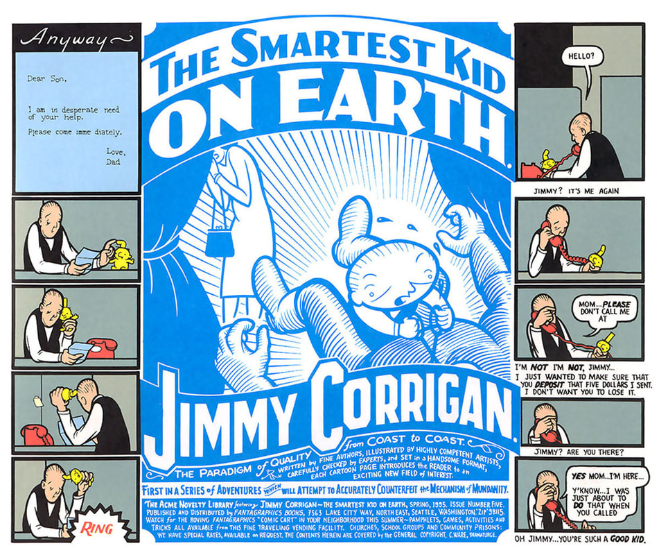
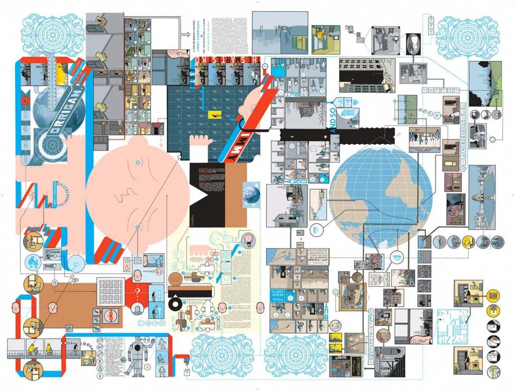
Ware's gargantuan graphic novel Jimmy Corrigan: The Smartest Kid on Earth plays with form, function, and narrative to challenge storytelling tropes and question how "reading" is experienced. It was the first Graphic Novel to win a British literary award - making the Guardian's First Book Award in 2001. Published in 200 as a collected volume - after running in strips and serialised form for five years, the hardcover edition is an incredibly detailed maze of interjoining stories. It is interesting to note what has been included versus omitted in the formation of the printed book - and how this may impact the narrative. In the hardback edition, the inner covers of the book include a witty, tiny printed set of instructions as to how to navigate the novel, but these are so superfluous and in such a small font pt. size that they become irrelevant. Ware leaves the interpretation, and chronology of story/panels up to the audience - challenging them to draw their own conclusions. The dust jacket of the hardback edition also unfolds several times, creating its own, broadsheet comic book strip - emphasising physically that the compilation is made up of many interlocking, yet separate parts both in its form AND it's narrative. The orientation of the book changes throughout the novel, adding to the disorientation, and different panel sizes/styles frequently appear alongside each other. The detailed illustrative style and use of bold outline strokes is reminiscent of classic comic book style, but has a more modern, artistic feel. 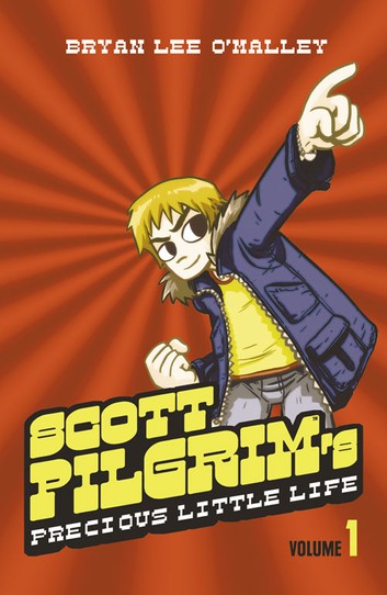
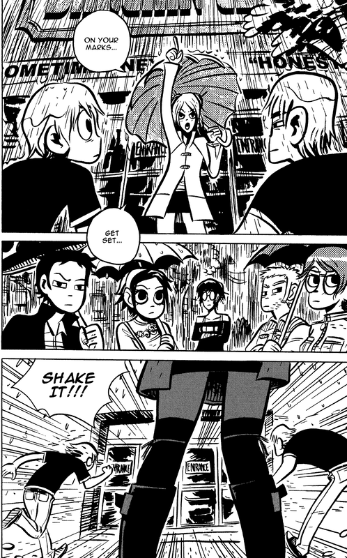
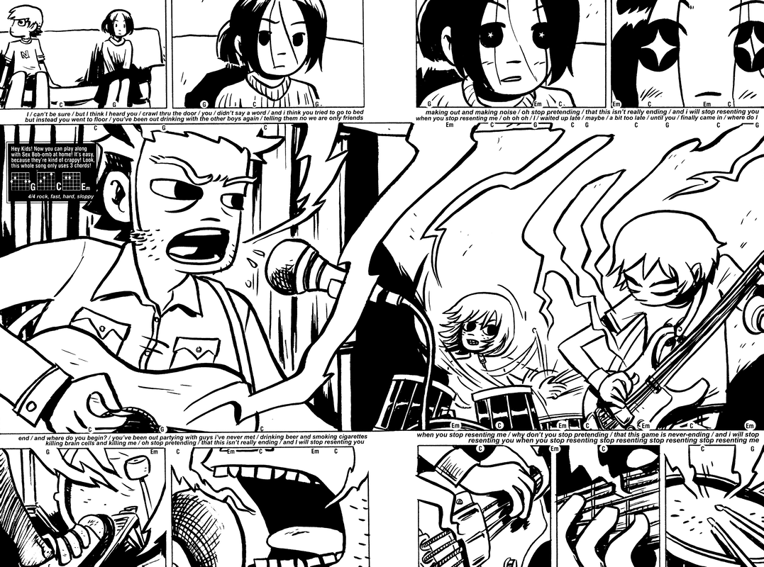
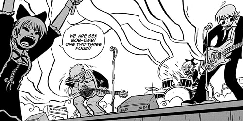
BRYAN LEE O'MALLEY
O'Malley is a notorious cartoonist, probably best know for the Scott Pilgrim series; a six volume series published between 2004 and 2010 in digest size black and white, before it's critical and commercial success instated a full-colour re-release, a successful cult movie, a video game adaption, and several soundtracks. The series was inspired by Plumbtree's 1998 single "Scott Pilgrim" - described by lead singer Carla Gillis as "positive but also bitter sweet". The lyrics " I've liked you for a thousand years" resonated with O'Malley and inspired him to create the story of 23 year old Scott - enraptured by delivery girl Ramona Flowers, and forced to defeat her seven evil exes if destined to be together. The relatable undertone of boy-meets-girl, and pursuit of love, keeps the story grounded and the audience captivated by waiting for the "happy ending", and helps add an element of realism underneath the extreme surrealist, "videogame" fight scenes, special powers, and pop-culture references. The story's origin in music, and O'Malley's own personal interest and background in music, is apparent in the characterisation of the band in the comic - and how sound and entertainment are portrayed in the silent print format. The rock and roll aspect of live music is showed through the sound being physically embodied, and drawn in great waves, lines, and zigzags - moving from the instruments to the audience/towards the page. The series was originally produced in black and white due to cost - it was much cheaper than working in full colour - however, O'Malley chose to use this to his advantage - "embracing the manga aesthetic" and leaning into the use of thick, black outlines, dramatic contrasts/reveals, and brush-stroke lines. 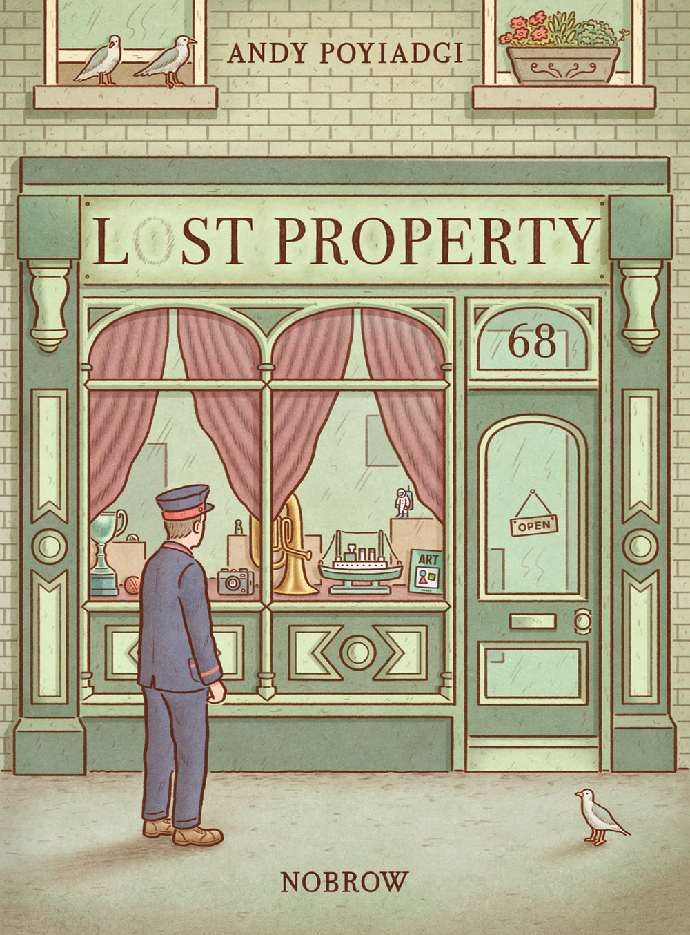
ANDY POYIADGI
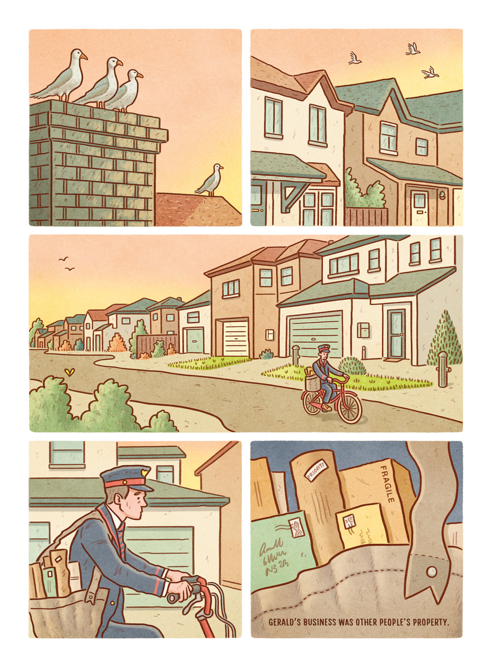
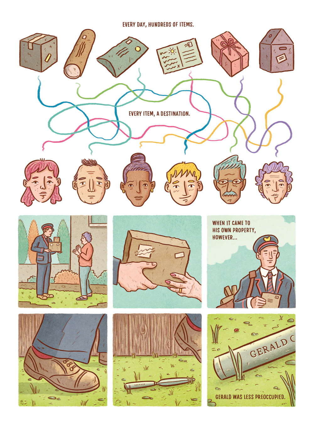
Lost Property by Andy Poyiadgi struck me through its use of colour palette, the hand illustrated pencil outlines of the characters which i thought mimicked my own intended style quite well, and the way its use of physciality/form mirrors the storyline. The graphic novella follows a postman - whose preoccupation with delivering other peoples' belongings has led to him losing most of his own possessions through life. These things, unbeknownst to him, have been collected, and stored in a lost and found. Confronted with all of the artefacts of his life, he chooses to make an art installation - sculptures created from a culmination of his life's objects. The idea of "objects" making up a character, or life, is an interesting commentary on how the physicality of things affects the human condition. The premise of losing things, or things becoming detached from us, is mirrored in the novellas physical format - the inner leaves are wire stitched together, however the outer covers are not attached to the rest of the novella. This embodies the idea that the two can be separated - one part "lost" from the other. This is an interesting concept, and goes to show how the form of the book can reinforce the written/illustrated story: when I first opened the book, I simply assumed this was an oversight/a mistake, but after reading the story, I realised it was a fun reflection of it. Poyiadgi also has a blog post about creating the illustration, character delveopment from initial sketches, and deciding on colours to be used, which I found useful for planning my own project. It is linked below: https://flyingeyebooks.com/creating-lost-property/ |
character creation, references & sketching...
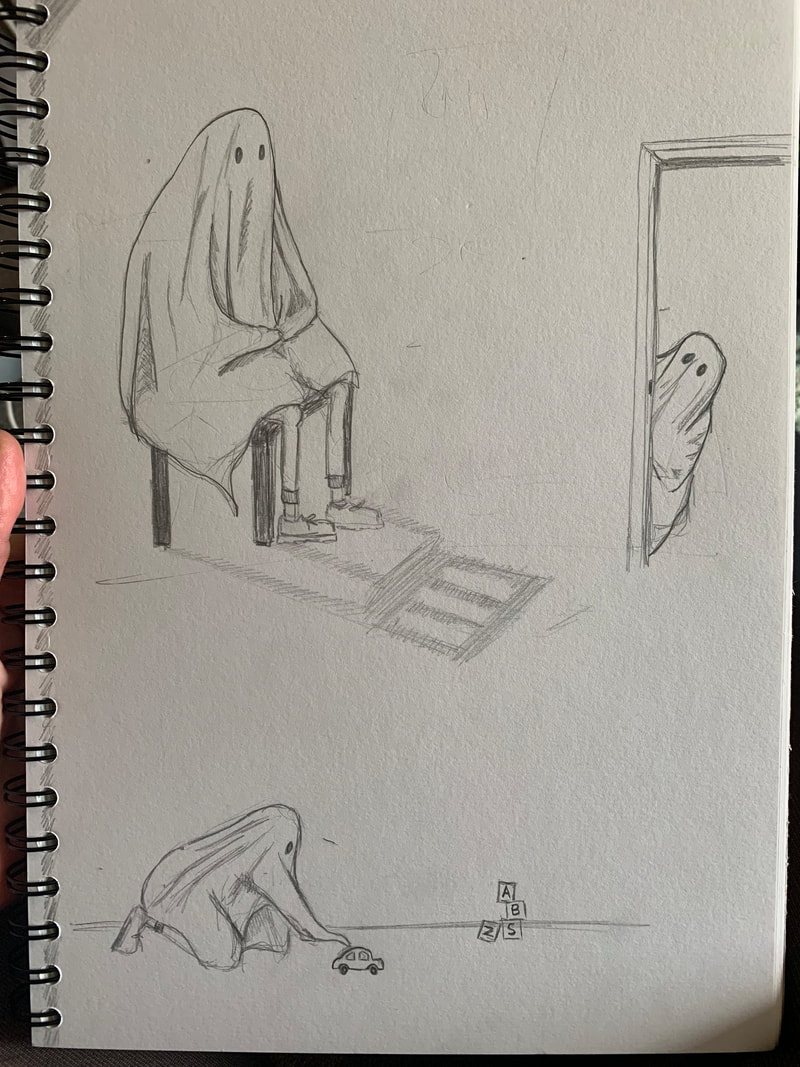
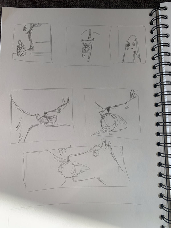
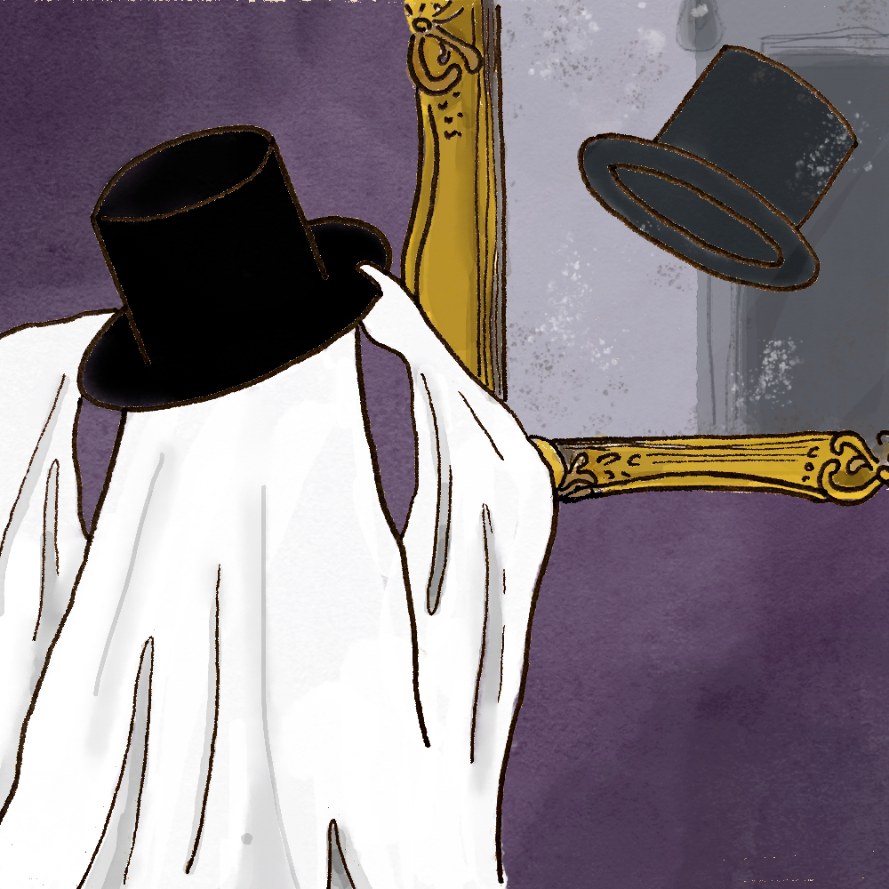
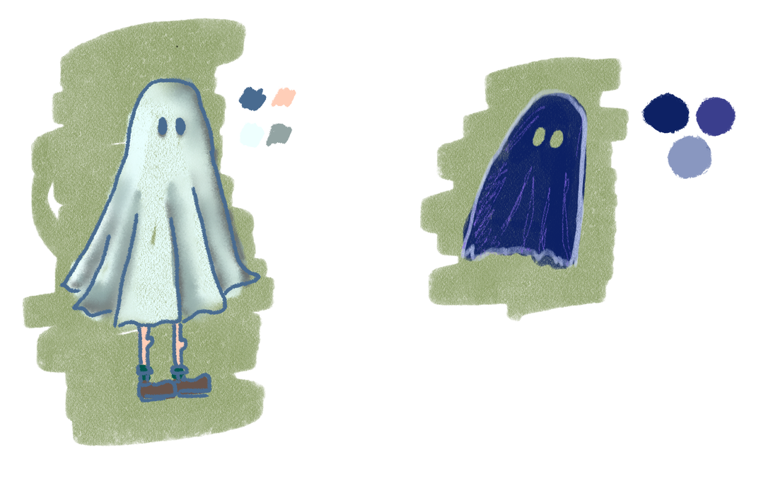
My initial work revolved around character illustration and short sequences of visual storytelling sans any text. I wanted to see if I could use expression and visual cues to convey a message, a clear sequence of events, and carry emotion without relying on captions, speech, or written story.
|
|
|
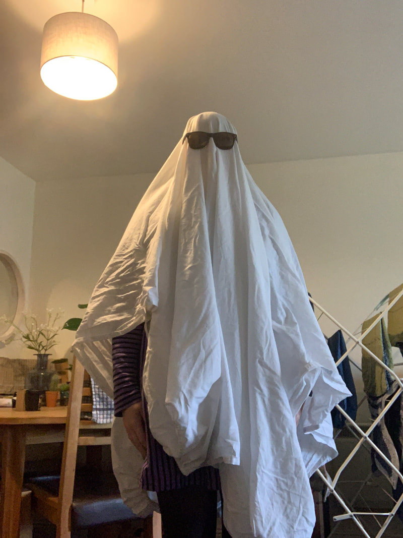
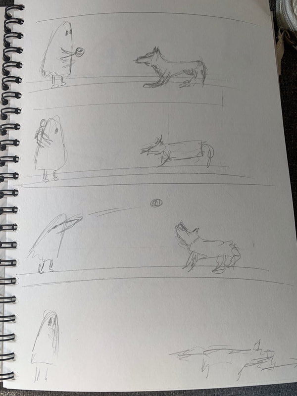
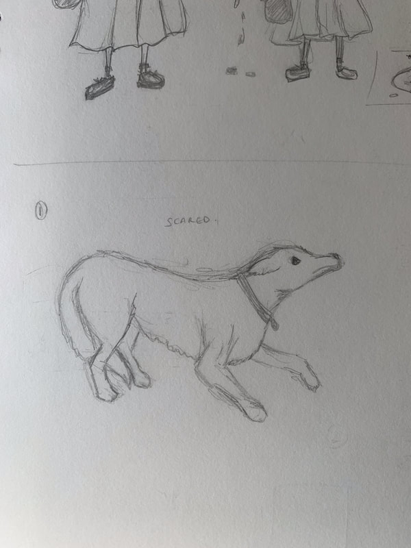
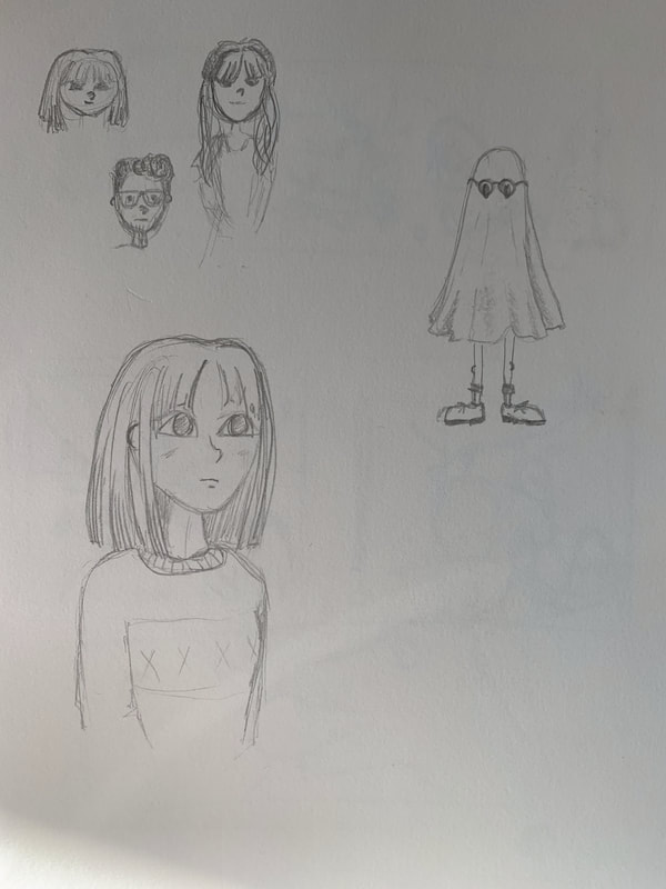
In order to accurately represent character proportions, and understand exactly how the material of the sheet ghost would fall, I ended up shooting some rather amusing photo references...
|

|
|
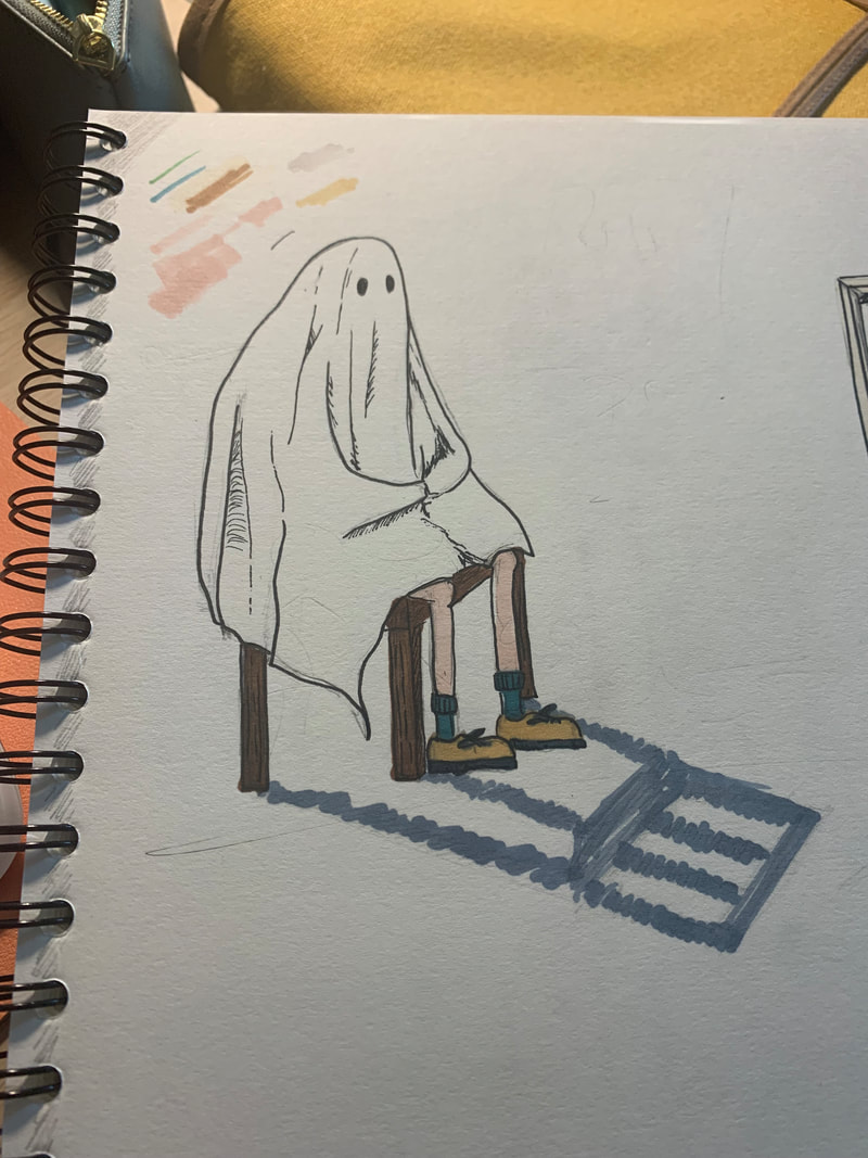
I used the reference images I took to better illustrate my ghost character in different positions. It helped me to understand the physics behind the sheet and how certain shadows would fall. I could then take artistic license to simplify these to create the cartoon style.
|
|
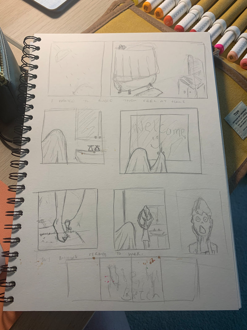
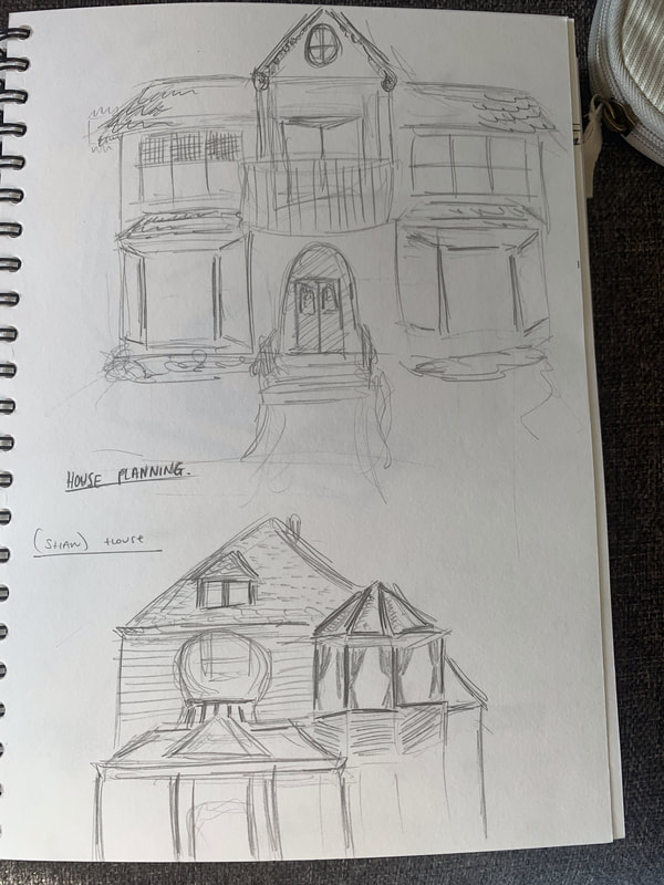
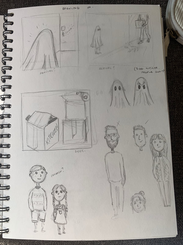
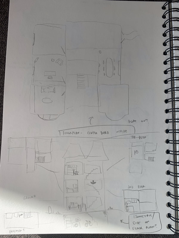
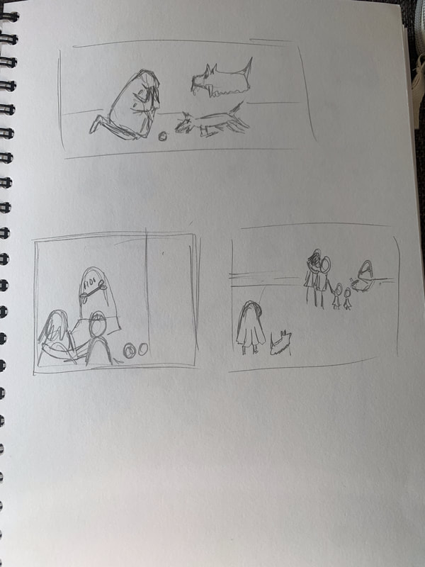
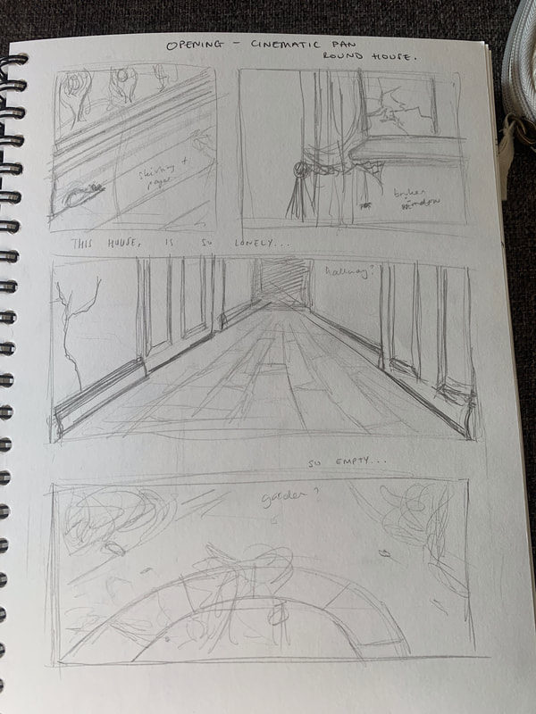
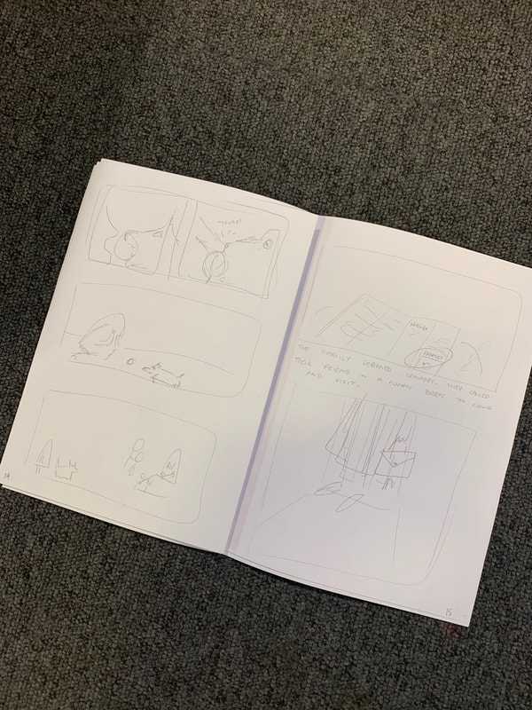
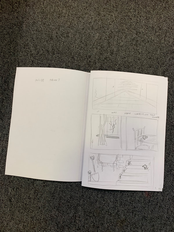
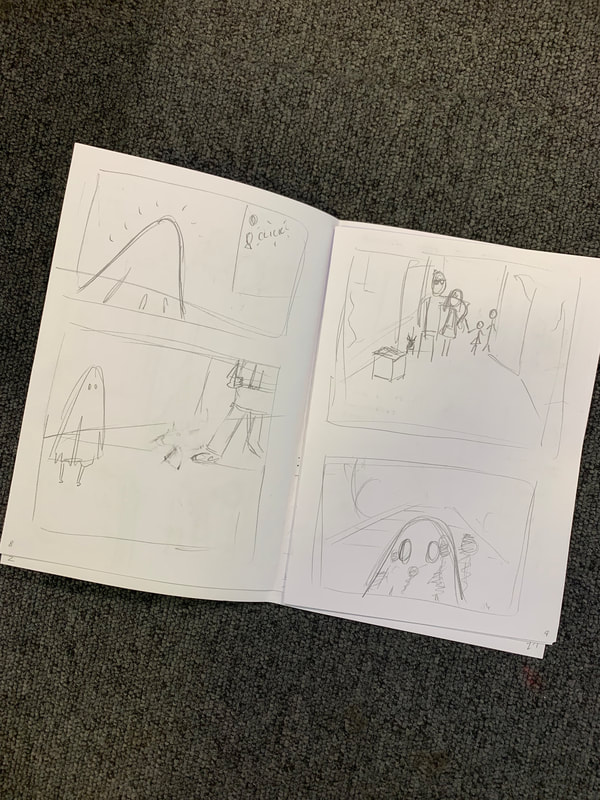
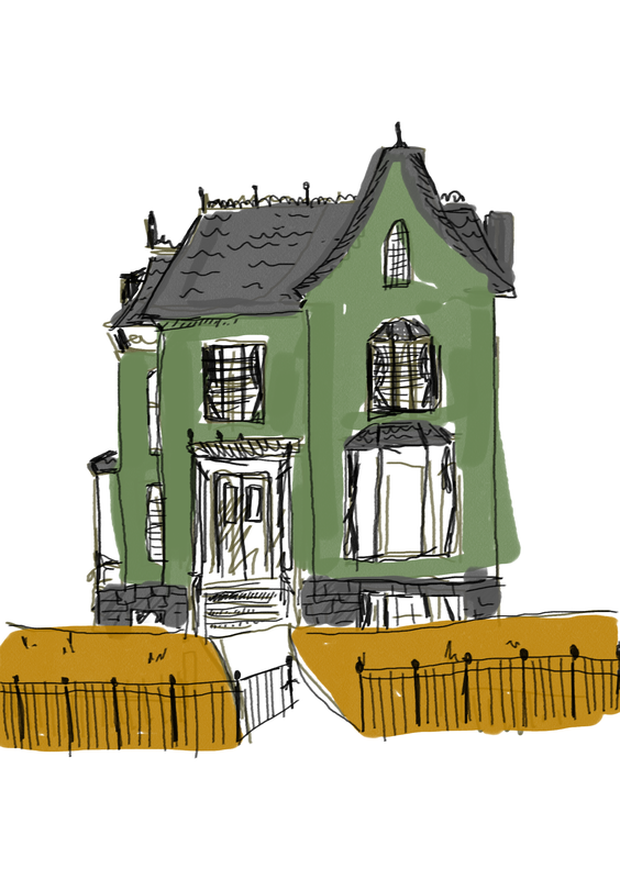
My other initial sketched revolved around the appearance of the family, the house, and styling different panels/mini storylines in small storyboard-esque sprints. My aim was to get down my ideas as quickly as possible for later development. I needed to ensure that I had enough ideas for a complete story, and thinking about key scenarios, or moments in the book that I wanted to illustrate, gave me a starting point to start fleshing out a "plot" later.
|
|
|
|
|
|
|
|
RISOGRAPHIC PRINTING - WORKSHOP |
(PRINT) |
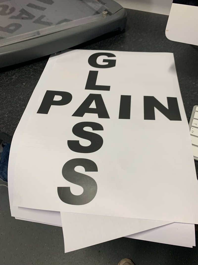
Our Riso workshop was structured so that we weren't precious about what we created, and focussed on the process and the abilities of the printer. We were not allowed to select the colours for printing, and the subject matter of the prints was randomised. Using what3words.com, we generated words based on our home address, and selected one to work with for the "image" portion (layer 1) of the print. I had the word "glass" and found an industrial diagram of a pane of glass. These images were printed in green, before being handed to another student, for them to design a text layer around - with no other stimulus than the image/print itself. this layer was then printed in orange. The prints were returned to us, and we were asked to create another text overlay - to be pink - to finalise the print. These words/phrases were generated from post-it notes that we had attached to the original images - before knowing how the prints/process would work. Being punny - I had "glass pain". I made a huge acrostic to overlay the print, and lowered the opacity when using the Riso printer, so that it overlaid the entire image/text.
The Riso printer similar to a photocopier, and works as an almost electronic-screen printer.
- Each layer (separate colours) is created in black and white
- this is loaded into the Riso machine, and "scanned" - creating a master.
- paper and the chosen ink is loaded into the machine
- when run, the colour passes through the "black" areas and forms the print layer.
-the next layer is used to create a new master, and new colours are loaded.
-the prints are run through the machine again, and the next layer is printed atop of the first.
- the print is formed of these various layers, until the complete image is created
B&W layer master for scanning in

Note: altered transparency/opacity levels in pink layer
|

Final print result.
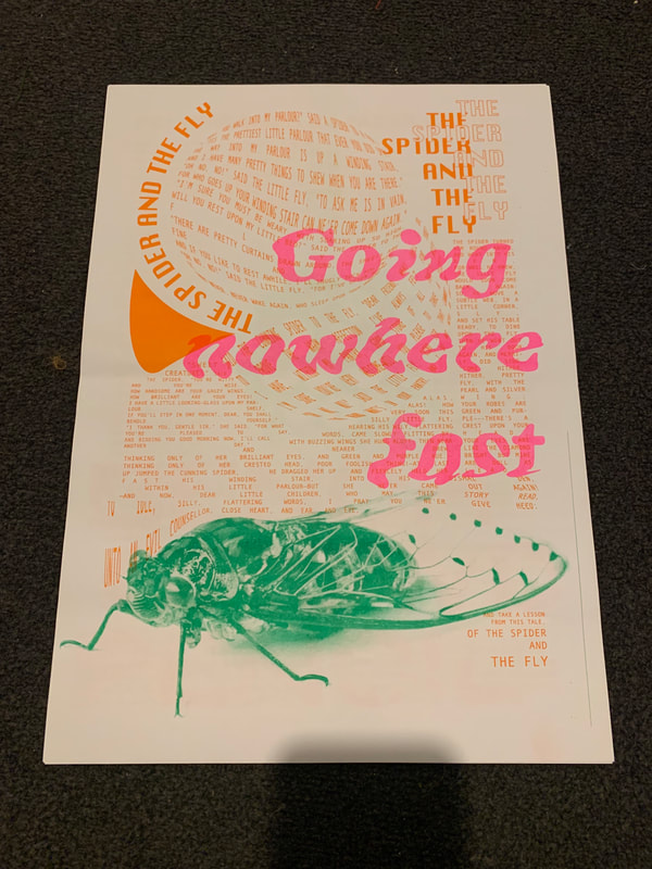
Note: layering and warping of orange text layer to fit against green image layer
|
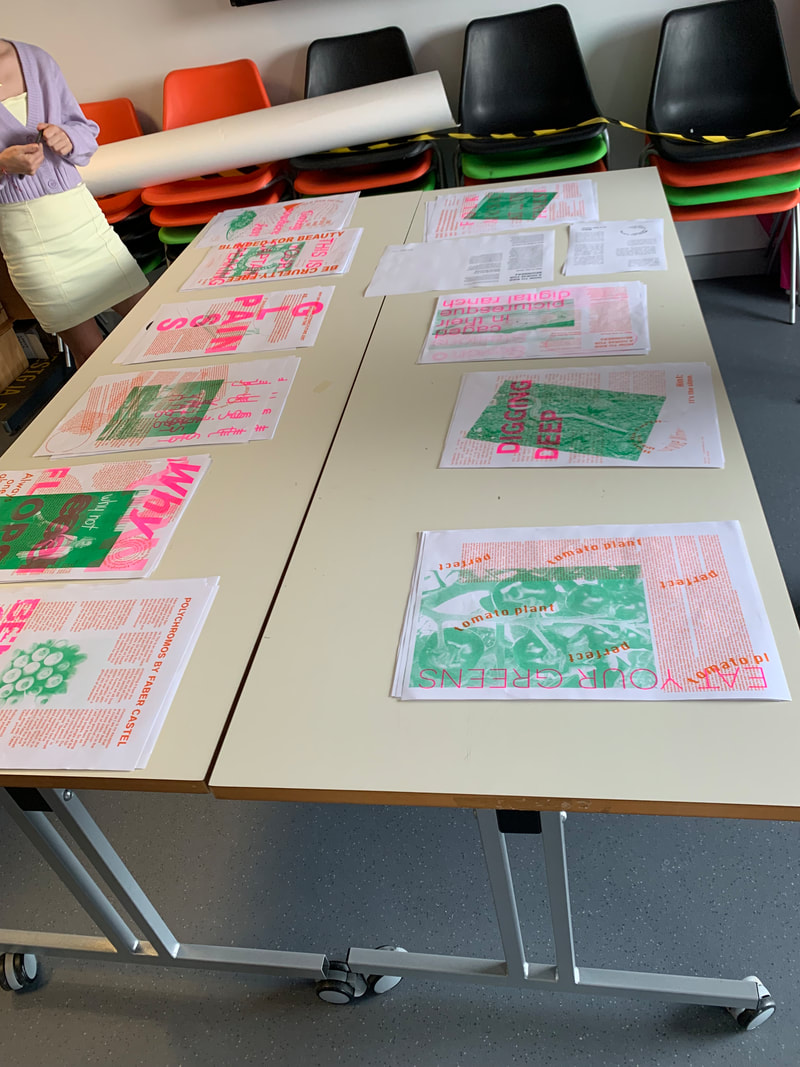
Full class print results
Orange layer created by me to fit around green image.
|
Riso: application for graphic novels

|
|
|
Riso printing is a viable option for printing the pages of a graphic novel, and the quality, unique colourways, and high contrast make it a popular option for creating limited run editions of small scale novellas. however, there are several pros and cons to creating comic artwork with this printing method:
Pros:
- Iconic colourways and neon pigments - instantly stylistically recognisable as Riso
- Connotations with indie market - seen as valuable, artistic, and unique
- High quality finish
- Handmade effect - manual lining up of layers/pages - labour of love
- illustrations/layers are scalable to desired paper/print size
- hand drawn elements can be printed - pencil lines/marker colouring etc.
Cons:
- Cannot print edge to edge - a bleed is needed - complications when aligning and binding (no full double page spread)
- for my project - limits colour for animation - difficult to represent Riso colours in RGB/digitally
- Cost of printing significantly higher than simple CMYK litho colour
- Workload increased - layers need to be created for each colour - print needs to be run for each colour layer
CURRENT PRACTICE - AUGMENTED REALITY |
(AR) |
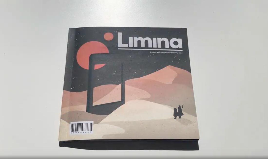
ARTHUR BRADLEY - Limina
Arthur was a previous MA Graphic Arts student, whose project utilised AR animation overlaying print. His focus was on educational, and advertising uses - creating Limina - an AR Magazine. I looked into his work on the suggestion of Stephen in one of our tutorials during this project, and it was useful to understand a) the scope of work created by another student for this and the following module, and b) the style of animation used. Most of his pieces rely on simply position, scale, and rotation of smaller overlay pieces, however, they are incredibly effective due to their interaction/relation to the printed page that they are attached to. Although the purpose or message of Arthur's project was not narrative based, one of his interactive elements was focussed around the idea of comic panels, and storytelling via animation through each panel - changing the perspective of the travel of a small boat, but keeping the subject the same so that continuity of journey was suggested. This was useful to look at, and gave me some ideas for how animation/interaction of AR elements between my own panels in the graphic novel might be used. It is also reassuring that another student on the course has questioned the same practices as I am aiming to with this project - how print and digital media can be used in tandem to create something with a more engaging feel, that will appeal to modern audiences. 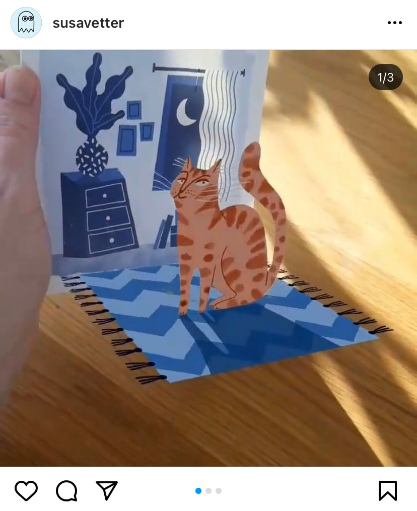
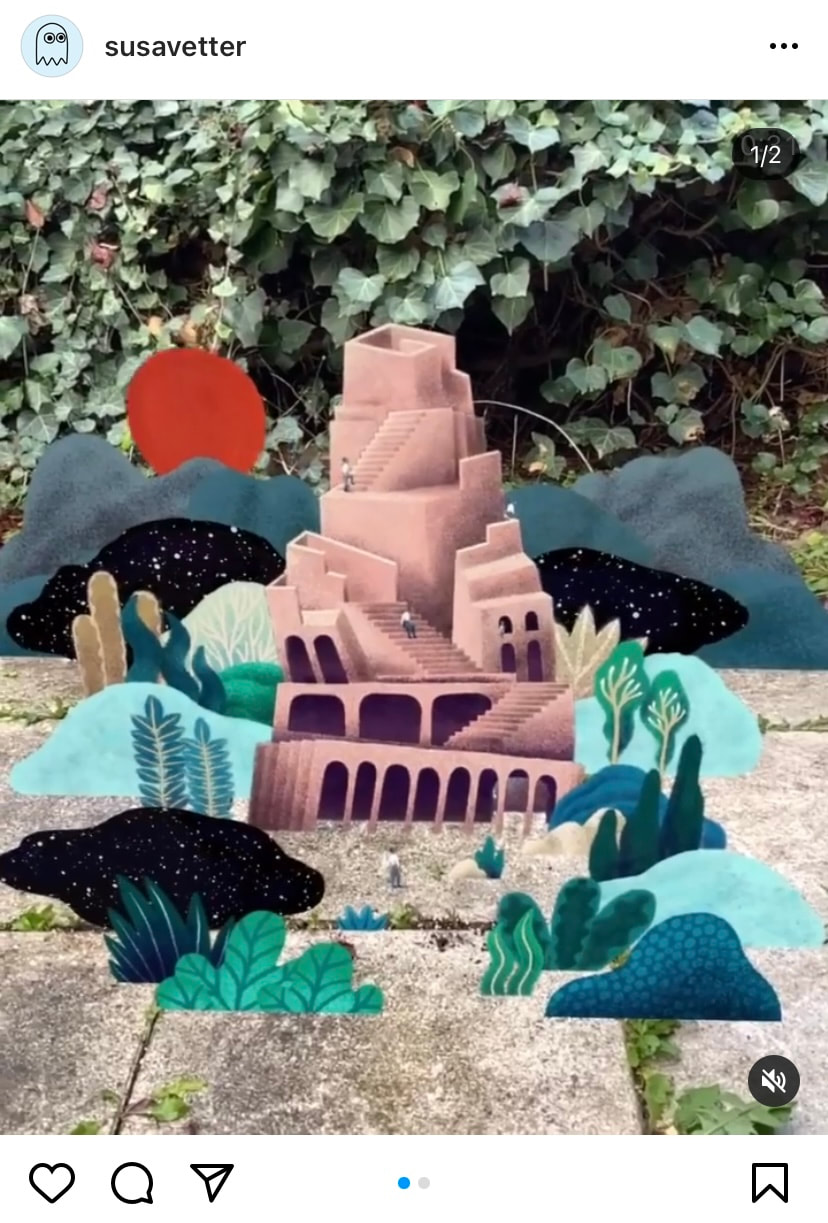
SUSI VETTA
Vetta is an AR artist who creates intricately layered animated artworks primarily in Adobe Aero. Taking inspiration from nature and architecture, Susi's augmented scenes interact with the existing space to create smaller fantasy worlds contained beyond the ability of the human perception. The mystical element to her work gives the augmented experience a magical, or dreamlike quality - the skewed, soft illustrated buildings, characters, and foliage in her scenes gently undulate. Most of her work is very soft, calming, and is built up of several layers placed along the "z-axis" infront of eachother. This layering of "flat" elements makes up the 3-D scene - and creates a sense of depth and dimension without the need for actual 3-D models. It is useful to understand how simulating the 3rd dimension can be achieved without 360 degree renders. Walking around the layers of the AR experience can place the user/viewer in the scene - although there is not a typical 3-D model, there is the ability to situate yourself between layers and interact with each aspect of the build. 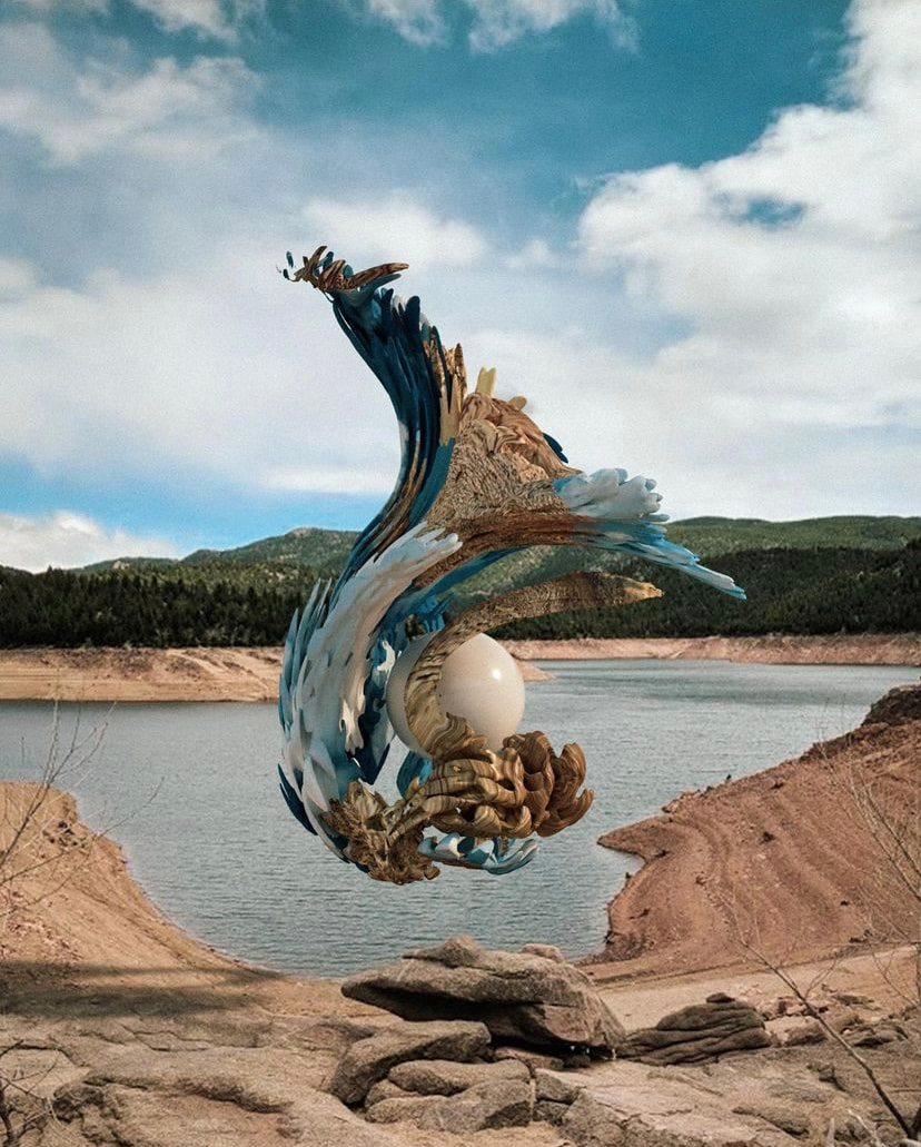
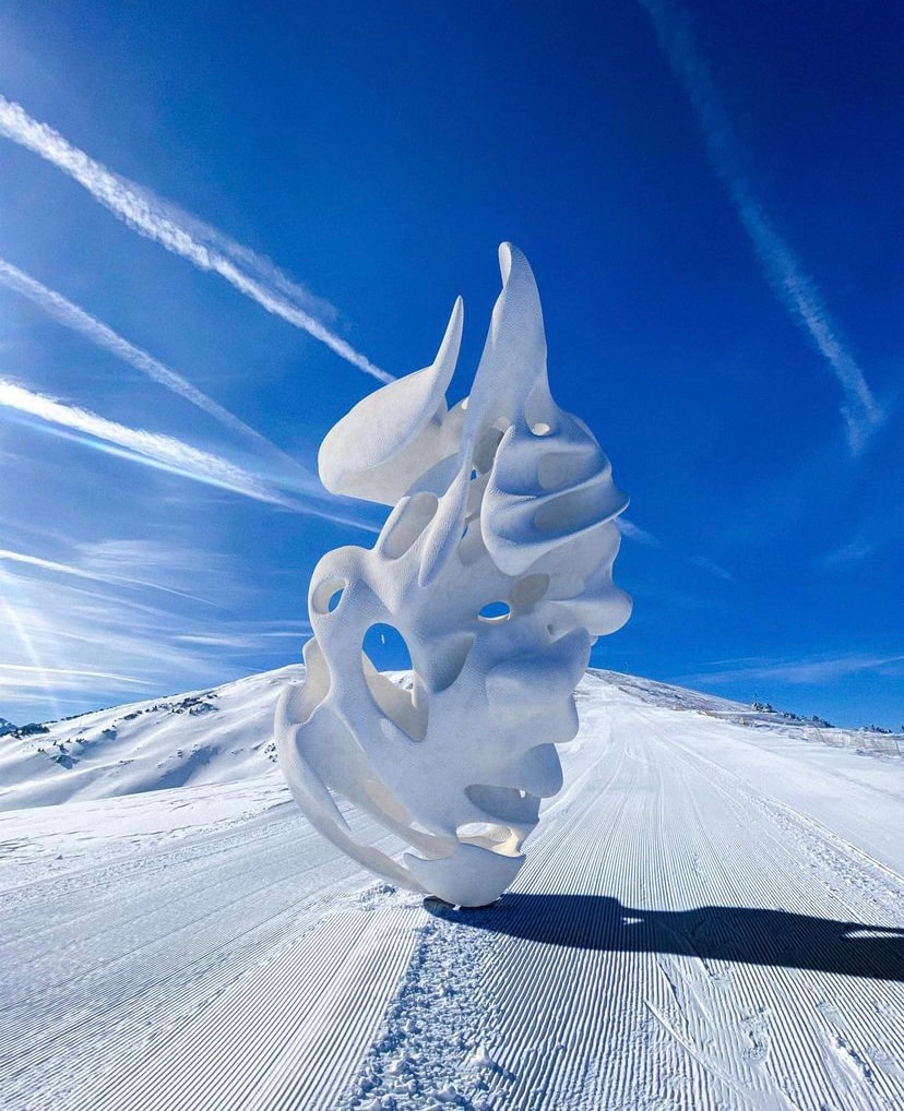
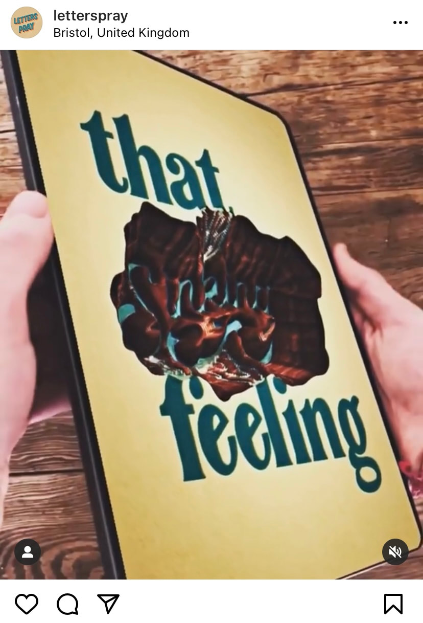
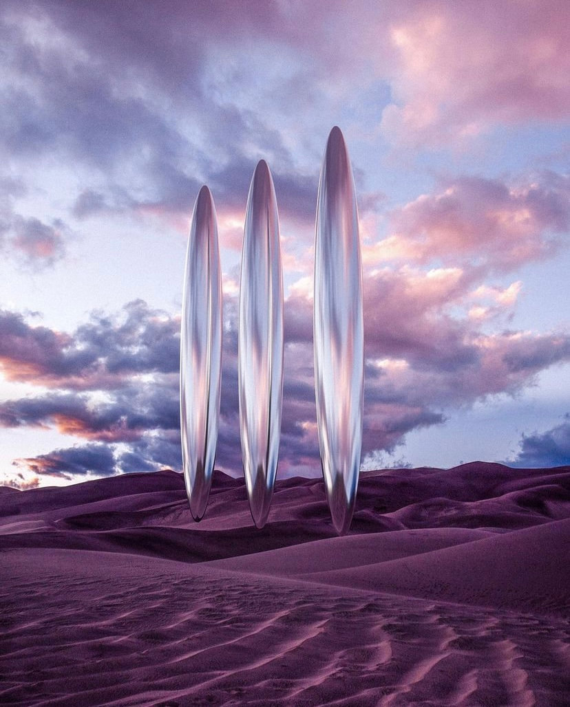
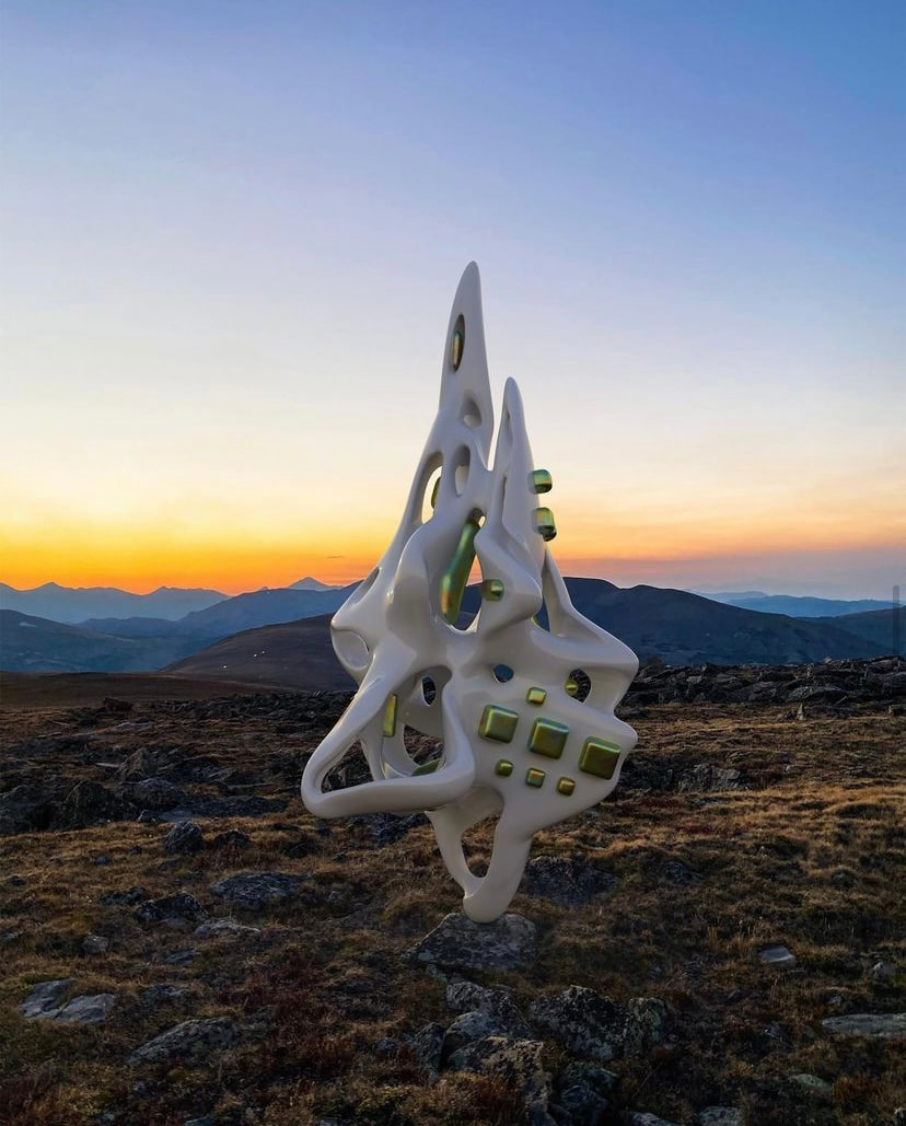
MATTHEW REY TREECE
Treece creates AR sculptures that explore alien architecture and post-modern form, whilst reflecting their natural surroundings colours and texture. The grounding of the sculptures in their settings adds realism to the augmented creations. Despite the viewers brain telling them that they are fantastical, impossible structures, the familiar materials and lighting projection convinces them of their physical stature and presence. In his own words, he "was drawn to augmented reality through a desire to see the manifestation of my imagination fused with our physical reality in a shareable format". Treece's work is an exemplar of how the impossible is made possible through use of Augmentation - his work takes the meaning of Augmented Reality literally - the sculptures ago one step beyond reality, using and improving on the materials and forms that we know and understand. They scratch the itch that audiences have of seeing constant new visual stimuli and extending the mind to problem solve how something is possible. Treece's work is created in Cinema4D and Adobe Dimension, and shared via Adobe Aero. |
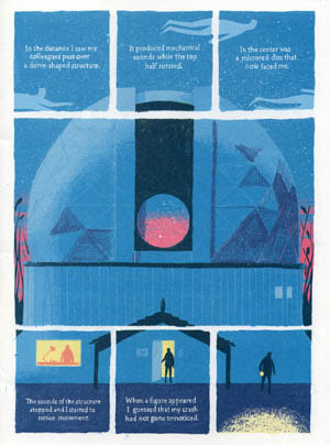
STUART CAMPBELL
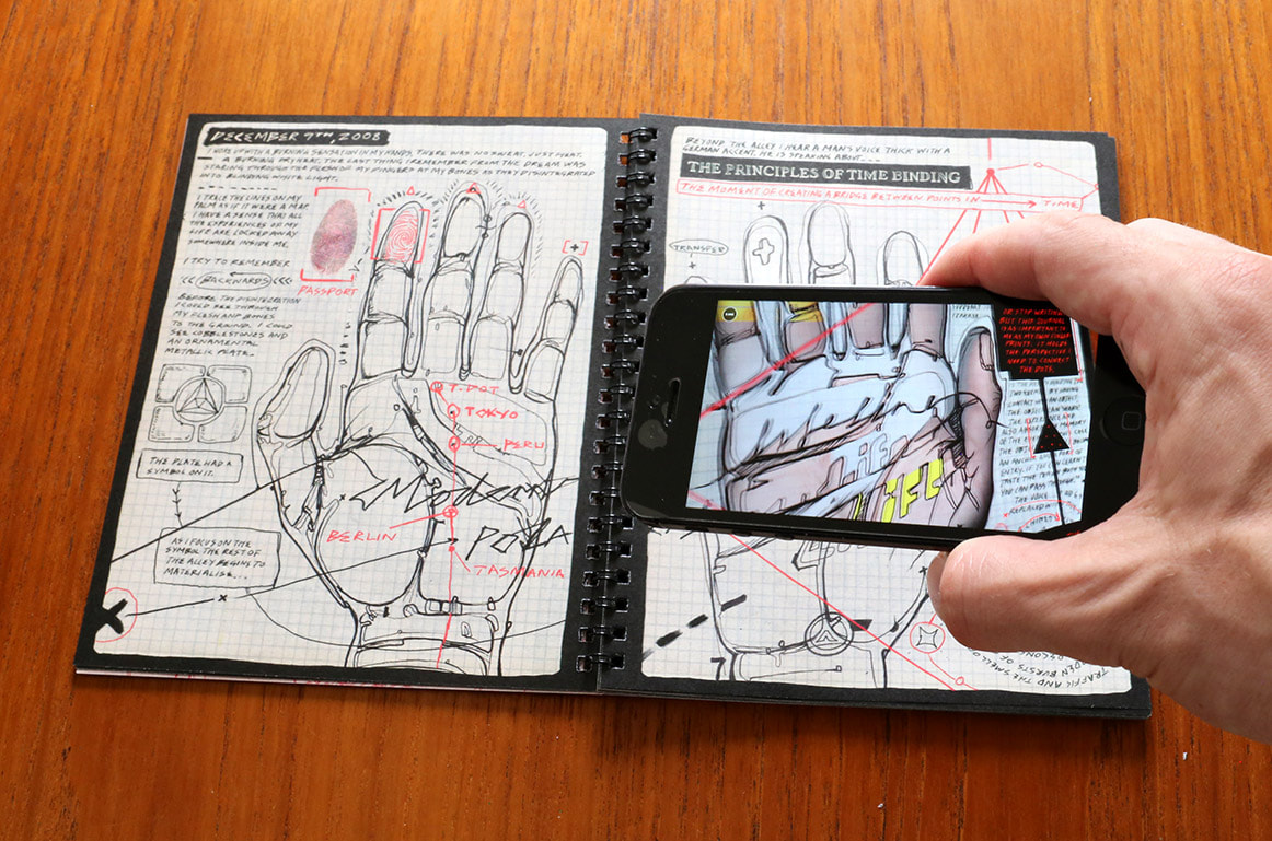
Campbell is an artist that uses AR and VR to curate new user experiences, landscapes, and immersive video and comics that challenge the boundaries between the real and the digital. Modern Polaxis - pictured above, is one of Stuart Campbells interactive comics that captured my attention when I was researching AR technologies available to me for my project, Little did i know that the Eyejacker app was created by Campell, and it is through this technology that Modern Polaxis is realised. In Campbell's own words, "a paranoid time traveller, comes to life as an Augmented Reality comic book. The book is presented as Polaxis private journal. Polaxis writes about his day to day life, but all his secret information, his paranoid delusions and conspiracy theories, he hides away in the Augmented Reality layer." Use of the augmented layer revealing a secret is appealing to a user - it gives an incentive to engage with the app and view the augmented reality - it gives a reason for the AR layer to exist beyond just novelty - it builds the narrative and reveals more of the context to the reader/viewer. The position of the character as a time-traveller also lends a hand to the suggestion of AR tech as a "futuristic", almost sci-fi development - arguably, it is considered a new, novelty invention, that has yet to reach its full potential. the suggestion of it being used in the commonplace - by means of a diary - suggests Campbell's, and indeed my own - hope that it has many great utilitarian and commonplace applications that we should be focussing on. NASA - First Woman
NASA released their first XR comic this year in September, as a recruitment incentive for their Artemis expedition, and to inspire more young women and people of colour to consider applications in the space programme, science and engineering. Using QR codes and a dedicated app, the reader can explore immersive VR and AR experiences, from minigames, to educational videos, to explorable lifesize environments. The use of new technology and video/games to appeal to a younger audience exemplifies the importance of engaging with a new wave of audiences - whose focus is more difficult to capture without the use of the digital aids. they are so accustomed to. The fact that NASA - a global pioneer of science, education, and human exploration are utilising the graphic novel and AR tech to promote their work reflects on it's importance, potential, and suggests it may be a prevalent form of storytelling in the future. Additionally, the choice to create a comic, focussing on a personal, human story to capture the hearts and minds of readers in an effort to garner recognition and applications to their workforce - highlights the power of emotive narrative, and the importance of a story being relatable, or some way connected to human experience. Whilst this project exemplifies what I myself am trying to achieve, and stands as a benchmark of interactive storytelling - it is important to recognise that the scale and budget of it is far beyond my own resources, and so creating something with the same production value, depth of interaction, or seamless utility is futile. It is important to keep my own goals and expectations in line with realistic targets. 
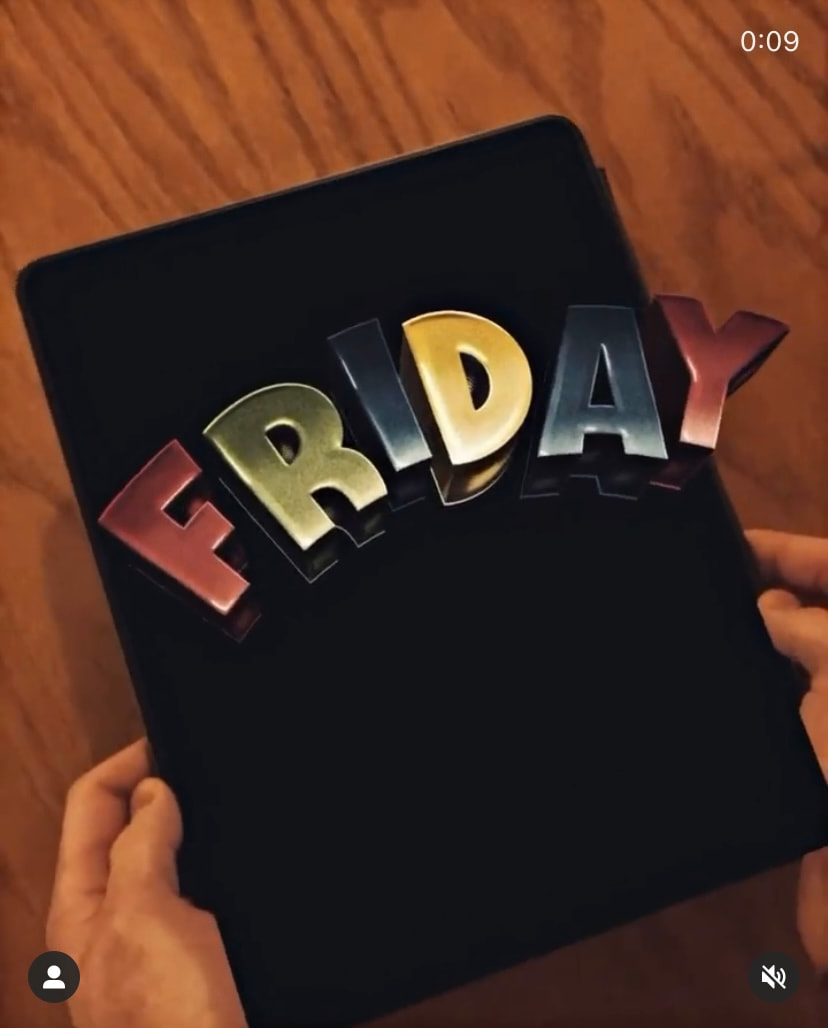
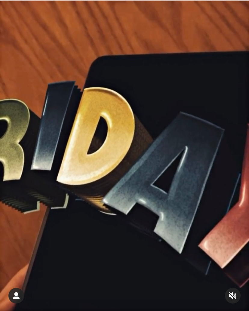
ANDREW WILSON
Wilson is a Bristol based lettering artist who experiments with creating 3-D animated text in procreate. Although most of his work concerns standard lettering, his understanding of depth, shadow, and imitating 3-D letters in signage and illustration lends itself to his work on actual 3-D text in AR. The concept that words aswell as images can be extended in AR expands the possibilities for AR uses in marketing, advertising, and communication. If language can be augmented and transformed in the digital space, it extends accessibility - letters can appear larger, or in a different language, or against a different coloured background - to aid reading. Additionally, making certain words or phrases stand out works in the same way as traditional painted signage, or electrified/neon light signs - it grabs the attention and creates a more engaging read. The use of procreate illustrates another "simpler" way to create 3-D assets than 3-d sculpting/modelling softwares - the ipad software is enabled with the ability to place objects along the z-axis - creating depth - easily, and basic animation options and creation of looping gifs are included. |
testing opensource augmented reality apps
Test 1 - Adobe Aero - Custom Illustration - Stock Animations
|
|
Adobe Aero is Adobe's answer to AR experiences, that can be accessed through the standard CC license and installed on ios or Android. The sharing is limited, and you cannot use QR to trigger experiences for other users - simply - you can simulate augmented elements in the space you are currently occupying/viewing with your camera. The app includes stock assets, and a variety of trigger options/animation that can be applied easily.
This first test was to see how I could insert my own vector illustrations into augmented reality. I created a simple 2-D pumpkin illustration in Adobe Illustrator, and saved as a .png. I then imported this into Adobe Aero, and applied animations based on triggers - making the pumpkin "bounce" and "spin" when tapped. The face of the png isn't tracked, so you can move around the object (you can set it to always face the camera as it moves) - however, it becomes apparent that it is a flat image, which I believe deters from the immersion of the experience - it simply looks as if it is placed over the video, rather than interacting with its environment. |
Test 2 - Zapworks - 1st test with movable trigger image and 2-D text/assets - using QR to launch WebAR
|
Pros:
|
When researching open-source software/apps for AR experiences, I found that Zapworks most accurately covered my initial idea to have QR/triggers on pages that a reader could scan in order to launch the animated overlays of the story. They offer several different options for creating AR experience - including their own £D animation studio, and 3D sculpting tech for more advanced pieces, however, there is a steep learning curve to using and creating experiences with this.
For this test, I was primarily concerned with testing the printed QR code as a trigger. The Qr code launches the web app via a link, which opens the users camera, and displays the augmented reality elements. I used the built in studio to add simple text, image, and video overlays. I was not concerned with the content, but the functionality. Cons:
|
Test 3 - Adobe Aero - Trigger image (Illustration) as anchor - 3-D Stock Asset
|
|
This was a simple test that combined aspects of the previous two. I wanted to test out Aero's anchor to page/image function, and explore how 3-D assets appeared through the app - as I was unsatisfied with the view of the 2-D illustration from the previous test.
I used a page of my sketchbook as an impromptu trigger and anchor - the illustrated elements made is easily recognisable to the camera. I then positioned one of Adobes stock 3-D models (an armadillo) onto the page, and explored how this interacted with the scene when the camera and the page itself were moved. There appears to be some glitches in the positioning and angle of the 3-D model when anchored to the page, it is unsure of the angle of the flat surface, and when panning the camera, it struggles to keep up with the viewfinder. It fails to hold its position well when the page itself is rotated, and even when the camera is moved, it jumps between perspectives. This makes the model seem unrealistic, and does not make for an immersive experience. Whether this is due to the anchoring, or the 3-D model itself requires further testing. |
AR TESTING NOTES - working out usage, reasoning and limitations
- Limitations with working with AR
- Opensource software - limited to 2D. imagery sits ONTOP of trigger image - not integrated with the trigger. Moving the ghost IN BETWEEN comic panels would be impossible. Option to lift entire illustration "UP" - but then lose the interaction with the original physical option
- Free softwares - limitations with views and acess - if the user has to go through several pages to view the interaction on a web based app, this is a deterrant.
- 3d modelling - better CPU needed to render in 3D and play with animation.
- What is the purpose of adding AR? It is important to think about the interaction with the physical, printed book, and how it contrasts this. The AR and animation should ELEVATE the experience of reading/using the graphic novel
- The environment/ sense of atmosphere alters when immersing a user in AR. I want to attempt to use this experience to further the story. I.e: make it a clue solving/finding game. The goal is to make the user WANT to go beyond the physical copy of the story, and make that experience rewarding, in more than just the sense of novelty.
- What changes when using AR/viewing the AR? - Considerations need to made surrounding how animation/imagery alters when, for example - pages are turned? How can a user/viewer interact with the augmented reality - is there a need to constantly rescan QR codes or does each page easily trigger overlays?
- In terms of making the AR Experience/User experience more immersive, I need to think about whether there will be further "calls to action "included in the augmented reality - for example links/buttons/find out more?
- Usage of the AR/Call to action are much more obvious/prevalent in marketing print, and more easily utilised. It is possible to add links to web/discounts/games etc. , driving a consumer to a product. It is also utilised as a way to add brand recognition - things that go viral or are novel/ "cool" get talked about.
- Currently - my focus has been on simply implementing the AR, without much thought for the user or WHY this is an important development for the printed book. Essentially, I was planning on AR being a novelty - a fun "spot the ghost" addition. It exists effectively a movie/animation trigger by the physical pages - but there is no real incentive FOR the AR.
- I want to think more about the purpose of the AR overlay as a storytelling medium. I understand it's uses in marketing, games, and for novelty, but I want to try and highlight its potential as a narrative tool, in as much as a way that graphic novel format is an alternative narrative tool.
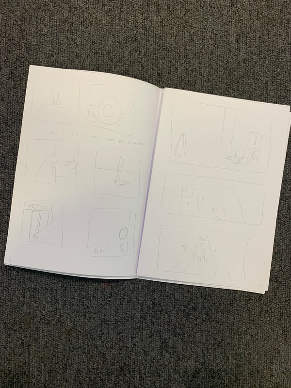
storyboarding, chronology & layout
My initial plan was to create a 24 page graphic novel, with covers, in the 17x23cm format of the Nobrow publications that inspired my work. However, due to the scope and timeframe fo the project, and the increased workflow involved in animation, modelling, and implementing AR tech, this was overly ambitious. In order to reduce my page count, I needed to edit my story into manageable panels that conveyed the entire narrative, but took less time to get there. The simplest way to do so was to rough storyboard everything into a mini mockup of the finished "book" until I was happy with the fitting. Below are several simple A5 prototypes for working this out:
|
|
|
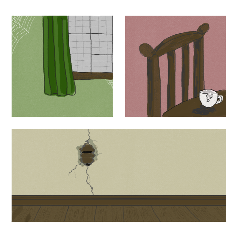
digitising & colouring panels
With the AR elements of my project being formed in the digital space, it made sense for my illustrations to be primarily digitally formatted. Instead of illustrating a full "page", water-colouring it physically, and then importing in photoshop for edits, I instead decided to work in panels, and leave all colouring to be done digitally. This allows me to move panels around later, quickly change colours of objects and scenes, and separate layers and colours for animation. I wanted my personal style to shine through, so I still physically drew out each image, using pencil, and then fineline/artists pens to create the line work.


|
|
As highlighted below, each component of the image is separates onto a different layer in Photoshop. My process involved photographing or scanning in the original linework image, and then duplicating this onto a new layer, upping contrast and altering Levels, before removing alpha from anything other than the lines.
For each "item" I used the selection tool to mask the outlines, and then used custom brushes to watercolour the fill on a new layer beneath the line work. When separating for animation, I will clone the outlines of each item, and merge into a singular layer. This way I can rig and animate different features in the image, and use them as an AR overlay. It also allows for simple editing of colouring, and the option to alter smaller components in an image, rather than having to redraw or recolour the entire panel.
For each "item" I used the selection tool to mask the outlines, and then used custom brushes to watercolour the fill on a new layer beneath the line work. When separating for animation, I will clone the outlines of each item, and merge into a singular layer. This way I can rig and animate different features in the image, and use them as an AR overlay. It also allows for simple editing of colouring, and the option to alter smaller components in an image, rather than having to redraw or recolour the entire panel.
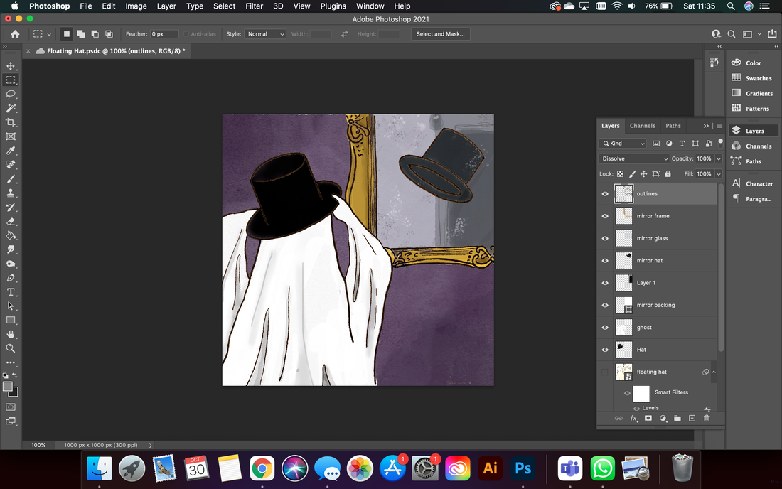
animation causing problems...Although drawing the panels traditionally, and reusing the outlines in photoshop seemed like it would cut corners, I ran into issues later when trying to animate. Namely - when objects moved, there was blank space, or gaps "behind" where they originally were , or lines were left unfinished (see video: right - corner of mirror, and space behind ghost). In addition the colour and definition of the outlines became increasingly spotty, and was not as polished at I would like it to be, or for it to work effectively in the digital space. I soon realised that I would need to create all of my illustrations in entirety digitally. The colouring process would remain the same, however, all outlining would need to be repeated (i.e: traced from the original pen drawing). Additionally, my workflow is further increased by the fact that my digital illustration is naturally slower than putting pen to paper - due to its unfamiliarity, and the superfluous options when it comes to materials, effects, and fills.
|
|
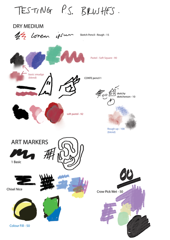
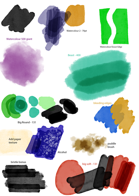
For this reason, I explored different brushes and textures and noted them on a page for later reference (see below). I am leaning towards using pastels for most colouring, as they give the soft, almost bleeding edge that stylistically I would like, yet form a rigid enough line to be able to mesh warp and animate easily.
If I can find the correct brushes, and get more comfortable with working on digital illustrations I may forgo traditional sketching altogether, and work directly in photoshop through storyboarding, to roughs, to final illustrations. My process will develop as I create more pages/panels for the book.
If I can find the correct brushes, and get more comfortable with working on digital illustrations I may forgo traditional sketching altogether, and work directly in photoshop through storyboarding, to roughs, to final illustrations. My process will develop as I create more pages/panels for the book.
|
|
the book: thinking about form, function, and physicality |
(Print) |
Whilst I had been focusing on the digital aspects of my project (namely because they were new technologies to me and I knew that they would require more of my attention and time) I had failed to consider the importance of the physicality of a printed book, and the process behind its manufacture. I had some important questions to address regarding producing a quality, printed piece of media, and I needed to consider exactly what the message of producing a printed artefact was, how I intended it to be received, and how it's form and properties influenced this.
My research revolved around the object of the book, its place in history, and the importance of narrative. How the book as a physical form could impact story, reader perception, and the difference in approach between written word storytelling and graphic/comic story telling. The following are key quotes, and summarised notes on some of my more theoretical reading:
There are countless forms of narrative in the world. . . . Moreover, in this infinite variety of forms, it is present at all times, in all places, in all societies. - Roland Barthes.
- Storytelling changes based on culture, history, invention, etc. It is open to evolution.
- Barthes named 5 semiotic codes to deciphering text, that are important to think about when storytelling in order to create a compelling narrative. In simplified terms, they are:
- Hermaneutic - anything mysterious/unanswered in a text - leads the reader through the story in "clue like" fashion. builds tension and intrigue by posing questions. structural - must be read in order to make sense
- Proairetic - structural action that propels the reader along the story. every action implies that there will be another action - the readers anticipation of this makes them read on. Similar to cells in a comic strip - each cell stands alone but works in tandem - as a culmination with/of the one before and precursor of the action/cell after.
- Semantic - contains connotative information to the text, do not need order or structure. e.g: rather than saying "the man was very wealthy etc." the story would mention the man's brand new Lamborghini.
- Symbolic - organised systems of connotative elements. Antithesis (two opposing semes) and Paradox (opposing semes brought together by the narrator) considered Barthes most important symbolic codes.
- Cultural - elements refer to accepted bodies of knowledge: e.g: Science. Meaning can be lost when writer relies on knowldge that they believe to be common, but is actually historically/culturally specific.
What is a book? A book is an experience… A book starts with an idea. And ends with a reader. - Julie Chen & Clifton Meador, How Books Work.
- The book as a concept that is grounded in the user/reader
- books are written and published with the purpose to BE read - to disseminate knowledge/ to spread stories
- If the purpose is to story-tell - this should be made as easy as possible through form
- The majesty, or value in Print media. The rich history, and connotations with quality, reliability, and recognisability - captures my desire to have my project grounded by the printed novella (rather than create something purely in the digital space). I aim to pay homage to the physical book.
- Historical function of the book versus audience perception, changing opinions through time, and contemporary augmentations - by using the digital with the physical - I am exploiting creative potential - pushing the boundaries of translating an idea to a literal experience.
The page is a powerful interface between designer and reader, flexible enough to respond to a variety of demands while remaining comprehensible and communicative. - Bonnie Mak, How The Page Matters.
- The page as a deliberately DESIGNED object - and how we can alter this.
- Communication and understanding as the pinnacles of storytelling/ printed word.
- If the audience cannot understand, and gain something/learn something/feel something from the book, there is no point in it.
- The sequential nature of the book, the commonly accepted format of reading present now has not always been so
- Historical Context: Began with scrolls - to wax tablet - to codex - to "book" now
While contemporary books seem to come in all sorts of proportions, out associations with size reflect its role in the codex's early days: a large book, whether in dimensions or heft, suggest value - Amaranth Borsuk, The Book.
- Size of the book, the pages, and the weight/quality of the paper influence how the reader feels about it
- Physical materials of books translating their importance/social status historically:
- e.g: paper/ parchment versus vellum. Gold foiling. Leather of cloth backs.
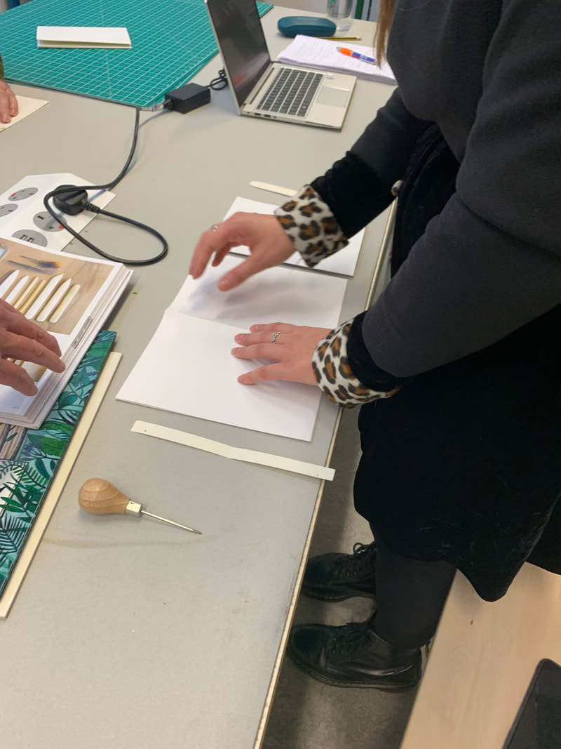
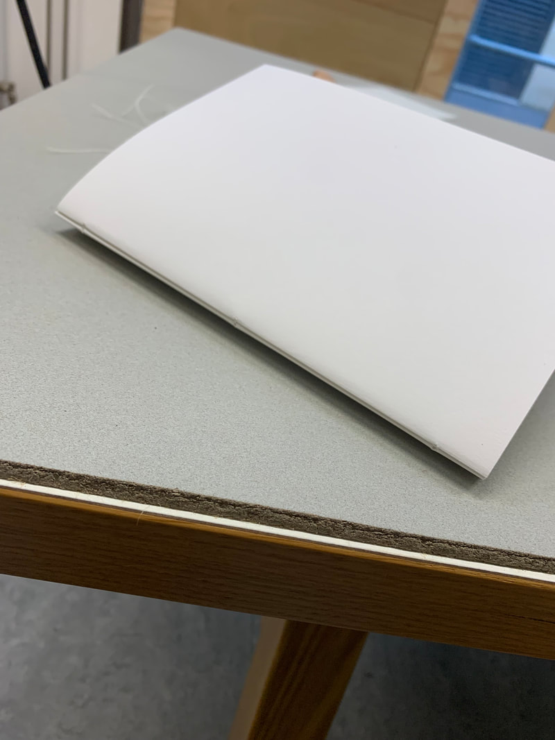
book binding - workshop
I booked in some time to see Tom Abba in the interdisciplinary publishing lab at Bower - a new department set up that specialises in publishing print books, book binding, and exploring the intermingling of digital and print forms. We discussed my project and plans for the AR graphic novella, and Tom's suggestion was to focus on the form of the book primarily - and allow any interaction, or user experience, to be influenced by this. This coincided with my reading and research into printed media - and how form begets function. I realised I needed to make the following decisions when considering creating a printed novella:
- Page count and cover options
- Type of binding used
- Dimensions of pages/book
- Grain and GSM of paper
- Order of reading - how the book is folded and what the flatlay would look like
- would AR interactions be triggered/change when pages were turned or would rescanning be required
- this is less of a decision - and more dependant on the software I use - but is important to note.
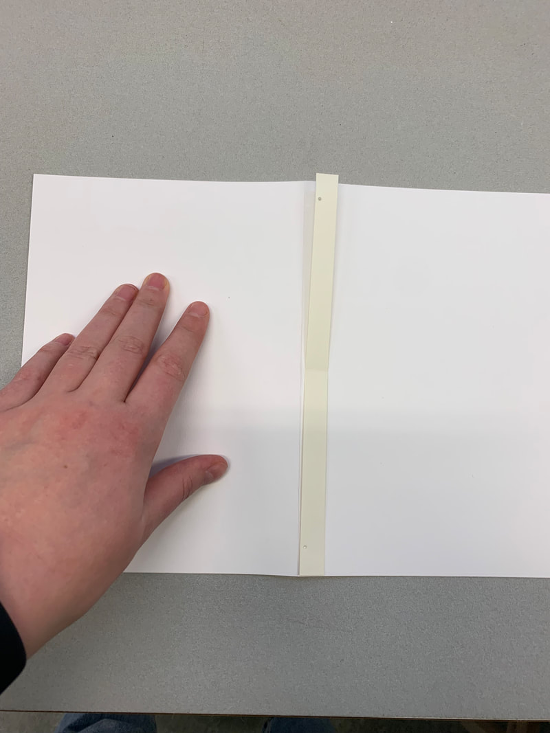
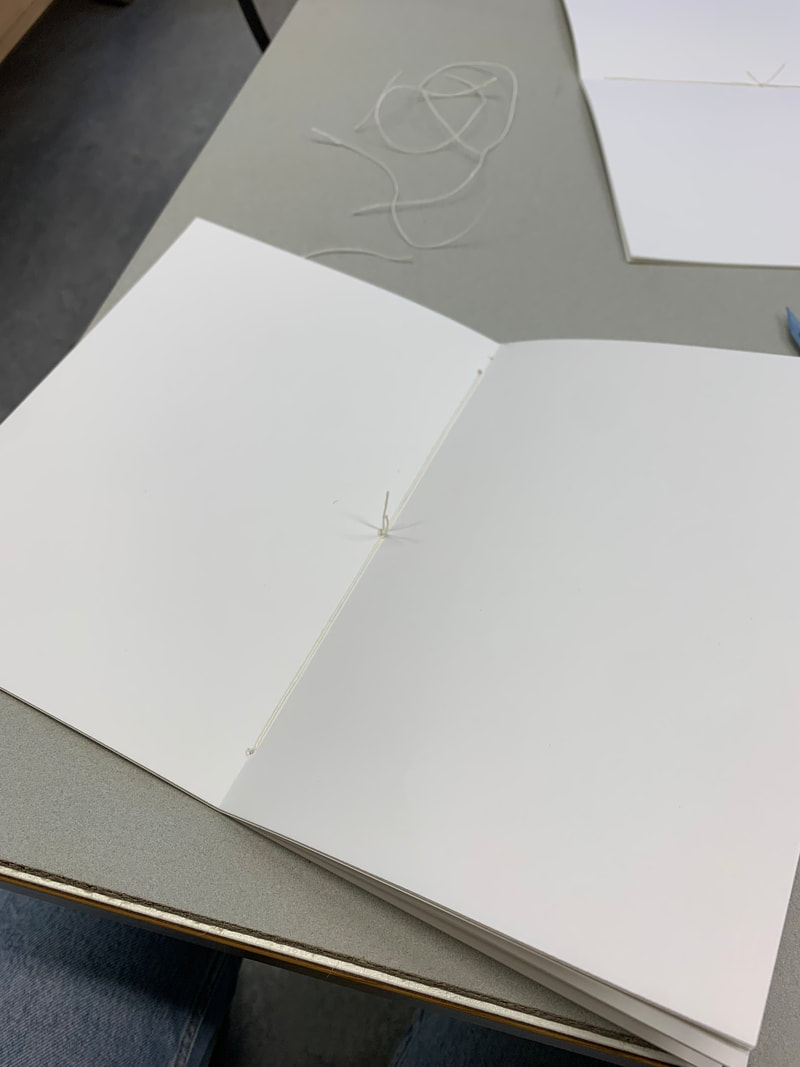
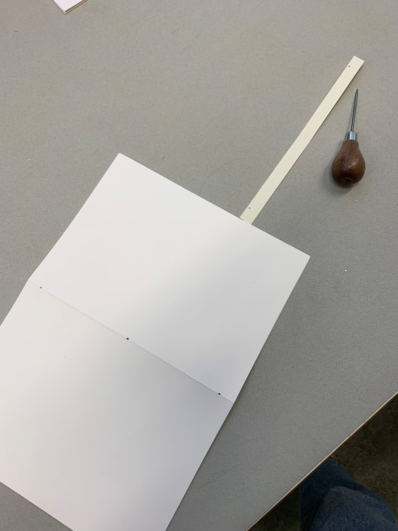
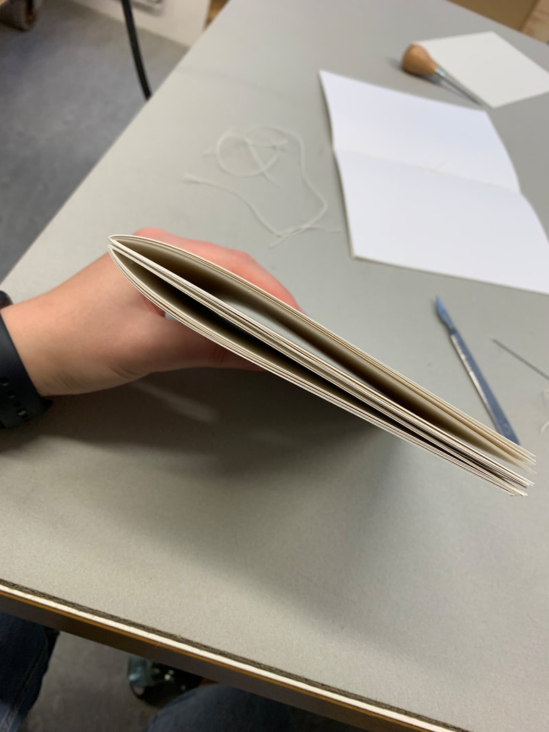
We then did a quick workshop on saddle stitch binding - the most common form of binging for books with under 40 pages, or with thin/low gsm paper. We worked at binding a 24, and a 48 page notebook, and tested 3 different GSMs of paper:
140, 160 and 180.
I learnt to identify which way the grain runs in the paper - important for deciding where the fold should be - and how to fold, puncture, and bind the book. Below are images of the process.
- Page count and cover options
- Type of binding used
- Dimensions of pages/book
- Grain and GSM of paper
- Order of reading - how the book is folded and what the flatlay would look like
- would AR interactions be triggered/change when pages were turned or would rescanning be required
- this is less of a decision - and more dependant on the software I use - but is important to note.
We then did a quick workshop on saddle stitch binding - the most common form of binging for books with under 40 pages, or with thin/low gsm paper. We worked at binding a 24, and a 48 page notebook, and tested 3 different GSMs of paper:
140, 160 and 180.
I learnt to identify which way the grain runs in the paper - important for deciding where the fold should be - and how to fold, puncture, and bind the book. Below are images of the process.
|
|
|
printing decisions: dimensions, quality and audience
DIMENSIONS
Since I wanted the fomr of the book to seem purposeful, and send across the idea of thoughfullness, and aquality to the audince, I need to think about dimensions. It cannot simply be a5 - although this would make the print process simpler. I decided against using a square format or any rounded corners - due to fact of connotations with children's books. I Want it to be an adult GN - and square paired with the illustrative style gives it too much of a jovial, novelty, child-like feel.
for this reason, I am going to stick with the Nobrow 17x23 dimensions - giving it a quality published feel, and a reasonable page width and height for my panels to be situated.
PAGES
My current intention is to create a 16 page graphic novella, plus the 4 covers.
BINDING
I am slightly opposed to having visible wire or thread stitches in my finalised book, which means that I would need to use a Perfect binding - in which pages are aligned at the left hand spine edge, roughened, and glue applied. A separate cover piece is creased, wrapped around the text block, and then bound on or glued on to give a square/clean finish. If I am to use perfect binding, I would need a higher gsm paper to make up the thickness of the book. I also need to take into account the glued seam - so a margin would need to be set on the inner side of each page. this needs to be taken into account for any full double page spread illustrations.
EXPERIMENTING WITH 3-D MODELLING |
(AR) |
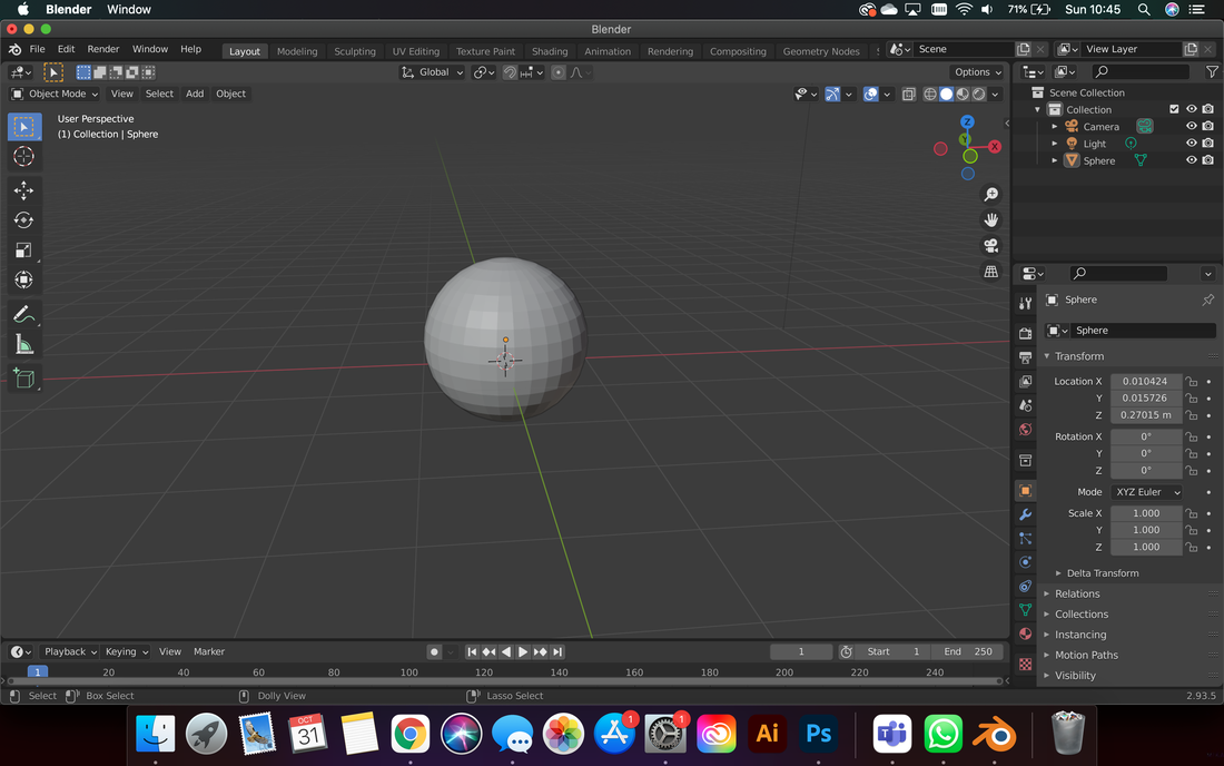
I wanted to explore having 3-d assets that should be anchored to pages in my graphic novel, as I think that augmented reality looks and works better when the augmented images reflect the dimension they are projected into. Being able to move around, and walk around an object makes it appear more tangible, and the user/reader's experience more immersive. Inspired by the 3-D workshop I had taken, I wanted to try and create some 3-D models with software and digital sculpting tools, so opted for Blender - which is open source. The learning curve for the 3-D pipeline is steep; firstly there is another axis to consider when creating any objects or shapes, secondly, the interface of a new software - let alone blender - is overwhelming, and thirdly, the various options and tabs for animation, lighting, rigging and materials mean there are extensive choices and margins for error.
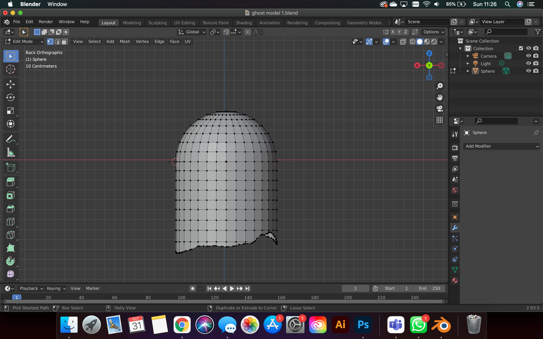
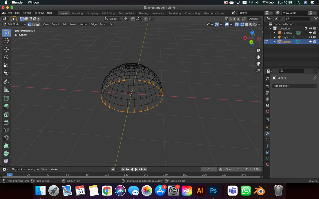
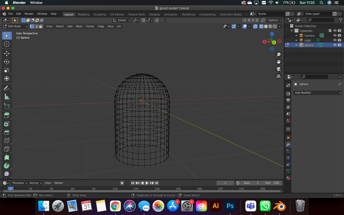
After watching video tutorials and reading articles about Blender's functionality for a few hours, alongside creating simplistic, geometric assets, I worked on creating my first model. Rather than immediately try and recreate my illustrated characters, I simplified the form of the sheet ghost, working from a sphere, and editing the mesh to create an elongated dome. I used the stock mountain landscape to intersect the base, and when sheared, this gave the rough, "torn" edge at the bottom of the sheet ghost. I removed the interior so the shape was hollow and made sure that both sides of the "sheet" were rendered. I then went around and edited the mesh at the bottom manually to randomise the edge further. To create the "eyes" I subdivided the mesh and removed two symmetrical polygons, then applied smoothing. Finally, I subdivided the mesh and selected polygons from both sides of the model end extruded them outwards and down to create two small arms. This created the basis of the model before rendering texture/materials, and adding sculpt.
After watching video tutorials and reading articles about Blender's functionality for a few hours, alongside creating simplistic, geometric assets, I worked on creating my first model. Rather than immediately try and recreate my illustrated characters, I simplified the form of the sheet ghost, working from a sphere, and editing the mesh to create an elongated dome. I used the stock mountain landscape to intersect the base, and when sheared, this gave the rough, "torn" edge at the bottom of the sheet ghost. I removed the interior so the shape was hollow and made sure that both sides of the "sheet" were rendered. I then went around and edited the mesh at the bottom manually to randomise the edge further. To create the "eyes" I subdivided the mesh and removed two symmetrical polygons, then applied smoothing. Finally, I subdivided the mesh and selected polygons from both sides of the model end extruded them outwards and down to create two small arms. This created the basis of the model before rendering texture/materials, and adding sculpt.

|
|
|
|
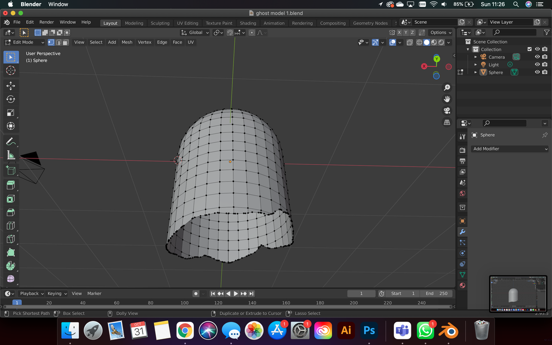
In exploring the multitude of tabs and options on blender; attempting to find the texture properties, I found the sculpting window/console. To learn the tools and to complete my model, I went through each individual sculpting tool, and applied them to my smooth model, noting what effect each took for later reference. I managed to warp the shape of the cloth to create folds/ripples that mimicked my original illustrations, and added more volume at the back of the ghost so that he was no longer perfectly symmetrical. Once I was happy with all my manipulations, I exported my final model, below:
|
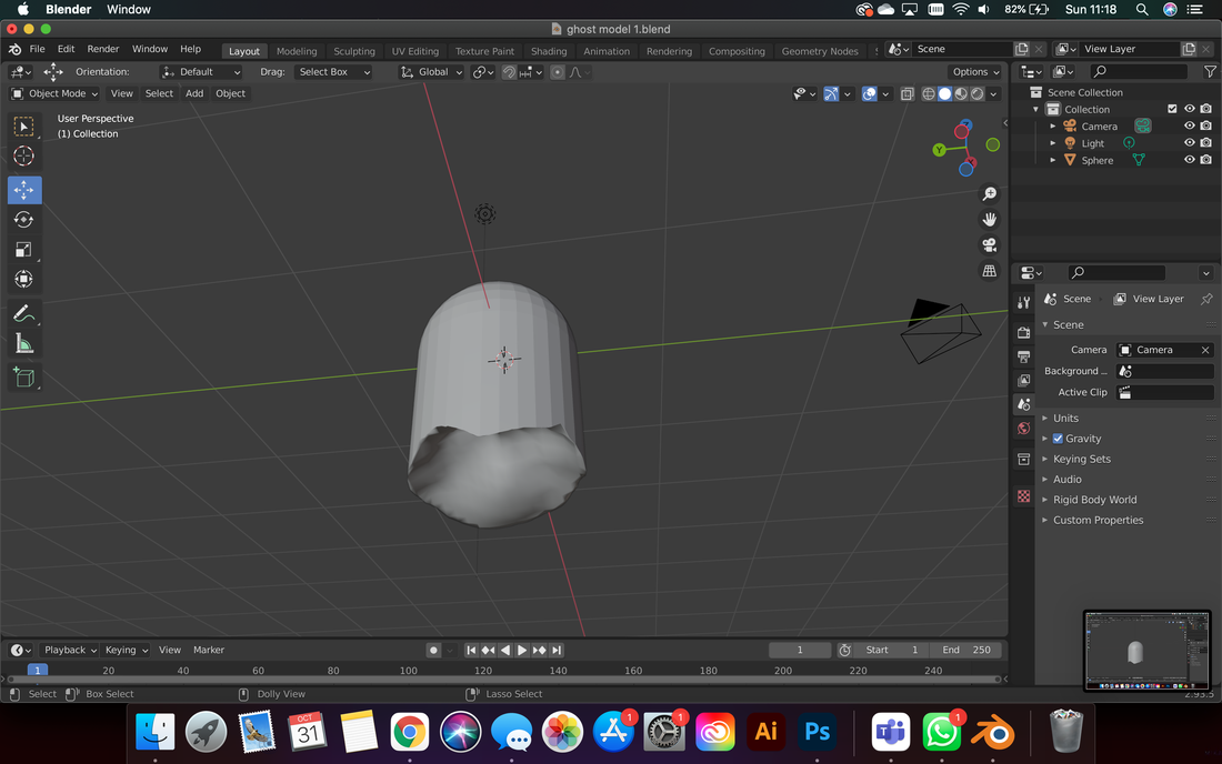
At this point, I had a smooth, simplified but recognisable ghost model that was hollow (left). As I had been following several tutorials to create a model, unknowingly, the "cloth" properties I had applied to the model actually only applied to animation in blender. Rather than simply being a texture render, (as I had expected), this meant that when my ghost interacted with another solid, it would crumple - as a cloth sheet would do, and disappear from the screen. I tested this (below) - adding a new solid - and creating an animation path to drop the ghost onto a platform. You can see that on impact, the cloth at the top of the ghost starts to rumple. I have tried adjusting setting so that a) the ghost doesn't disappear and remains in a heap on the platform and b) the cloth creases more dramatically, but I cannot troubleshoot it and get it to work. Since I have no intention of animating in blender, I chose to leave exploring these options, as they were not a productive use of my time for this particular project.
|
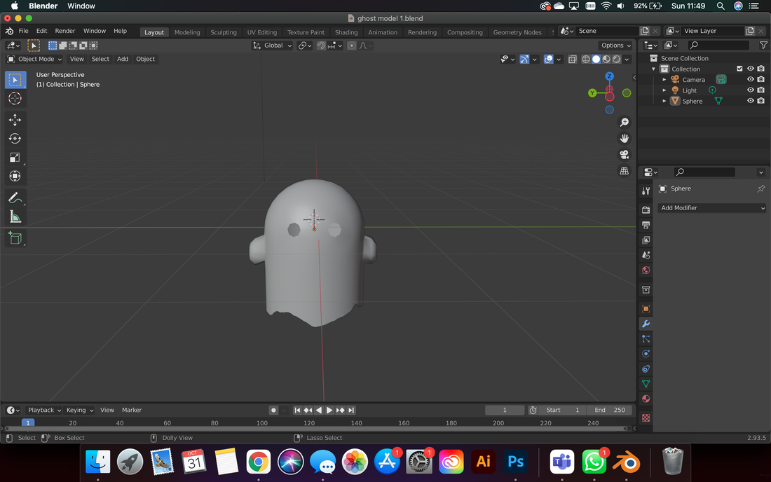
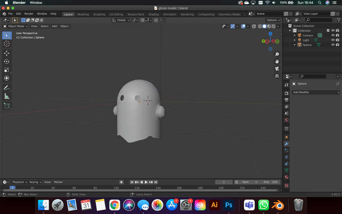
Final Model - Ghost Model v.1.0:
integration with AR
once I had a model created, it was time to place it in Adobe Aero to test the visualisation of it in an augmented reality space. I added the standard pre-programmed animation avialable in Aero to make the ghost hover and bounce repeatedly, and then filmed 3 scenarios and scales to show the positioning of the model, and the ability to edit the size and placement.
|
|
Results of first model and AR interaction testing:
|
second 3-D model and executive decisions
Now that I had a basic grasp on blender and its tools, I set about creating another model, this time with more detail, and a more accurate representation of my Hubert ghost character - legs, shoes, and colouring included. In attempting to make a second, more detailed model, I ran into many difficulties, that made me realise that 3-d modelling my assets would not be a viable option for me for this project. In order to learn the software well enough to render realistic, immersive models that matched my illustrations, I would need a much larger timescale, and better computing power at my disposal.
Final Model - Ghost Model v2.0:
|
Blender: Work in progress model - creating the "legs"
|
Testing AR - putting the model into Aero
|
Although I was pleased with my second model and the skills I had learned, it was best to abandon Blender after this point, so as not to focus my time on progressing something that I would inevitably be dissatisfied with in the final product of the project. I considered having one singular model as a standalone interaction/extra for the novella, but I believe this would detract from the continuity, and cohesive styling of the project. It would be better to have a consistent theme across my project, and to execute it well, rather than have a poorly executed example of more complex tech.
For example, although I created the model with both feet facing forwards - when exported (as seen above) one of the feet is attached upside down and backwards to the leg. I have no idea why this has happened, as my original model does not appear in this way, and when imported into Adobe Aero for AR testing, the model appears correctly. Additionally, I had the same issue of rendering colours, textures, and lighting to look realistic and not "smooth and shiny" - which brings the model out of immersive/reality.
For example, although I created the model with both feet facing forwards - when exported (as seen above) one of the feet is attached upside down and backwards to the leg. I have no idea why this has happened, as my original model does not appear in this way, and when imported into Adobe Aero for AR testing, the model appears correctly. Additionally, I had the same issue of rendering colours, textures, and lighting to look realistic and not "smooth and shiny" - which brings the model out of immersive/reality.
ANIMATING PANELS FOR AR - production tests
With 3-D modelling all but eliminated for the project, I went back to using 2-D animated projections as my augmented reality experiences. With Eyejacker being created by Stuart Campbell for his own AR comic, I thought it would be the best program to create my animated overlays with - it targets the trigger image, and displays the augmented reality in the app. The user would simply need to have the app downloaded, and then each page/trigger would automatically load as they moved through the book - without need for constantly scanning QR codes on individual pages.
To begin testing this, I created a simple vector image inspired by one of my storyboard panels - the smashed vase. I used Illustrator to create the vector illustration, so that I could easily and quickly manipulate the layers/elements in after effects and animate them more efficiently without worrying about colouring/linework/ all of the issues I had previously run into when testing my digital illustrations; the purpose of this test was to see the functionality of Eyejacker, not the quality of my illustration.
To begin testing this, I created a simple vector image inspired by one of my storyboard panels - the smashed vase. I used Illustrator to create the vector illustration, so that I could easily and quickly manipulate the layers/elements in after effects and animate them more efficiently without worrying about colouring/linework/ all of the issues I had previously run into when testing my digital illustrations; the purpose of this test was to see the functionality of Eyejacker, not the quality of my illustration.
|
|
Above is the trigger image that I created for the animation test, and the animated version of the elements that I created in After effects. Once I was happy with the animation loop, I exported it as a .mp4, and exported the trigger image as both a digital png, and printed onto A4. I noted the discrepancy in the printed colours, versus the on screen animation/image - this is something I need to be wary of when creating animated panels for my actual Graphic Novella - I want the overlays to appear seamlessly, so the colours need to appear as consistently as possible.
|
|
|
I loaded the image and the animation into the Eyejack creator app, and tested it - first through QR code - launching the app on my phone and using the on-screen png as a trigger to track it over my laptop, and then on the printed image. I tested the angles, moving the paper and screen to see how well the animation tracked to the original image. I was happy with the results - the animation plays correctly, and the trigger image sources the correct overlay - however, the overlay completely eclipses the original image.
This limits the sense of immersion in the AR - as no real remnant of the original drawing/surface is there. In order to create a more seamless, integrated AR experience, I would need to use smaller segments of animation, with transparency behind them - so that objects move within the trigger panels, but the original surface/drawing is still visible.
Considerations for this include:
- What is in the original printed image:
- It either needs to be a blank background - that things can be overlaid onto. In which case - think about how this would work in terms of how the panels look BEFORE the AR is shown. It needs to still carry some story/be aesthetically pleasing enough on its own.
- The overlay needs to be large enough to cover any existing features that need to change,
- The dimensions of the original image
- The animation needs to be set up in the same size and aspect ratio, so that things move within the image when it is layered over.
increasing interaction with printed panels - transparency testing
To test using AR to overlay animation with transparency, I first created a template for the panels that I could import both into the original digital drawing, and after effects to ensure that the elements would line up. I created a grid in Illustrator, before pulling it into Photoshop to illustrate the comic panels using its boundaries. I then created the illustration - separating the colours, outlines, and each separate "panel" onto different layers. I also created all of the AR elements - those that would be animated - on new layers, before exporting the final image as a png, and saving the .psd.
Illustrator grid for laying out comic panels. Created using
Grid principles |
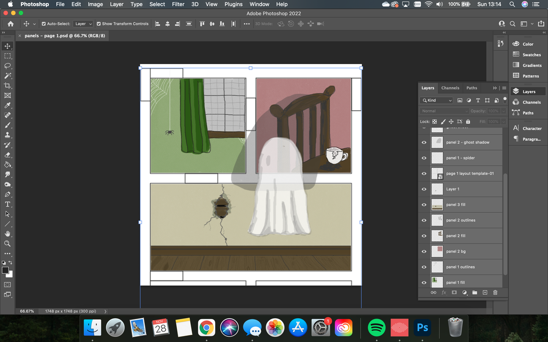
Illustration - all layers in Photoshop.
Final panels - for print and use as trigger image
|
I brought the .psd file into AfterEffects as a comp with editable layers, and worked on animating the moving overlay elements:
- Adding solids as new layer over each individual panel
- Setting each solid as an alpha track matte with the moving element linked (when it moved betyond this square frame - it is invisible)
- Keyframing scale, position, and opacity of moving elements
I then removed all of the background illustration layers, and ensured there were no solids left in the composition that would appear behind the moving elements. Certain that my transparency would be successful, I exported the animation as an H.264 (.mp4) through the media encoder queue, as I am accustomed to.
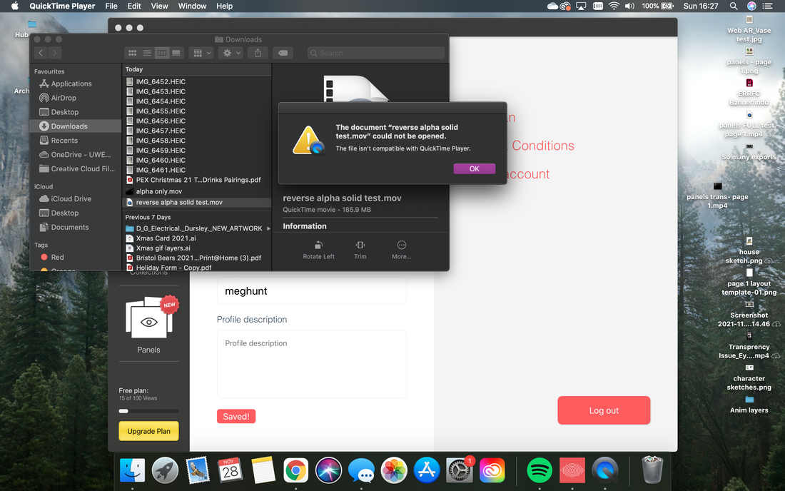
When I viewed the animation, it was still appearing with a black background. After some troubleshooting, I discovered that H.264 format does not support alpha channels - the layer that would lend the transparency to the animation.
Instead, I would need to render the video either as a.mov (Quicktime), or .avi, and ensure that the settings were set to render RGB+Alpha. This is where I started to run into problems...
I exported the file as a .mov, with Alpha and RGB enabled, however, my video was still playing with a black background. Thinking that this may just be the default setting background of my video player, I attempted importing it into Eyejack, to see if the transparency would be recognised. However, the problem persisted, and the animation refuses to show transparency - appearing like so in the interaction:
|
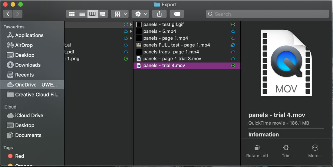
I did attempt various workarounds - exporting with different settings (frame rate/ colour profile/ alpha etc.), as different file formats, a total of 7 different times. I tested the video by re-importing it back into After-Effects - where it would clearly display with the alpha channel - but for some reason would not play outside of Ae with this. I scoured the internet for workarounds - but all pointed me back to simply rendering as a .mov with RGB + Alpha enabled. I exhausted all of the options/ file formats available to me on both my laptop, and the Macs on campus.
|
|
Problem solving...
Troubleshooting this transparency issue took me several days. I spoke with friends who had a better understanding of After Effects and animation, to see whether they could shed any light on why the exports were appearing this way, but nothing seemed to resolve the problem. I transferred all of my files to a PC, rather than Mac, and attempted exporting the file as a .avi (a file format not available to me on mac that supported alpha) but this resulted in a filesize so large I couldn't transfer it between my machines - and realistically creating a series of videos in this format would be unsustainable for the project.
My next test was to export the video with the alpha channel only. I thought I had recognised the issue with the video, when the alpha channel showed white versions of all of the animated objects - leading me to believe that the alpha channel was set to transparency only beneath the images - hence was not appearing correctly surrounding the images as I intended. I attempted to resolve this by exporting new versions of the file with the following options:
- Inverting the alpha track matte
- Adding a solid layer in the background, and inverting its alpha matte
- Adding a solid layer, and setting it to silhouette alpha.
|
All of these file formats continued to show the same issue - whether not playing on my quicktime player, or simply appearing with the same transparency issues/black background. At one point, I did question if I was simply mistaking the black background default of the .mov players as a solid background, but the problem persisted as the black background was being rendered in the Eyejack app - which was where the transparency was key. After spending several hours over a couple of days exporting various formats, I had around 27 different file formats exported of the same video - none of which were suitable to overlay in the app.
|
problem solving 2.0...
|
My next area of investigation was creating a separate animation test - as I was concerned that I had some settings I was unaware of included in my panel animation that were preventing the alpha channel from exporting correctly. I used a simple cube solid and animated its position and rotation. I exported in all of the above mentioned formats - through both the render queue and media encoder - however, the black background was still appearing in Eyejack when I tried to view the animated overlay. (right)
By this point, I had worked out the precise format (Quicktime - Apple ProRes 4444 with alpha) to export the .mov out using the Media Encoder to ensure transparency, and playability on my Macbook. This is below in an image for future reference: 
|
|
a solution!
With none of my animations working, but appearing transparent when viewed separately from the Eyejack app (tested through re-importing back into AfterEffects, and overlaying other videos in Premier Pro) I began to wonder if the issue was with the utlity of the app. I was concerned that it wasn't possible to use transparent videos for the AR experience using the app. When looking into Eyejack, I saw that other experiences advertised on the website didn't have backgrounds - so I realised it must definitely be a possibility. When I searched the FAQs, I found that the app supported only transparent pngs, and gifs.
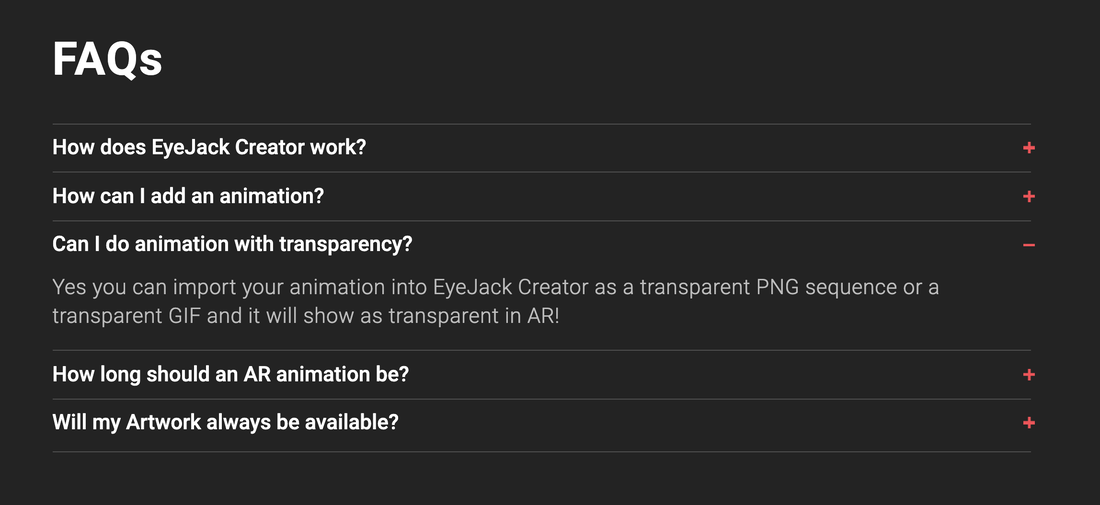
The issue was that After Effects does not offer a gif export option that includes transparency. In order to create a transparent gif, I would need to export the .mov with the alpha channel, import this into Photoshop, and then export for web legacy from Ps to create a transparent gif.
Issues to consider when doing this are:
After resizing and re-exporting the gif from Photoshop, the result was a transparent gif that worked correctly in the app. There is an issue with the opacity of the ghost shadow (top panel right) and the sheet ghost in the bottom panel. Both were not set to 100% opacity, so the illustration below should still be viewable through them. This is something I need to experiment with over the next week to try and resolve. If opacity of moving objects is not possible, I will need to reconsider how I go about presenting my ghost character, and how some of my animated interactions will appear and work.
Issues to consider when doing this are:
- Size/dimensions of the image/animation - the original illustrations were quite large, so the layers of the animation were also.
- The memory and storage needed for photoshop to render an animated gif at such high resolution exceeded anything that my computer had
- Original images either need to be smaller/ .movs need to be resized (loss of quality)
- Duplication of all files = more storage needed and more time to complete each animation ready for Eyejack
- Is it worth animating in AfterEffects? - consider needs of my animation complexity - could just animated frame by frame in photoshop and export directly from there.
After resizing and re-exporting the gif from Photoshop, the result was a transparent gif that worked correctly in the app. There is an issue with the opacity of the ghost shadow (top panel right) and the sheet ghost in the bottom panel. Both were not set to 100% opacity, so the illustration below should still be viewable through them. This is something I need to experiment with over the next week to try and resolve. If opacity of moving objects is not possible, I will need to reconsider how I go about presenting my ghost character, and how some of my animated interactions will appear and work.
|
Page 1 Panels - Digital Test
|
Page 1 Panels - Print Sample
|
|
|
|
What's next?
With most of my technical tests completed, I have a good understanding of the process I need to undertake to create my illustrations, and AR animations for the graphic novella. I need to fine tune the transparency issues with the overlays, and decide whether my workflow needs to include AfterEffects based on the complexity of my animations.
Once all of the process decisions have been ironed out, the next stage of my project is the production of all of the illustrations and laying them out ready for print. Aside from this, my research needs are focussed on physical production of the novella – working with paper stock, printing, and binding of the finished “book”, and developing my knowledge and understanding of publishing. I intend to liaise with the Interdisciplinary Publishing Lab at Bower Ashton Campus, in particular Tom Abba, a technician who has agreed to work alongside me as an ad-hoc “tutor” of sorts for all things book - to determine how the physical copy of my novella will be formed.
I have created a rough timeline of production, with key actions, outputs, and measurable criteria, to keep the project on track:

