Research and Resources
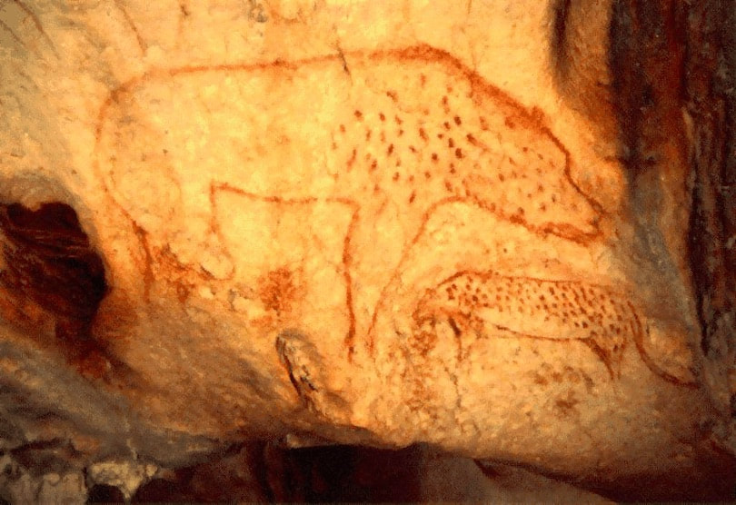
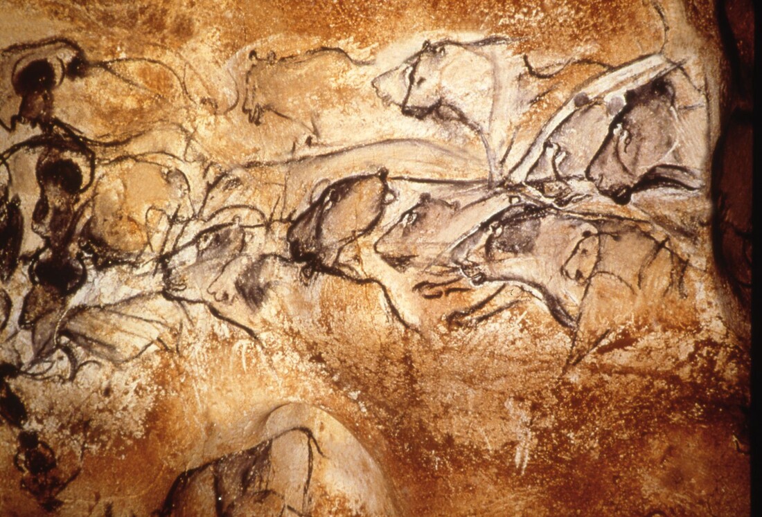
Upper-Palaeolithic Cave Art (Prehistoric/Ice Age era)
The first instance that came to mind when thinking about communicating visually, was prehistoric cave art. Although the mind may conjure up ideas of stick figures holding bows and arrows, and hunting scenes (probably influenced by pop-culture representations of cave art in film and television) the majority of the first upper-palaeolithic cave art (the first art created by what historians consider "modern man") focussed on documenting predatory animals. Human forms were sparse, and often only presented in fragments such as heads, or genitalia, and herd animals or prey appeared much later. Although meaning behind the cave art is impossible to decipher, and many have linked it to religious or shamanic practice, the highlighting of dangerous animals (i.e: risks to other people) could be seen as a type of informative visual language. Rather than documenting hunting, herding, and everyday life as we may have come to expect (and let's face it - why would they document this?) there is a focus on getting a message across of danger associated with the pictured animals. 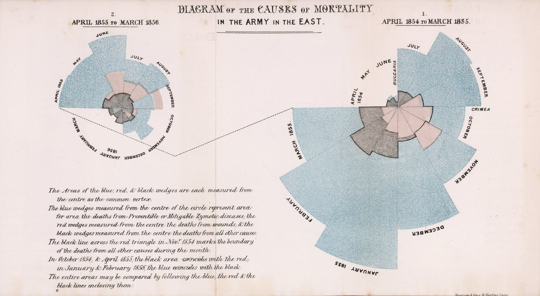
Florence Nightingale: Mortality Diagram (1858)
"Diagram of the Causes of Mortality in the Army in the East" Florence Nightingale's iconic infographic was included in her writings about British Army medical procedure presented as an appeal to parliament. Her writings, and this groundbreaking instance of data-visualisation convinced Queen Victoria to adapt Nightingale's recommendations for war medicine and sanitation practices. These would later become standard practice worldwide, and eventually help save the lives of countless soldiers throughout history. This infographic is one of the first data visualisations to shape policy in this way, and with its innovative and easily adaptive design, it is still commonly regarded in design circles as one of the most influential infographics of all time. 

Infographics: The Power of Visual Storytelling
This book looks at the history of infographics, their purpose, design influences, and key factors in creating useful, engaging information design in the modern era. It is primarily concerned with information design for marketing (across social media and editorial work) which is particularly helpful for my design theory when at my 9-5, however, the information given on the history behind info-design is extremely interesting. It documents the content change from editorial infographics - originating in newspapers and typically used now for premium brand marketing - to more concise, visually striking content designed for quick consumption on the web. One of the influences drawn upon is De Architectura, in which Vitruvius states that three standards to which all structures should adhere: soundness - utility and beauty. From these architecture principles, the writers lay out their own 3-point manifesto for presenting information in a structured format:
Finally, the 3 design approaches laid out in approaching infographic designs seem useful in further planning of this project: VISUAL METAPHOR - containing information in a framing mechanism indicative of your subject matter SYMBOLS AND ICONOGRAPHY - visual elements in place of verbal explanation. But must be culturally inclusive/understood widely by your target audience. DECORATIVE FRAMING - using design elements that appeal to your target audience lets them connect with the infographics on an emotional level - therefore deepening their interest/retention 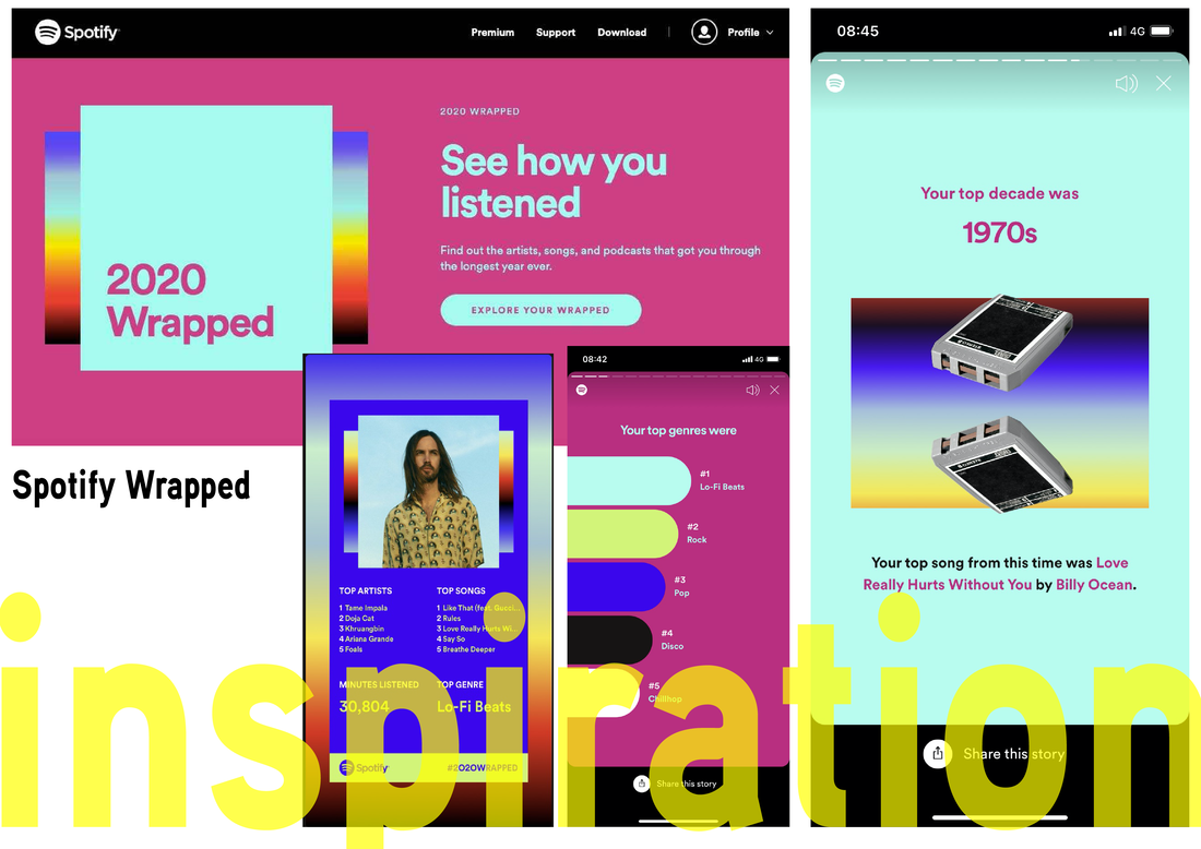
Spotify Wrapped (2020)
One of the first things that popped into my head when thinking about visualising personal data was Spotify Wrapped. At the end of the year, Spotify filters through your listening data to provide you with a colourful, easy to digest reflection of your listening trends over the past 12 months. Each piece of data is presented in a timeless retro/futuristic graph or icon graphic thats instantly shareable across all social media platforms. This data is usually completely inaccessible to the user (you don't know who is your most listened to ARTIST or GENRE or DECADE - this background data is simply used to make you more radio suggestions) which adds a triviality, or novelty, to discovering your trends in a neatly packaged animation or visual; you feel as if you are being presented a gift. This "journey" or "mood" is something I hope to capture in my own presentation of data. 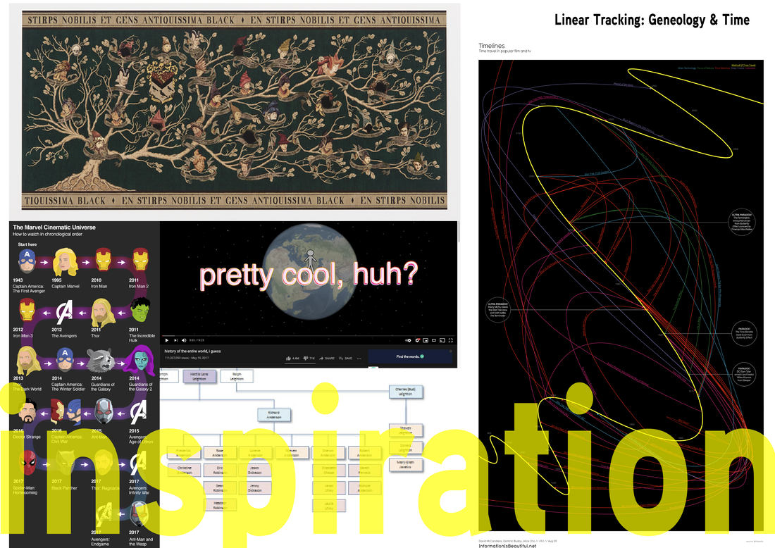
Linear Tracking: Genealogy Diagrams and Timelines
The most popular way or organising events (or EXPERIENCES) is chronologically, and this approach seems most sensible to me when basing a project on myself, and that which "defines" me. Looking at events from across the spectrum of my life allows for a wider range of information to be included as a "fact", and in turn this should present a better understanding of my personage. Time passing has a huge impact on who you are: the person I was as a teenager is very different from my current self. Through exploring aspects of my life in a temporal sense, I can highlight the importance of how history (both our own and universally) affects us in the present. In addition, the inclusion of important albums/single that I listen to and books that I love, allow me to span a timeline much more vast than my own existence, which I think could make a more interesting composition/pattern in terms of design. This will also allow me to create inter-woven threads across my timeline (based on album release date versus when listened to) similar to how the fictional timelines connect in McCandless' Timeline above. Being able to distort a linear relationship, and show an abstract form - using space, size, and perspective - is something that I believe will add visual interest to my poster. |

Edward Tufte (1942-Present)
Tufte is a Yale University Statistics professor; who is considered a pioneer of data visualisation, errs on the side of conservative information design.He believes that too many visuals or illustrative elements are superfluous, and detract from the clarity of the information. Tufte's work is grounded in statistics and the presentation of quantifiable data. In this way, he can be seen as the opposite end of the spectrum to Nigel Holmes (above) explorative design. According to Tufte, information design should eschew all useless, non-informative, or information-obscuring elements - coined "chartjunk". "Sometimes decoration can help editorialize about the substance of the graphic. But it is wrong to distort the data measures—the ink locating values of numbers—in order to make an editorial comment or fit a decorative scheme." Tufte, Edward R (2001) [1983], The Visual Display of Quantitative Information 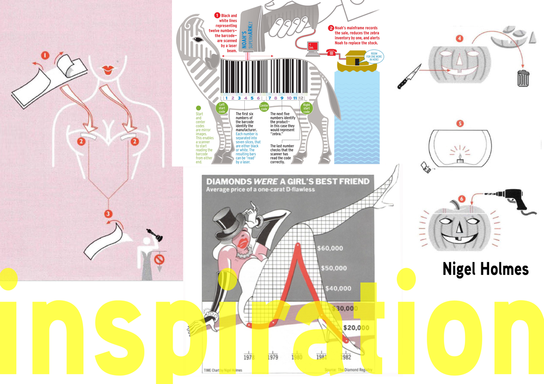
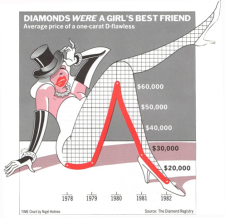
Nigel Holmes (1978-94)
Holmes is a British Graphic Designer who epitomises the other end of the infographic design spectrum ideologically: he believes in using illustration and visual metaphor to support and reinforce the topic - making the graphic appealing to viewers with an almost superfluous use of comic/illustration. Most recognisable work: illustrated series of editorial “explanation graphics” in Time magazine throughout the late 70s and 80s. 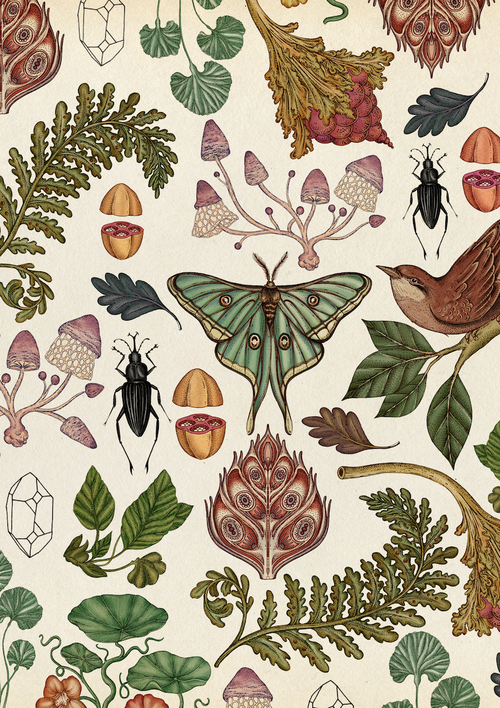
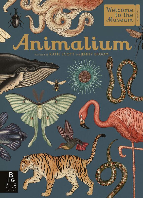
Katie Scott - Encyclopaedia Illustrations
Scott is a London-based freelance illustrator, well-noted for her work with V&A, Kew Gardens, and various fashion and wallpaper brands. Her realistic flora and fauna illustrations give off a vintage feel that really appealed to me. As a child, I remember being fascinated by animal encyclopaedias, and illustrated non-fiction (particularly related to the natural world). and how the images of said things helped me to retain the information about them. The almost nostalgic feel of Scott's work is something I hope to bring forward in my own work. 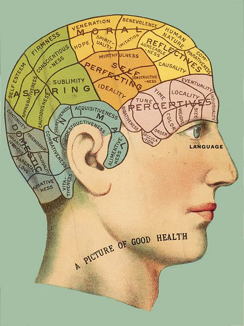

Anatomical Diagrams & Artistic Deviations
Following on from Scott's animal illustrations, I was reminded of anatomical diagrams in medical learning. The first examples which came to mind were DaVinci's sketches, and in a more practical sense, Gray's Anatomy. A fascination with the human form, and the need for medical students to further visualise procedures and internal structures for accuracy - has lead to GA being used to this day; currently on its 42nd edition. The human curiosity behind the inner workings of the body and mind extends to alternative medicine, and alternative renders of "anatomical" structure - the most popular being phrenology (now widely disregarded as nonsense) reflexology, and palmistry. All 3 rely on mapping physical attributes or areas of the brain, feet and hands respectively and assigning thought, feeling or meaning to them. The segmentation of the physical body to reflect something more spiritual, or even to predict events in time is an interesting concept in terms of using these "diagrams" as visual instruction manuals. The appeal of these alternative images and their general disregard as effective or scientifically grounded in Western society has led to a phenomenon of them in popular culture; for example - "tattoo phrenology heads" can be bought as decor in Urban Outfitters, and palmistry "ring holders" are another popular trinket. To me, this highlights the importance of culture on a viewers interpretation of visual information: A once medically acclaimed diagram or figure is now a "vintage-chic" trinket. 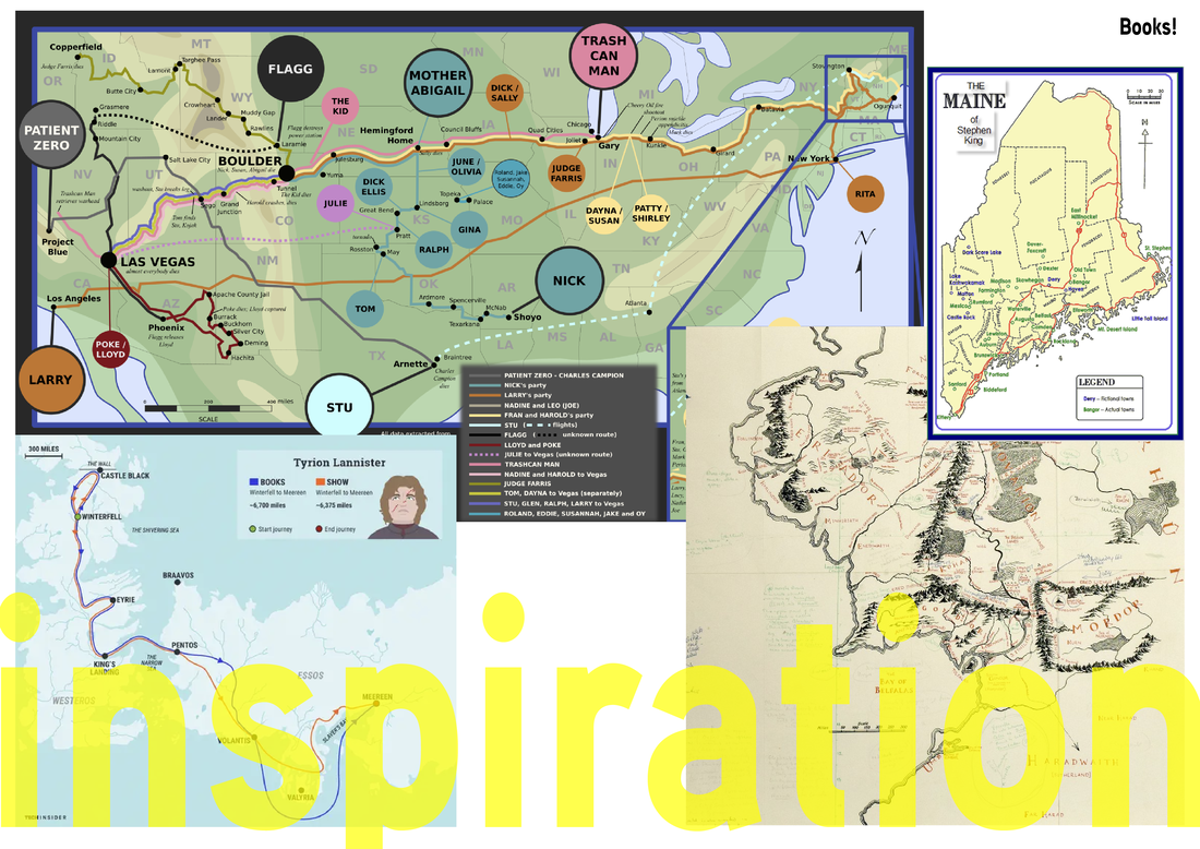
Character Tracking: Fictional Maps & Visual Journeys
Cartography is obviously a popular way to visualise spacial/geographical data, but something that intrigued me was the formation of false/imagined maps, and their use within and alongside narrative fiction. The prime example of this would be the maps of Middle Earth in the Lord of the Rings Trilogy - so that a reader can easily visualise the span and scale of the hobbits' journey. The "fake" maps are used as an addition to the written story to help readers keep track of where certain characters are, and where fictional landmarks are in relation to each other. The tracing of a character's journey across location/space seems like the next step on from timelines - as it ground the narrative of a person in the 3-dimensions. The need to relate/visualise journeys spatially to fully understand the concept of a characters progress seems to be a universal human curiosity. 2 of the most popular fan-created maps of character journeys exist for the Game of Thrones universe, and Stephen king's epic The Stand (which takes place across a very real USA). The fact that non-authors and non-artists are creating information design in the form or character tracking maps to aid other readers of their favourite material, highlights the importance of visual language in explaining long or convoluted processes. |
Initial Ideas
- Initially drawn towards icons/iconographic design - I usually work with vector based illustrations to highlight information that is quick and easily visualised for consumption across social media platforms..
- Trying to pull together a diverse 50 facts - possibly worth reaching out to others to see their perception of my intrinsic qualities?
- Use of a survey also allows more data to be collected? Optional entry versus multiple choice - multiple choice will result in percentage of people who perceive a certain something - will give me more definitive numbers
- Use of external data sources links to the Spotify/Monzo wrapped inspiration
- Visual language - thinking of image as its own communication. Transcends the boundaries of illiteracy/nationality/age and culture. it is important to visually represent some of my facts with minimal text to push the boundaries of what illustration can communicate in a "data" sense.
- Vintage/hand-drawn style contrasting with a modern Sans typography
- I want to combine the lush illustrative style of Katie Scott, and the fact that my music taste is grounded in the late 60s-70s to stylise my poster.

Mindmap (Above)
Since my thoughts often appear to me as a disorganised jumble, the easiest way I found to present my initial ideas was as a sort of mind map. I wanted to refrain from using lines to specifically LINK any ideas, as they do not necessarily work together - moreover, I just wanted to get everything on paper incase it led to anything productive, The darkest (black) text are the most prominent ideas, stylistic choices or features that I wish to include in my final piece. These then spurned further ideas, or needed a bit more elaboration; these "sub-thoughts" importance is ranked by their shade (lightest = least relevant).
Since my thoughts often appear to me as a disorganised jumble, the easiest way I found to present my initial ideas was as a sort of mind map. I wanted to refrain from using lines to specifically LINK any ideas, as they do not necessarily work together - moreover, I just wanted to get everything on paper incase it led to anything productive, The darkest (black) text are the most prominent ideas, stylistic choices or features that I wish to include in my final piece. These then spurned further ideas, or needed a bit more elaboration; these "sub-thoughts" importance is ranked by their shade (lightest = least relevant).
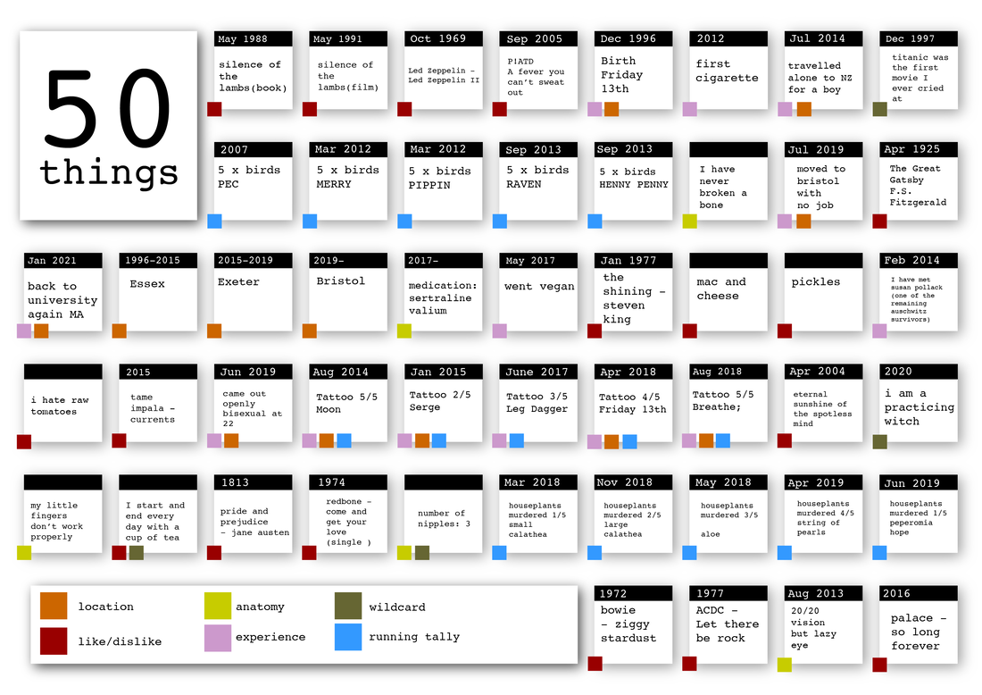
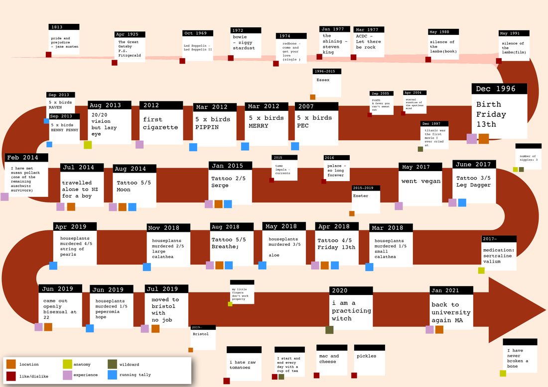
Categorising the 50 Things
Above is the image of my final 50 things I wish to include in the poster. I wanted to give a more comprehensive view of myself and my personality, so decided that using experiences and likes/dislikes from across my life would allow for a)some more interesting things to be alluded to, and b)a better overall impression of me could be inferred by the viewer. With a Literature degree, I had to include some of my favourite books, and this lead to the inclusion of other pop-culture likes, such as film and music. I already knew that my music preference leaned more towards the 1970s, therefore using my favourite albums allowed me to explore a wider timeline based on release date. Ultimately, including music was also essential in any representation of "me", as I believe that music holds its own power in transcending time and bringing back memories. The addition of the "running tallies" came from the coincidence that I owned 5 birds, and 5 tattoos. I knew I wanted to include the fact that I'm a notorious houseplant murderer, so I populated 5 more facts with those deceased plants that I could roughly remember a date to. The implication of tallying random aspects of my life also reflects quite well on my anal-retentive nature and penchant for list-making; so the category makes sense in and within itself. I also wanted to include some anatomy-based facts, as I had planned to make a nod somehow to the anatomical diagrams I had researched above. Locations seemed like a huge aspect of my life and my journey: moving out, moving cities and the events that went along with these geographical changes led me to include this as a category, and this went hand in hand labelling anything I had DONE, SEEN, or LEARNT as "experience". Finally, I included a couple of wildcard facts to add a few littler extra-rich threads to the tapestry of my character, and simply allocated a category to these random facts that I had left over.
Above is the image of my final 50 things I wish to include in the poster. I wanted to give a more comprehensive view of myself and my personality, so decided that using experiences and likes/dislikes from across my life would allow for a)some more interesting things to be alluded to, and b)a better overall impression of me could be inferred by the viewer. With a Literature degree, I had to include some of my favourite books, and this lead to the inclusion of other pop-culture likes, such as film and music. I already knew that my music preference leaned more towards the 1970s, therefore using my favourite albums allowed me to explore a wider timeline based on release date. Ultimately, including music was also essential in any representation of "me", as I believe that music holds its own power in transcending time and bringing back memories. The addition of the "running tallies" came from the coincidence that I owned 5 birds, and 5 tattoos. I knew I wanted to include the fact that I'm a notorious houseplant murderer, so I populated 5 more facts with those deceased plants that I could roughly remember a date to. The implication of tallying random aspects of my life also reflects quite well on my anal-retentive nature and penchant for list-making; so the category makes sense in and within itself. I also wanted to include some anatomy-based facts, as I had planned to make a nod somehow to the anatomical diagrams I had researched above. Locations seemed like a huge aspect of my life and my journey: moving out, moving cities and the events that went along with these geographical changes led me to include this as a category, and this went hand in hand labelling anything I had DONE, SEEN, or LEARNT as "experience". Finally, I included a couple of wildcard facts to add a few littler extra-rich threads to the tapestry of my character, and simply allocated a category to these random facts that I had left over.
Layout Planning
Arranging Chronologically
The next stage in my process was to work out how I would represent the time frame of my "facts" and how different aspects of my life (location/event/like or dislike) interlinked. My first attempt was to rearrange my original list into date order chronologically, however, I was left with some "facts" that did not belong to a specific moment in time, some which spanned across and encompassed other events, and some which were far too displaced from my own timeline. For example, the albums and books in my LIKES category were released many year prior to my birth, and were discovered/important to me at different times in my own timeline. It was impossible to show these relationships with a linear layout, and I needed to put pen to paper to really envisage how the components all worked together.
The next stage in my process was to work out how I would represent the time frame of my "facts" and how different aspects of my life (location/event/like or dislike) interlinked. My first attempt was to rearrange my original list into date order chronologically, however, I was left with some "facts" that did not belong to a specific moment in time, some which spanned across and encompassed other events, and some which were far too displaced from my own timeline. For example, the albums and books in my LIKES category were released many year prior to my birth, and were discovered/important to me at different times in my own timeline. It was impossible to show these relationships with a linear layout, and I needed to put pen to paper to really envisage how the components all worked together.
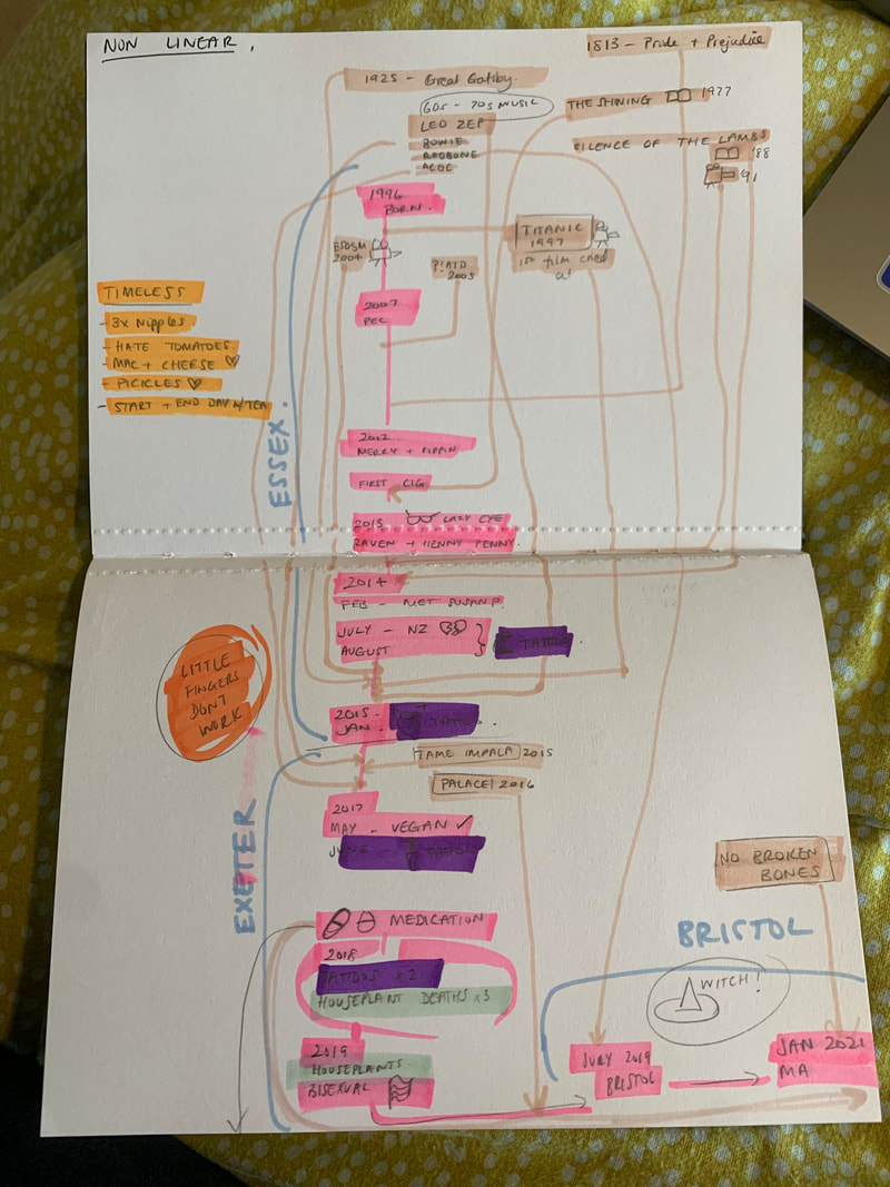
Thinking About Non-Linear Timelines
I began by noting down the events within my own history - from 1996 through to present. I then mapped out the books, films, and albums - placing them around their release time spatially, but linking them to my experience of them with leading lines. I also placed the locations as brackets around wider timeframes/events, to give experiences a sense of place. I may represent this in the final poster as the outline of the map areas surrounding or overlaying the other facts. Finally, I added any non-timed facts at the side - to make sure that I would not miss them out of the final composition. |
Ideas for Visually Representing Facts, Importance, and Time
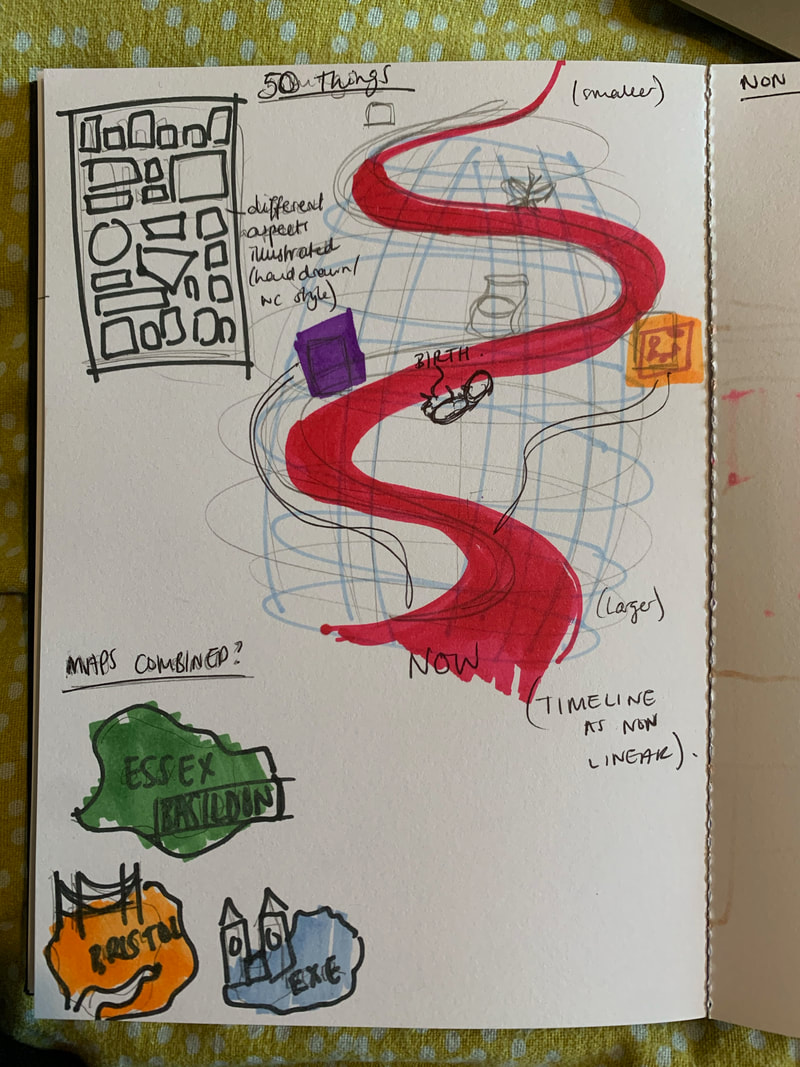
In order to create more space to fit all of my facts onto the poster, and to present the idea that certain "facts" spanned over more than one timezone, I began imagining more abstract ways to visually represent them in my sketchbook. The immediate solution was to represent my locations as map shape - perhaps with iconic landmarks protruding from them to identify the places easily/identify what was important to me in those places. this would mean I could place the maps wherever I chose on the timeline/outside of the timeline and they would exist in a different dimension to the linearly tracked facts. I also sketched out another wavy timeline, in order to conserve space, however this time I also played with 3-D/perspective, making the closest point in time (most recent) at the forefront/larger and the oldest point much smaller and further away. In conjunction with this, I could resize the graphic representations of my facts. Another way I considered using size was as an indicator or importance: if something was particularly prevalent to my character, it would appear enlarged, whilst smaller, more inconsequential information would be smaller. This is an instant pre-attentive attribute that the viewer could understand without the need for a key. |
Design Development
|
Step 1: Allocating a colour scheme and creating the basic structure.
I chose muted browns and oranges to represent the 60s/70s era of my preferred music and literature, that would also lend itself to the soft, illustrative nature of the icons/images that I intended to create. I began with the warped shape of the timeline/road and the outlines of map areas, choosing to keep them simple and graphic to contrast the plethora of illustrations and text that would be added around/within them. |

|

|
Step 2: "Rough" illustration and working out placement.
I mocked up the placement of where I wanted graphic representations of my facts to go using simple shapes in illustrator, and began adding text captions. This was an easy way to determine how much space I had to work with and relationships between facts/objects based on their size and placement. I also at this point decided to alter the perspective of the timeline and the maps - adding a drop shadow and removing the bottom halves of the map outlines so it appears that the timeline went through the locations and was stretching from the pas (small) to the present (large) on an almost 3-d axis (as I had illustrated in my sketches.) I think this added a nice depth to the poster, and helped to visually explain how the locations SURROUNDED my other listed experiences. |
|
Step 2 Cont. My sketchbook illustrations were created quickly using pencil and markers, to get onto paper the visual representations of my facts that i wanted to include. Not all 50 facts had visual counterparts, either due to it being a) impossible to portray, b) unnecessary in terms of their importance to me or c) to conserve space on the poster and prevent it from becoming too cluttered. I had not intended to ever use these sketches in the final product, as they are my rough working, however, when I presented my ideas to the group, the feedback was overwhelmingly positive about the illustration style of these images, and general consensus was that they should be included in my final work.
|

|

|

|
Step 3: Digitising the Sketches
My original plan was to use the sketches as a template to create vector graphics from, however, from the feedback I had received, I wanted to retain some of the hand-drawn texture as it made the images more personal. I explored scanning in the images, and using vector masks to simply clean the edges and "crop" out the drawing with a smooth outline, however, it appeared too flat and did not allow me to play with the textures, shapes, and colours like I wanted to. I researched bringing hand-coloured illustration into Ai, and found a method that worked for me: Image Tracing with specific settings to capture colour and marks and vectorise them. I went through the painstaking process of photographing, image tracing, and then reshaping and combining the resultant vector "puzzle pieces" that made up each illustration, before tweaking colour palettes and grouping to create the final images. Some remained as vector shapes, simply copied into the final poster, however, the larger drawings were rasterised to stop my laptop from combusting at the sheer size of the files being used in tandem!.
|

|
Step 4: Working out how to include all the information! Alternative title: learning when to abandon an idea.
Once some of my illustrations were placed, I started to realise how little room there would be to include all of the information that I had originally intended. I abandoned the idea of including every album cover/book cover/film shot as a visual, and instead drew inspiration from my line sketches, and McCandless intertwining "timeline" infographic from Information is Beautiful. I used the pen tool to create swooping curved lines, and typed on the paths created. For the novels that I wanted to include I used repeated, memorable quotes to make up the text paths. I thought this would be a nice way to demonstrate that the lines represented literature - as the timelines were physically formed from words in the book. In the case of The Shining this concept worked particularly well, with the iconic "all work and no play makes jack a dull boy" repeating over an over as it was typed in the story. I used typefaces that stylistically captured either the time period or an element of the novels: flowing handwritten script for Pride and Prejudice, a serif typewriter font for The Shining, Sans Art-Deco-eqsue lettering for The Great Gatsby and so on and so forth. I denoted the book title, author, and year of publication in the standard typeface and colours that were featured on the poster, to explain clearly to any viewer what these lines were representing. |
Although I loved the concept behind these lines, they cluttered and confused the composition of the poster, and made other text difficult to read. Since legibility and understanding is the underpinning factor of information design, I knew that this couldn't work. I trialled whether a dark background would make the poster more legible and allow me to hold onto my idea by quickly filling it BLACK, but the problem still remained. This, however, did highlight that using a higher contrast background to my foreground colours gave some depth to my poster, and made it "pop" more, but I was concerned I would lose the 70s, warm feel. Later, I would request feedback from the rest of the group as to whether they preferred the original background colour or the dark brown that I eventually settled on (seen below).
After I had removed the time-line novels, I thought about how else I could represent them on my poster and still add visual interest/a contrast to the rest of the information. After all, they are secondary to the actual physical events/experiences I had listed on the central timeline, so I needed to differentiate them in some way. Thinking that "less is more", especially with my hand-drawn illustrations already lending the kitsch, personal touch to my overall design, I simply allocated spaces for the information to sit as text in rounded boxes. I mocked this up in the original colours, and a new, darker version, ready to present to the group.
After I had removed the time-line novels, I thought about how else I could represent them on my poster and still add visual interest/a contrast to the rest of the information. After all, they are secondary to the actual physical events/experiences I had listed on the central timeline, so I needed to differentiate them in some way. Thinking that "less is more", especially with my hand-drawn illustrations already lending the kitsch, personal touch to my overall design, I simply allocated spaces for the information to sit as text in rounded boxes. I mocked this up in the original colours, and a new, darker version, ready to present to the group.
|
|
Step 5: Final touches!
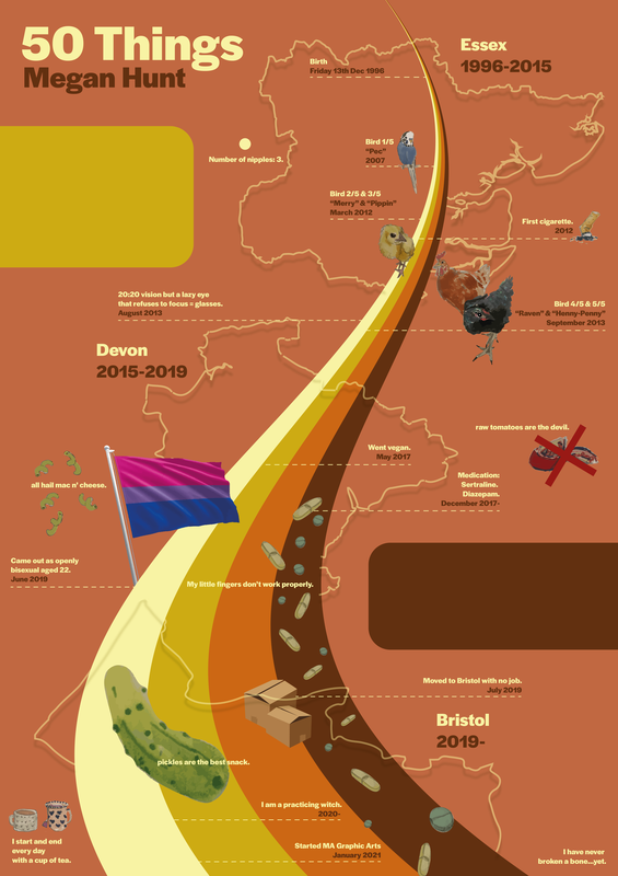
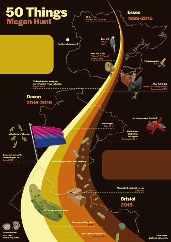
After the resounding feedback and a strong gut feeling that the second, darker poster was more striking and legible, I continued adding my information and illustrations. I played with aligning all of the text, and creating equal margins around the outside of said text using the negative space, however, the disorganised, staggered nature of the "captions" looked better upon reflection, so I reverted back to that format. I did, however, align any text on the outermost left and right edges (see: Tattoo, mac and cheese, drinking tea, Houseplants murdered on the lefthand side.) I planned to list all of the Art (books, movies, and music) in the brown box, and have an icon denote each header in it's 70s format (a cassette for music, a boxy tv for film, and a stack of novels for books) however I had run out of room yet again, and took to the simplified approach of using text titles, which looked a lot cleaner and complemented the space well. I went through and resized certain illustrations based on their importance and their position in the timeline (e.g: the huge pickle highlights my intense preference for them!) and tidied up all of the "captions" so that their leading lines blended nicely into the central timeline. A final spell-check, a tick-list to make sure all 50 things were definitely included, and exporting to pdf, png, and svg...et voila!
After the resounding feedback and a strong gut feeling that the second, darker poster was more striking and legible, I continued adding my information and illustrations. I played with aligning all of the text, and creating equal margins around the outside of said text using the negative space, however, the disorganised, staggered nature of the "captions" looked better upon reflection, so I reverted back to that format. I did, however, align any text on the outermost left and right edges (see: Tattoo, mac and cheese, drinking tea, Houseplants murdered on the lefthand side.) I planned to list all of the Art (books, movies, and music) in the brown box, and have an icon denote each header in it's 70s format (a cassette for music, a boxy tv for film, and a stack of novels for books) however I had run out of room yet again, and took to the simplified approach of using text titles, which looked a lot cleaner and complemented the space well. I went through and resized certain illustrations based on their importance and their position in the timeline (e.g: the huge pickle highlights my intense preference for them!) and tidied up all of the "captions" so that their leading lines blended nicely into the central timeline. A final spell-check, a tick-list to make sure all 50 things were definitely included, and exporting to pdf, png, and svg...et voila!
Final Piece

evaluation
Overall I am extremely pleased with my final outcome for this brief. I think the stylistic elements derived from the retro feel and the hand-drawn illustrations really capture my personality behind the information, whilst the structure of the timeline, and addendum boxes help convey all of the facts in a clear and easily digestible fashion. I think the visual metaphors act as cues or reminders that help the viewer take in key information and retain it, regardless of whether they choose to read all of the text. I am particularly happy with the map areas as representative of my locational facts, as they wrap around the main events timeline seamlessly, and convey the overarching information purely from a visual representative that transcends language and text. I am happy with my decision to include my original illustrations, rather than stylise them or convert to icons, as they impart a lot of personality to the piece that would have otherwise become quite clinical. I think I have used a good ratio of text to image, and have conveyed a variety of personal information that intrigues and interest a potential viewer. My only regret is the inability to access the digital print studios, and lack of submission of this brief as a physical printed outcome, as it would be nice to appreciate the scale and size of the full poster in its printed format. If there is an opportunity for me to print at a later date, I may do so in order to evaluate how the design work translates to large format print - or simply to keep the project as a keepsake for my flat!
